Table of Contents >> Show >> Hide
- Quick Cheat Sheet: Choose Like a Pro (Even If You’re Paint-Tired)
- Before You Commit: 5 Bathroom Paint Rules That Save Regret
- 31 Bathroom Paint Colors for Any Style
- Crisp & Classic Neutrals (Timeless, Easy to Pair)
- #1 Simply White (soft, flexible white)
- #2 Alabaster (warm off-white)
- #3 Linen White (creamy, cozy off-white)
- #4 Whipped Cream (soft off-white with gentle depth)
- #5 Simplified White (clean, modern white)
- #6 Revere Pewter (classic greige)
- #7 Edgecomb Gray (light greige that stays soft)
- #8 Drift of Mist (airy warm-gray)
- #9 Shiitake (warm taupe-neutral)
- #10 Heather Gray / Smoked Oyster (soft modern gray)
- Water-Loving Blues & Blue-Greens (Spa Calm to Coastal Cool)
- #11 Gray Wisp (soft airy blue-green)
- #12 Sea Salt (green-blue-gray “chameleon”)
- #13 Window Pane (misty, tranquil blue-green)
- #14 Rock Candy (icy, clean pale blue)
- #15 Stardew (soft pastel blue)
- #16 Adriatic Sea (deeper, dramatic blue)
- #17 Evening Sky (clear mid-tone blue)
- #18 Hidden Gem (smoky blue-green “new neutral”)
- Nature-Inspired Greens & Earth Tones (Organic, Restful, Trend-Resistant)
- #19 Fresh Eucalyptus (green that feels “spa by design”)
- #20 Sage Green (soft muted green)
- #21 Deep Olive Green (rich, moody green)
- #22 Oakmoss (earthy green with depth)
- #23 Terracotta / Clay (warm earthy neutral)
- #24 Silhouette (moody brown with sophistication)
- #25 Marblehead Gold (golden warmth without “yellow bathroom” panic)
- Warm, Playful, Unexpected (For Personality Without Chaos)
- #26 Corn Yellow (bright, happy, retro-cool)
- #27 Persimmon (orange with a friendly glow)
- #28 Soft Blush Pink (warm, flattering, not “nursery”)
- #29 Lilac (whimsical, modern, and slightly unexpected)
- Moody & High-Drama (Powder Room Energy, Boutique-Hotel Finish)
- #30 Soft Black / Deep Charcoal (cozy, chic, and bold)
- #31 Cyberspace / Midnight Navy (classic, rich, and timeless)
- How to Make Any Color Look Expensive
- Real-World Experiences: What People Learn After Painting a Bathroom (Extra )
- Conclusion: Your Bathroom Color, But Smarter
Picking a bathroom paint color is a little like picking a haircut: it looks perfect on the tiny sample card,
then you get home, turn on the overhead light, and suddenly your “soft greige” is giving “storm cloud at 6 a.m.”
The good news? Bathrooms are small, which means paint is one of the quickest, most budget-friendly ways to make the
whole space feel intentionalwhether your vibe is spa calm, vintage charm, bold maximalist, or “I just want it to look clean.”
This guide rounds up 31 bathroom paint colors (ranging from bright whites to moody navies) plus practical,
real-world advice on undertones, lighting, and the best bathroom paint finish so your new color looks great in the mirror
not just on a Pinterest board.
Quick Cheat Sheet: Choose Like a Pro (Even If You’re Paint-Tired)
- Windowless or dim bathroom: favor warm whites, soft greiges, and light blue-greens.
- Lots of natural light: you can pull off deeper colorsnavy, olive, charcoal, even soft black.
- Busy tile/countertops: keep walls calm (off-white, light gray, gentle green) and let finishes shine.
- High moisture: pick a satin or semi-gloss finish for easier cleaning and better moisture resistance.
Before You Commit: 5 Bathroom Paint Rules That Save Regret
1) Light changes everything (especially in bathrooms)
Bathrooms have all kinds of “mood lighting,” and not always the flattering kind. Daylight, vanity bulbs, recessed cans,
and that one overhead fixture from 2009 will each pull different undertones. Test your finalists on two walls (or on poster board),
then check them morning, afternoon, and nightbecause the color you love at 2 p.m. can look wildly different at 10 p.m.
2) Undertones are the secret boss level
“White” isn’t just white. Off-whites can lean creamy, gray, pink, green, or even slightly yellow. Same with grays and blues.
If your tile or countertop has a warm beige or gold cast, a cool icy paint can make everything feel off. Aim for undertones that
agree with your fixed finishes (tile, stone, flooring), not fight them.
3) Don’t forget how color looks next to skin
Bathrooms are mirror-heavy for a reason. Very cool whites and blue-grays can make complexions look a little washed out in some lighting,
while warmer neutrals often feel more forgiving. If you’re choosing a bold color, consider placing it on the walls and keeping the ceiling/trim
lighter to maintain balance.
4) Pick the right sheen for steam and splashes
For most bathrooms, satin is the sweet spot: durable, wipeable, and not overly shiny. Semi-gloss goes even harder
on moisture resistance and cleaning, but it can highlight wall imperfections (hello, patchwork). If your bathroom has weak ventilation or gets used
like a busy train station, semi-gloss might be worth it.
5) Small bathrooms can go darkif you plan for it
Yes, you can paint a powder room deep navy or charcoal and make it look incredible. The trick is to lean into it: add layered lighting, reflective finishes,
and a clear contrast (white trim, brass hardware, light stone) so the room feels dramaticnot dungeon-adjacent.
31 Bathroom Paint Colors for Any Style
Crisp & Classic Neutrals (Timeless, Easy to Pair)
#1 Simply White (soft, flexible white)
If you want a bathroom that looks bright and clean without feeling stark, a soft off-white is your best friend.
Pair it with chrome for a crisp look or brass for warmth. Works with farmhouse, modern, and classic styles.
#2 Alabaster (warm off-white)
A warm off-white brings comfort to tile-heavy bathrooms. It’s especially good if you have beige stone, warm grout,
or wood accents. Add black hardware for contrast or keep it tonal for a calm, airy feel.
#3 Linen White (creamy, cozy off-white)
Want “hotel towel” vibes? Creamy off-whites feel soft and welcoming. Linen-style whites work beautifully with
marble-look tile, natural oak vanities, and woven textures for a relaxed, elevated finish.
#4 Whipped Cream (soft off-white with gentle depth)
This is the kind of off-white that doesn’t scream “builder basic.” It has enough body to keep walls from looking flat,
especially under vanity lighting. Ideal for small baths that need brightness but not glare.
#5 Simplified White (clean, modern white)
If your bathroom style is modern or transitional, a clean off-white sets a fresh baseline. Use it with matte black fixtures,
large-format tile, and minimal decor for a crisp, gallery-like look.
#6 Revere Pewter (classic greige)
Greige is the ultimate peacekeeper: it plays nicely with warm and cool finishes. Revere Pewter-style tones work with
travertine, creamy tile, brushed nickel, and woodespecially if you want something warmer than gray.
#7 Edgecomb Gray (light greige that stays soft)
If you want “neutral, but not boring,” a light greige adds depth without darkening the room. It’s a great bridge color for
bathrooms with mixed finisheslike cool tile plus warm wood or brass.
#8 Drift of Mist (airy warm-gray)
This kind of barely-there warm gray is amazing when you want a bathroom that feels calm and cohesive. It’s especially helpful
if stark white feels too clinical, but beige feels too traditional.
#9 Shiitake (warm taupe-neutral)
Warm taupes and mushroom tones are having a moment because they feel grounded and spa-like. Use this with stone tile, warm metals,
and creamy whites for an earthy, modern organic bathroom.
#10 Heather Gray / Smoked Oyster (soft modern gray)
If you prefer cool-leaning modern bathrooms, a gentle gray can look sleek with white tile and polished chrome.
Keep it from feeling cold by adding warm lighting and a wood vanity or woven accessories.
Water-Loving Blues & Blue-Greens (Spa Calm to Coastal Cool)
#11 Gray Wisp (soft airy blue-green)
This color family is famous for making small bathrooms feel bigger. It reads as calm and cleanlike steam, eucalyptus, and quiet.
Pair it with white trim, light stone, and brushed nickel for a timeless look.
#12 Sea Salt (green-blue-gray “chameleon”)
Sea Salt-style shades shift with light, so they feel fresh and dimensional. They work beautifully with coastal, farmhouse, Scandinavian,
and spa-inspired bathroomsespecially alongside natural wood and soft whites.
#13 Window Pane (misty, tranquil blue-green)
If you want your bathroom to feel like a deep breath, go for a light, watery blue-green. It pairs well with marble, pale wood,
and simple white trim. Add greenery and you’re basically in a boutique hotel.
#14 Rock Candy (icy, clean pale blue)
This is a great choice for modern bathrooms that lean bright and minimal. Pale blues reflect light and feel crisp, especially with
white tile and chrome. Use warmer bulbs so it doesn’t read too cold.
#15 Stardew (soft pastel blue)
Pastel blue can feel vintage, coastal, or cottage depending on what you pair it with. Try it with beadboard, classic hex tile,
and polished nickel for a nostalgic, cheerful bathroom that still looks grown-up.
#16 Adriatic Sea (deeper, dramatic blue)
Want bold without going full-black? A deep ocean blue creates instant sophistication. It’s stunning with white trim, brass fixtures,
and a statement mirror. Great for powder rooms and guest baths where you want impact.
#17 Evening Sky (clear mid-tone blue)
A mid-tone blue reads clean and classic. If your bathroom has a lot of white tile, this gives you contrast without going moody.
Add natural textures (baskets, wood shelves) to keep it relaxed.
#18 Hidden Gem (smoky blue-green “new neutral”)
Blue-green is becoming a modern neutral because it feels grounded but interesting. In a bathroom, it pairs beautifully with
warm metals, creamy whites, and stone. Use it on walls, cabinetry, or even the door for a statement.
Nature-Inspired Greens & Earth Tones (Organic, Restful, Trend-Resistant)
#19 Fresh Eucalyptus (green that feels “spa by design”)
If you’ve ever walked into a spa and immediately relaxed, thank the color palette. Eucalyptus greens look clean, modern, and restorative.
Pair with white tile, light oak, and simple linens for a calm, curated space.
#20 Sage Green (soft muted green)
Sage is the universal “yes” color: calming, flattering, and easy to live with. It works in modern, traditional, and farmhouse bathrooms.
Use it with warm whites and brass for a gentle, welcoming glow.
#21 Deep Olive Green (rich, moody green)
Olive makes a bathroom feel expensive. It’s gorgeous with darker wood vanities, vintage-inspired mirrors, and warm brass.
If you’re nervous, start with olive on cabinetry and keep walls lighter.
#22 Oakmoss (earthy green with depth)
Mossy greens bring drama without feeling harsh. Oakmoss-style shades look especially good with natural stone,
creamy trim, and layered lighting. Think “forest retreat,” not “hunting lodge.”
#23 Terracotta / Clay (warm earthy neutral)
Clay tones are having a major moment because they’re both cozy and modern. In bathrooms, terracotta looks beautiful with
creamy whites, handmade-looking tile, and warm metal finishesespecially in Mediterranean or Southwestern-inspired spaces.
#24 Silhouette (moody brown with sophistication)
Brown is backand it’s not the sad beige of yesteryear. Moody browns feel elegant, grounding, and surprisingly versatile.
Pair with white marble, brass, and warm lighting for a luxe, cocoon-like bathroom.
#25 Marblehead Gold (golden warmth without “yellow bathroom” panic)
A muted gold can warm up bathrooms with cool tile or lots of white. It feels sunny and invitingespecially in a morning routine space.
Keep it balanced with white trim and simple, clean lines.
Warm, Playful, Unexpected (For Personality Without Chaos)
#26 Corn Yellow (bright, happy, retro-cool)
Yellow in a bathroom can feel cheerful and surprisingly fresh, especially in a small powder room. Pair it with white wainscoting
or crisp trim so it reads intentional, not accidental.
#27 Persimmon (orange with a friendly glow)
If you want a bathroom that feels energetic (and a little fearless), a bright orange with soft undertones can be incredible.
It works best in powder rooms or spaces with good lighting and clean, simple finishes.
#28 Soft Blush Pink (warm, flattering, not “nursery”)
Pale pinks and dusty blush tones can make bathrooms feel elegant, vintage, and surprisingly modern. They also tend to be flattering in the mirror.
Pair with warm brass, creamy whites, and stone for a calm, romantic look.
#29 Lilac (whimsical, modern, and slightly unexpected)
Lilac is playful without being loud. It’s a great choice for kids’ baths, guest baths, or anyone who wants a color that feels fresh and creative.
Keep the rest of the palette simple so lilac gets to be the star.
Moody & High-Drama (Powder Room Energy, Boutique-Hotel Finish)
#30 Soft Black / Deep Charcoal (cozy, chic, and bold)
Soft black and charcoal are dramatic in the best wayespecially in a powder room. The key is contrast: bright trim, good lighting,
and reflective finishes (mirror, metal, glossy tile) to keep it elevated.
#31 Cyberspace / Midnight Navy (classic, rich, and timeless)
Navy is bold but dependable. It looks clean with white tile, sophisticated with brass, and modern with black fixtures.
If you want a high-end feel, consider painting trim and cabinetry in matching tones for a “color-drenched” look.
How to Make Any Color Look Expensive
- Match paint undertones to fixed materials: tile, stone, grout, and flooring should guide your choice.
- Upgrade lighting temperature: warmer bulbs can soften cool paints; crisp bulbs sharpen warm neutrals.
- Use contrast with intention: light walls + dark vanity (or the reverse) creates designer-level depth.
- Repeat a supporting color 2–3 times: towels, art, and a rug can “lock in” your palette.
- Choose the right sheen: satin for most walls, semi-gloss where moisture and fingerprints are unavoidable.
Real-World Experiences: What People Learn After Painting a Bathroom (Extra )
Ask anyone who’s painted a bathroom and you’ll hear the same plot twist: the color you chose in the store is not always the color you get at home.
It’s not your imaginationbathrooms are notorious for tricky lighting, shiny surfaces, and weird shadows. A lot of homeowners start with a “safe”
light gray, only to discover it turns a little blue under cool LED bulbs or a little green next to certain tiles. The fix usually isn’t repainting
immediately (though some people do). More often, swapping bulbs to a warmer temperature and adding a warmer white towel or wood accent brings the whole
look back into balance.
Another common experience: the mirror test. People fall in love with crisp whites and icy tones because they look clean and modern,
then realize that under bright vanity lighting those cool shades can feel harsh. That doesn’t mean cool colors are “bad”it just means they’re honest.
They’ll highlight wall texture, grout lines, and anything slightly off. If you’re not in the mood for your bathroom to be a high-definition documentary,
warmer off-whites and greiges are often more forgiving (and still look fresh).
Then there’s the moment when someone paints a powder room a deep navy, charcoal, or olive and suddenly becomes the most confident person in the group chat.
Dark colors can be stunning in small spaces, but the people who love the final result usually did three things: they added layered light (not just the overhead),
chose hardware that pops (brass or polished nickel), and kept at least one large surface light (ceiling, trim, or tile). The people who regret it tend to have
one lonely overhead light and a vanity bulb that belongs in an interrogation room. Drama is good; dark + bad lighting is not.
Practical lessons show up fast in bathrooms, too. Satin and semi-gloss finishes really do make life easier when you’re wiping away splashes, toothpaste dots,
or the mysterious marks that appear even when you swear no one touched the wall. But higher sheen can spotlight every patch and bump, which is why experienced DIYers
often spend extra time on prep in bathrooms: filling dents, sanding rough spots, and priming properly. The “experience takeaway” is simple: in a moisture-heavy room,
paint isn’t just colorit’s a surface you’ll live with every day.
Finally, many people discover that the best bathroom color isn’t always the boldest or trendiestit’s the one that makes your routine feel better. A soft blue-green
can turn a rushed morning into something calmer. A warm off-white can make the space feel cleaner and brighter. A moody navy can make a tiny powder room feel like a
boutique hotel. The most successful bathrooms don’t chase a single “perfect” shade; they build a color that works with the room’s light, finishes, and the way you
actually use the space. And yessometimes that means choosing the color that looks best with your face at 7 a.m. That’s not vanity. That’s strategy.
Conclusion: Your Bathroom Color, But Smarter
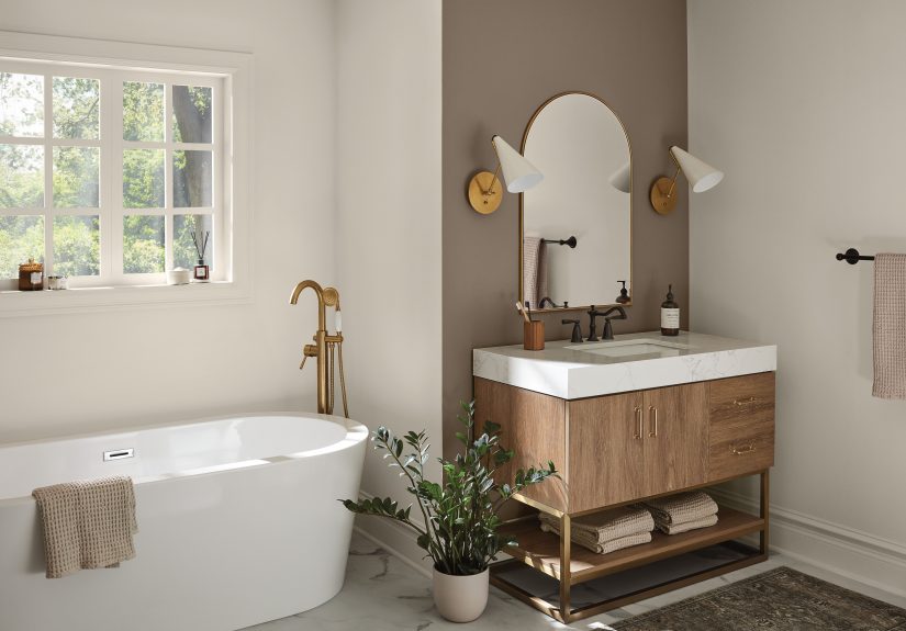
The best bathroom paint color is the one that plays nicely with your lighting, tile, and daily routine. If you want timeless, start with warm off-whites and soft
greiges. If you want spa vibes, lean into blue-greens and gentle greens. If you want personality, try blush, lilac, or even a confident yellow. And if you want
drama, go navy, olive, charcoal, or soft blackjust promise you’ll add good lighting. Your bathroom doesn’t need to be huge to feel high-end. It just needs a color
that makes sense in the real world.