Table of Contents >> Show >> Hide
- Why Slide Backgrounds Matter More Than You Think
- How to Change the Background in PowerPoint
- How to Change the Background in Google Slides
- PowerPoint vs. Google Slides: Which Background Tool Is Better?
- Best Practices for Slide Background Design
- Common Problems and Quick Fixes
- Specific Examples for Better Slide Backgrounds
- Practical Experience: What I’ve Learned Changing Slide Backgrounds
- Conclusion
Changing the background of a slide sounds like a tiny design moveuntil your “simple update” turns into a 38-minute wrestling match with menus, themes, master slides, and one stubborn image that refuses to behave. The good news? Whether you use Microsoft PowerPoint or Google Slides, changing a slide background is much easier once you know where each tool hides the important buttons.
This guide walks you through how to change the background of slides in PowerPoint and Google Slides, including solid colors, gradients, images, textures, theme-wide backgrounds, and practical design tips. You will also learn when to apply a background to one slide, when to apply it to every slide, and how to avoid the classic presentation crime of putting tiny gray text on a busy photo of a mountain. Beautiful? Maybe. Readable? Absolutely not.
By the end, you will know how to create cleaner, more professional slides for business presentations, school projects, webinars, sales decks, online courses, pitch decks, and any slideshow that deserves better than default white.
Why Slide Backgrounds Matter More Than You Think
A slide background is not just decoration. It sets the tone, supports the message, and guides the viewer’s attention. A clean background can make your content look polished and trustworthy, while a messy one can make even great information feel like it was assembled during a coffee emergency.
In PowerPoint and Google Slides, backgrounds can include solid colors, gradients, images, patterns, textures, or theme-based designs. The right choice depends on your goal. A corporate finance deck may need a calm white, navy, or light gray background. A creative portfolio may work better with bold color blocks or full-slide photography. A classroom lesson might benefit from a warm, simple background that keeps students focused without putting them to sleep.
Background vs. Theme vs. Layout
Before changing anything, it helps to understand three common presentation design terms:
- Background: The color, image, gradient, or pattern behind your slide content.
- Theme: A complete design system that includes fonts, colors, backgrounds, and layouts.
- Layout: The arrangement of placeholders, titles, text boxes, images, and other slide elements.
If you want to change only one slide’s appearance, edit the background directly. If you want a consistent design across the whole presentation, edit the theme, Slide Master, or Theme Builder. Consistency is your friend. Random backgrounds on every slide can make your deck look like it was designed by a committee of raccoons.
How to Change the Background in PowerPoint
PowerPoint gives you several background options, including solid fill, gradient fill, picture or texture fill, and pattern fill. You can apply a background to one slide or use “Apply to All” to update the entire deck.
Change a Slide Background Color in PowerPoint
To change the background color of one slide in PowerPoint, follow these steps:
- Open your PowerPoint presentation.
- Select the slide you want to edit.
- Go to the Design tab on the ribbon.
- Click Format Background.
- In the side panel, choose Solid fill.
- Pick a color from the color menu.
- Close the panel to apply it to the selected slide only.
If you want that same background color on every slide, click Apply to All in the Format Background panel. This is the button that saves you from clicking through 47 slides one by one, which is good because life is short and your mouse has feelings.
Use a Gradient Background in PowerPoint
A gradient background blends two or more colors. It can make slides look modern, but it should be used carefully. A subtle blue-to-navy gradient can look elegant. A neon orange-to-purple gradient may look like a roller-skating birthday party from 1987. Choose wisely.
- Select your slide.
- Go to Design > Format Background.
- Choose Gradient fill.
- Select a preset gradient or customize the gradient stops.
- Adjust direction, angle, brightness, and transparency as needed.
- Click Apply to All if you want the gradient across the full presentation.
For professional presentations, keep gradients soft. Text should still be easy to read, especially on projectors, older monitors, or video calls where compression can turn delicate colors into pixel soup.
Add a Background Image in PowerPoint
A background image can add emotion, context, or branding to a slide. It works especially well for title slides, section dividers, event slides, and visual storytelling. However, images can also compete with your text, so choose photos with open space or add transparency.
- Select the slide you want to edit.
- Right-click the blank margin of the slide and choose Format Background, or go to Design > Format Background.
- Select Picture or texture fill.
- Under picture source, choose where to insert the image from, such as your device, stock images, or online sources available in PowerPoint.
- Choose your image.
- Use the Transparency slider to make the image lighter if text needs more contrast.
- Click Apply to All only if the same image should appear throughout the deck.
One useful trick is to use a full-slide image only on title or divider slides, then switch to a simpler background for content-heavy slides. Your audience came to understand your message, not decode text hidden inside a forest photograph.
Remove or Reset a PowerPoint Background
If a background is not working, you can remove it quickly:
- Go to Design > Format Background.
- Choose Solid fill.
- Select white or another clean background color.
- Use Reset Background if available, or apply the theme background again.
If the background comes from the Slide Master rather than the individual slide, you may need to edit the master design. Go to View > Slide Master, select the master or layout, and change the background there. This is the best approach when you need a consistent branded design across many slides.
How to Change the Background in Google Slides
Google Slides keeps background tools simple. You can change a slide background to a color or image, apply it to one slide, or add it to the theme so it appears throughout the presentation.
Change a Background Color in Google Slides
To change the background color of a slide in Google Slides:
- Open your presentation in Google Slides.
- Select the slide you want to edit.
- Click Slide in the top menu.
- Select Change background.
- Next to Color, choose a preset color or create a custom color.
- Click Done to apply the background to the selected slide.
For a full presentation update, use the theme tools instead of changing every slide manually. Google Slides is friendly, but it will not stop you from wasting your afternoon if you insist on doing everything the hard way.
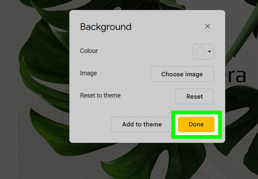
Add a Background Image in Google Slides
To use an image as a slide background in Google Slides:
- Select the slide you want to customize.
- Go to Slide > Change background.
- Next to Image, click Choose.
- Select an image from your computer, Google Drive, Google Photos, by URL, camera, or image search if available.
- Click Select.
- Choose Done to apply it to the current slide.
- Choose Add to theme if you want it to become part of the presentation theme.
Use high-resolution images, but avoid oversized files when possible. Huge images can slow down a deck, especially if you are presenting online or sharing the file with collaborators. A sharp, compressed image often works better than a massive photo that makes the slideshow load like it is carrying furniture upstairs.
Change the Theme Background in Google Slides
If you want the same background style across multiple slides, use the Theme Builder:
- Open your Google Slides presentation.
- Click Slide > Edit theme, or use View > Theme Builder depending on your interface.
- Select the master slide or a specific layout.
- Click Background and choose a color or image.
- Close Theme Builder when finished.
This method is especially useful for branded presentations. You can create a title slide layout, content slide layout, section divider, quote slide, and closing slide with backgrounds that feel related instead of identical. Matching does not have to mean boring.
PowerPoint vs. Google Slides: Which Background Tool Is Better?
Both tools can create professional slide backgrounds, but they feel different in practice.
PowerPoint Background Strengths
- More advanced formatting options, including gradients, textures, patterns, and detailed transparency controls.
- Strong Slide Master tools for complex branded decks.
- Better offline editing for large presentations.
- More control over image formatting, layering, and design variations.
Google Slides Background Strengths
- Simple background color and image tools.
- Easy collaboration in the browser.
- Fast theme editing for shared teams and classrooms.
- Convenient access to Google Drive images and cloud-based assets.
If you need advanced visual control, PowerPoint usually offers more options. If you need quick collaboration, easy sharing, and a lightweight workflow, Google Slides is hard to beat. In many teams, the best tool is simply the one everyone can open without sending three “Can you request access?” emails.
Best Practices for Slide Background Design
Knowing how to change a background is useful. Knowing which background to choose is where the magic happens. A great background supports your content without stealing the microphone.
Keep Text Readable
Readability should always win. Use strong contrast between text and background. Dark text on a light background or light text on a dark background is usually safest. If you use a photo, place text over a plain area, add a semi-transparent overlay, or use a text box with a subtle fill.
A beautiful background is useless if your audience has to squint. Presentations are not eye exams.
Use Brand Colors Carefully
Brand colors can make your deck feel professional and consistent, but not every brand color works as a full-slide background. Bright red, electric blue, or saturated yellow may be excellent accent colors but exhausting as backgrounds. Use bold colors for title slides, dividers, buttons, icons, and highlights. Use softer tones for content slides.
Choose Images With Negative Space
Negative space is the empty or calm area in an image where text can sit comfortably. For example, a photo of a laptop on the right side with a blank wall on the left can make a great title slide. A crowded image of a conference room, charts, people, coffee cups, and someone’s elbow? Less great.
Avoid Background Clutter
Patterns, textures, and decorative images can look stylish, but they can also fight with charts, screenshots, and paragraphs. If your slide already contains lots of information, keep the background simple. Use a quiet color, a subtle gradient, or a very light texture.
Apply Backgrounds Consistently
Most presentations look better when backgrounds follow a system. For example:
- Title slide: full-image background with dark overlay.
- Section divider: bold brand color.
- Content slides: white or light gray background.
- Quote slides: soft gradient or simple color block.
- Closing slide: branded image or logo background.
This structure gives the deck rhythm. It also helps the audience understand where they are in the presentation.
Common Problems and Quick Fixes
The Background Image Looks Stretched
This usually happens when the image has a different aspect ratio than the slide. Most modern slides use a widescreen 16:9 format. Use images that match your slide size, or crop the image before setting it as the background. In PowerPoint, you can also insert the image normally, crop it to fill the slide, adjust it, and then send it to the back if you need more control.
The Text Is Hard to Read
Add a dark or light overlay, increase font size, change text color, or choose a less busy image. In PowerPoint, the transparency slider can soften a background image. In Google Slides, you can place a semi-transparent rectangle over the image and put text on top.
The Background Does Not Apply to Every Slide
In PowerPoint, use Apply to All or edit the Slide Master. In Google Slides, choose Add to theme or edit the Theme Builder. If some slides still look different, they may use separate layouts or manual formatting.
The Background Is Covered by Objects
Sometimes what looks like a background is actually an image or shape sitting on top of the slide. Try selecting the object and deleting it, sending it backward, or checking the master/theme layout. This is especially common in templates downloaded from the web.
Specific Examples for Better Slide Backgrounds
Business Pitch Deck
Use a clean white or light gray background for most slides. Add your brand color as a top border, side accent, or section divider. Use a full-bleed background image only for the opening and closing slides. This keeps the deck professional and investor-friendly.
Classroom Presentation
Use warm, simple backgrounds such as pale blue, cream, or soft green. Avoid extremely bright backgrounds, especially for long lessons. Students should focus on the concept, not wonder why slide seven looks like a highlighter exploded.
Webinar or Training Deck
Use consistent backgrounds with strong contrast because webinar slides are often viewed on small screens. Leave space for captions, webcam overlays, or recording controls. If you use screenshots, keep the background plain so the screen capture remains the hero.
Creative Portfolio
Use image backgrounds, bold color blocks, and layout variety, but keep the design controlled. Let the work shine. If every slide screams, none of them sound important.
Practical Experience: What I’ve Learned Changing Slide Backgrounds
After working with many slide decks, one lesson becomes obvious: changing the background is rarely just about the background. It usually reveals the entire design system of the presentation. If the deck has no system, the background change becomes messy. If the deck has a clean structure, the change is quick and painless.
The best results usually come from starting with the purpose of the slide. A title slide can handle drama. A content slide needs clarity. A data slide needs calm. A quote slide needs breathing room. When people choose backgrounds without thinking about slide purpose, they often end up with a beautiful deck that is difficult to use. The slides may look impressive at first glance, but once the presenter starts talking, the audience has to work too hard to read and follow along.
One practical habit that helps is creating three background styles before building the full presentation. First, create a simple content background. This is the workhorse design for slides with bullet points, charts, tables, or screenshots. Second, create a strong section divider background. This can use a brand color, gradient, or image. Third, create a closing or call-to-action background. This gives the deck a polished ending. With only these three styles, most presentations immediately feel more organized.
Another experience-based tip is to test slides in the environment where they will be used. A background that looks perfect on a laptop may look washed out on a projector. A subtle gray may disappear in a bright conference room. A photo background may look fine on a big monitor but become unreadable when shared through a video call. Before presenting, run through the deck in slideshow mode and check it from a few feet away. If you cannot read the slide quickly, your audience probably cannot either.
Image backgrounds require special discipline. The most common mistake is choosing an image because it is attractive, not because it supports the message. A background image should create context, mood, or visual interest without competing with the content. If the slide is about teamwork, a simple image of people collaborating may work. If the slide is about quarterly revenue, a calm branded background may be better than a dramatic city skyline. Not every slide needs a cinematic moment.
PowerPoint is especially helpful when you need precise control. The Format Background panel, transparency settings, and Slide Master can save hours when editing larger decks. Google Slides, on the other hand, shines when teams need to collaborate. A marketing manager, designer, teacher, or student group can update a background and share it instantly. The tradeoff is that Google Slides has fewer advanced background controls, so you may need simple overlays or prepared images for more complex designs.
The final and most important experience is this: never judge a slide background by itself. Judge it with the actual title, text, chart, image, and speaker notes in place. A background is successful only when it makes the slide easier to understand. Good slide design is not about showing off the software. It is about helping people get the point quickly, remember it longer, and not leave the room wondering why the agenda slide had a marble texture.
Conclusion
Changing the background of slides in PowerPoint and Google Slides is simple once you understand the right workflow. In PowerPoint, use Design > Format Background for colors, gradients, pictures, textures, and presentation-wide updates. For deeper consistency, use Slide Master. In Google Slides, use Slide > Change background for quick color or image changes, and use Theme Builder when you want backgrounds to apply across layouts.
The best slide backgrounds are clear, consistent, and supportive. They improve the presentation without overpowering it. Whether you choose a clean solid color, a subtle gradient, a branded design, or a full-slide image, always protect readability first. Your background should help your message stand outnot sneak behind it wearing camouflage.
Note: This article is based on current, real-world PowerPoint and Google Slides background workflows, official product documentation, presentation accessibility guidance, and practical slide design best practices. It is written for web publishing without source-link elements or citation placeholders.