Table of Contents >> Show >> Hide
- The real designer rule: Don’t decorate the edgesdesign the room
- When it’s totally fine (and smart) for furniture to touch the walls
- When designers beg you to pull furniture off the walls
- The spacing cheat sheet designers use (so you don’t have to guess)
- Room-by-room guidance: where wall contact works (and where it fights you)
- How to pull furniture off the wall without making the room feel cramped
- Mistakes designers see all the time (and easy fixes)
- So… should your furniture ever touch the walls?
- Real-World Experiences: What People Notice When They Stop “Hugging the Walls” (Extra)
Confession: almost everyone’s first instinct in a new space is to shove every piece of furniture to the perimeter like it’s scared of the rug. Sofa to the wall. Chairs to the corners. Coffee table drifting in the middle like a lost island. And then we step back and think, “Why does this room feel… weirdly smaller?”
Designers have a surprisingly calm answer to the “should furniture touch the walls?” debate: sometimes, yesbut not as a default setting. The real goal isn’t “never touch” or “always touch.” It’s balance, circulation, and a layout that supports real life (movie nights, homework marathons, weekend guests, and the occasional frantic search for the remote).
The real designer rule: Don’t decorate the edgesdesign the room
When everything hugs the walls, rooms tend to develop two classic problems:
- The “bowling alley” effect: long, empty center space that looks open but doesn’t feel usable.
- The “waiting room” vibe: seating lined up along the perimeter like you’re all waiting to be called up to the front desk.
Designers think in zones: conversation zone, reading nook, TV zone, work zone, play zone. Once you decide what the room is for, the wall question becomes easy: place furniture where it functions best, not where it politely avoids the middle.
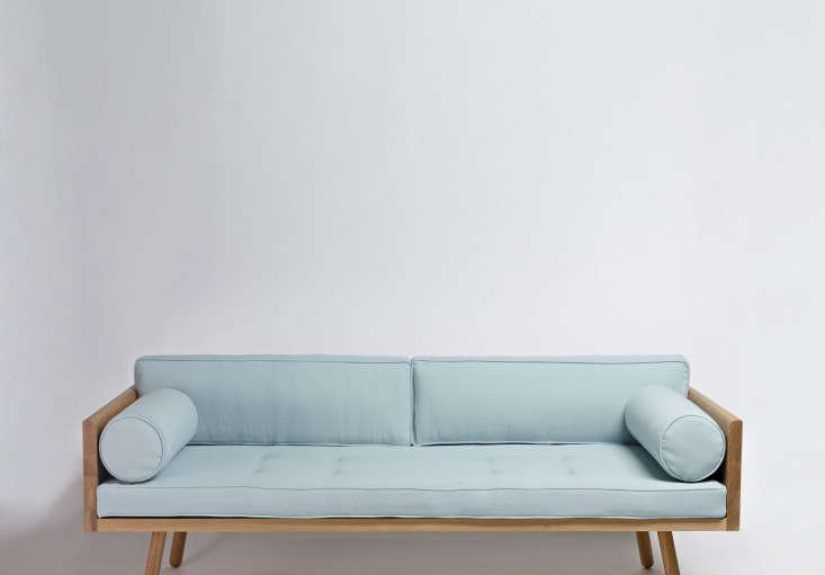
When it’s totally fine (and smart) for furniture to touch the walls
Yes, touching the wall can be the right moveespecially for pieces that are meant to be “anchors.” Here are situations where designers commonly approve of wall contact:
1) Storage pieces that need stability
Bookcases, dressers, media consoles, and wall units often look best and behave best when they’re flush. It reads intentional, keeps circulation open, and prevents the piece from feeling like it’s floating without purpose.
2) Tiny rooms where inches matter
In a genuinely small space, moving a sofa 10 inches off the wall might mean you can’t open a door fullyor you’ll be shimmying sideways like you’re auditioning for a heist movie. In those cases, it’s okay to put the larger piece to the wall and “float” something else (like a chair or ottoman) to keep the room from feeling like a perimeter-only layout.
3) When you’re protecting traffic flow
If a path through the room is constantly used (front door to kitchen, hallway to patio), pushing a console or bench tight to the wall can preserve a clean walkway and prevent bottlenecks.
4) If you’re working around windows, radiators, or vents
Sometimes the wall isn’t just a wallit’s a light source, a heater, or the reason your dog insists on lying in one specific spot. Designers often prioritize function here: don’t block what needs airflow or access.
When designers beg you to pull furniture off the walls
Here’s where the “float it” advice shinesespecially in living rooms and multipurpose spaces.
1) When you want a room to feel bigger (yes, bigger)
Counterintuitive but real: a sofa pulled even a few inches off the wall can make the room feel more spacious because the layout looks deliberate, not cramped. You also avoid that “everything is pressed flat” feeling.
2) When conversation matters
People talk better when seating faces each other or forms a U-shape around a coffee table. Designers often move seating inward to create a conversation area that feels cozy instead of shout-across-the-room awkward.
3) When you have a large room with “dead space” in the middle
Big rooms often look emptiest when furniture is pushed to the edges. Floating a sofa, adding a console behind it, or using two seating clusters can make the room feel finished and welcomingnot like a dance floor nobody requested.
4) When you’re relying on an area rug to define the space
Designers frequently use rugs to “draw” a room layout. If furniture is all against the walls, rugs tend to be too small or disconnected. Pulling pieces inward helps the rug act like an anchor instead of a decorative postage stamp.
The spacing cheat sheet designers use (so you don’t have to guess)
These are practical ranges designers lean on. Think of them as “starting points,” not unbreakable laws.
Living room spacing
- Sofa from wall: about 2–6 inches for a subtle “float,” or 8–12 inches if you want more depth and room for curtains/outlets.
- Coffee table distance: roughly 14–18 inches from the sofa for comfortable reach and legroom.
- Main walkways: aim for about 30–36 inches; in tighter spots, 18–24 inches can still work.
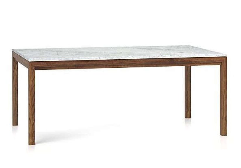
Dining room spacing
- Table edge to wall: plan for at least 36 inches so chairs pull out comfortably; 42–48 inches is the “luxury” zone if people pass behind seated diners.
Rug and wall spacing
- Rug distance from wall: many designers like leaving about 12–24 inches of floor showing around the rug when possible.
- Furniture on the rug: ideally, at least the front legs of major seating sit on the rug to connect the zone.
Room-by-room guidance: where wall contact works (and where it fights you)
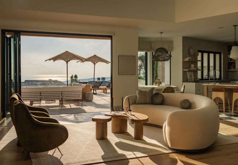
Living room
Best case for floating: Pull the sofa slightly off the wall, place chairs angled inward, and let the rug hold the group together. If you need extra polish, add a slim console table behind the sofa to make the “float” feel intentional.
When touching the wall is fine: A media console, bookcase, or a low credenza typically belongs against the wall to keep sightlines clean and circulation easy.
Bedroom
Best case for floating: If you can center the bed with space on both sideseven if it’s narrowit usually looks more balanced and functions better (hello, nightstands and not climbing over your partner).
When touching the wall is fine: Small bedrooms sometimes require a bed against one wall. If so, balance it with strong styling: a substantial headboard, wall sconces, and symmetrical bedding so it looks designed, not accidental.
Dining area (especially open concept)
Dining furniture rarely needs to touch walls, but it needs clearance. If you’re tight on space, consider a round table, bench seating on the wall side, or a slim banquette that intentionally “anchors” to the wall while keeping the table functional.
Home office
Desks can go either way. Against-the-wall works for focus and cable control. Floating a desk can look gorgeous in a larger room, especially if you want the workspace to feel integrated (not like a punishment corner). The key is planning where cords go and ensuring you still have comfortable pathways.
Small living rooms
Small rooms don’t automatically mean “everything on the wall.” Designers often recommend one big anchor piece on a wall (like a sofa), then pulling something inwardan accent chair, a petite coffee table, or even an ottomanto form a functional zone.
How to pull furniture off the wall without making the room feel cramped
- Pick a focal point: fireplace, TV, big window, or statement art. Your seating should relate to this point.
- Set the conversation zone first: place the rug, then arrange seating so it “sits” on the rug (at least front legs).
- Measure your walkways: keep main routes openespecially door-to-door paths.
- Add an “intentional buffer” behind the sofa: a console table, a plant, a floor lamp, or a narrow bookshelf makes floating look purposeful.
- Check the awkward gaps: if there’s a weird strip between wall and furniture, either reduce it (move closer) or commit (add a slim table, art, or lighting).
Mistakes designers see all the time (and easy fixes)
Mistake: Everything against the walls “to make it feel bigger”
Fix: Float one key piece (often the sofa) by just a few inches. You’ll be shocked how much more “designed” it looks.
Mistake: A rug that’s too small
Fix: Size up so seating connects to the rug. If budget is a concern, layer: a large, simple base rug with a smaller patterned rug on top.
Mistake: No clear pathways
Fix: Prioritize circulation. A beautiful room that requires parkour to cross is not, in fact, a victory.
Mistake: Furniture floating with no reason
Fix: Floating is not the same as drifting. Tie the arrangement to a focal point and anchor it with a rug, lighting, or a console.
So… should your furniture ever touch the walls?
Yessome pieces should. But if all your pieces do, your room can lose its purpose. Designers aim for a layout that feels balanced: anchored where it makes sense, floated where it improves comfort, conversation, and flow. The best rooms don’t worship the wall. They serve the people living in them.
Real-World Experiences: What People Notice When They Stop “Hugging the Walls” (Extra)
Design advice is nice in theory, but the magic happens when you try it in a real homewhere the dog has opinions, the kids treat sofas like trampolines, and your charging cable is somehow always two inches too short. Here are some common experiences homeowners and renters report when they experiment with wall vs. float layouts (and what designers typically suggest in response).
The “Wait… the room got bigger?” surprise
One of the most frequent reactions is disbelief: pulling the sofa off the wall feels like it should steal space, but the room often looks larger. Why? Because the layout finally has a center of gravity. When furniture lines the perimeter, your eye reads the room as a hollow box. When seating shifts inward, your eye reads a purposeful zonelike the room has a plan, not just square footage.
A practical example: someone moves a sectional forward by 6–10 inches to clear curtains and add breathing room. Suddenly the wall behind it becomes usable: a slim console holds a lamp and a bowl for keys, and the sofa no longer looks like it’s being pressed into the drywall. The overall vibe changes from “we placed things where they fit” to “we designed a living room.”
The “Why do we talk more now?” effect
When chairs angle toward the sofa and everything gathers around a coffee table, people tend to linger longer. It’s not mystical. It’s geometry. Facing seating encourages conversation, and a reachable surface makes the space feel hospitable (drinks, snacks, board games, homework pileswhatever your household runs on).
In many homes, the first attempt is small: pull the sofa forward, rotate a chair inward, and place a lamp to create a cozy corner. The second attempt is bolder: add a rug large enough that the front legs of the seating sit on it, instantly “locking” the arrangement together. People often say the room starts to feel like a destination instead of a pass-through.
The cable-and-outlet reality check
Floating furniture sometimes reveals the unglamorous side of design: cords. A lamp behind a sofa needs power. A floating media setup needs planning. This is where experienced designers get pragmatic: use a console behind the sofa to hide cords, add a cord cover painted to match the wall, or plan your layout so the pieces that need power stay near outlets while the purely “social” pieces (chairs, ottomans) do the floating.
A common compromise is to keep the TV console against the wall, then float the sofa just enough to improve the roomwithout creating a cable nightmare. The goal isn’t to make your house look like a showroom. It’s to make it livable and pleasant.
The small-room workaround that actually feels intentional
In tight spaces, people often discover that the best solution isn’t “everything against the wall,” but “one anchor + one float.” For example: sofa on the wall, but a small accent chair pulled slightly forward at an angle. Or a loveseat floated a few inches to allow curtains to fall correctly, paired with a wall-mounted shelf instead of a bulky side table.
Another real-world trick is swapping shapes instead of shoving furniture. A round coffee table can make traffic flow easier than a sharp-cornered rectangle. A pair of small nesting tables can replace one large table. The layout feels looser and more functionalwithout pretending the room is bigger than it is.
The “dead space” problem in larger rooms
In big living rooms, people often complain that the center feels empty and the seating feels far apart. When they stop pushing furniture to the walls, the center becomes the point: a rug anchors a conversation zone, and the outer edges become supportive spacebookshelves, a reading chair, a plant, or a storage bench. The room ends up with multiple purposes instead of one giant vague purpose called “existing.”
And here’s the funniest part: once the room is zoned, people usually walk through it more easilybecause the pathways are clearer. Open space isn’t the same as good flow. Thoughtful flow beats random openness every time.