Table of Contents >> Show >> Hide
- Why We Can’t Quit Black and White
- Alternance Noir & Blanc in Fashion
- Black and White at Home: Interiors with Impact
- The Magic of Black-and-White Photography
- Alternance Noir & Blanc in Branding and UI Design
- How to Use Alternance Noir & Blanc in Everyday Life
- Real-World Experiences with Alternance Noir & Blanc
Say “alternance noir & blanc” out loud and it already feels stylish.
It’s French for the play of black and white, and it shows up everywhere: in classic
tuxedos, gallery walls, minimalist websites, moody photographs, and that chic café
with the checkerboard floor you secretly wish were your office. The black–white duo
is simple on paper, but in real life it’s a powerful design tool that can shape mood,
guide attention, and instantly make things look more intentional.
In this guide, we’ll explore how alternating black and white works in fashion, interiors,
photography, branding, and even user interfaces. You’ll see why this high-contrast
pairing feels timeless, how to avoid making things look cold or harsh, and practical
ways to bring alternance noir & blanc into your everyday life without turning your
home into a chessboard.
Why We Can’t Quit Black and White
Black and white isn’t just a color combo; it’s a language. Black grounds, anchors, and
adds weight. White opens up space, creates breathing room, and lets the eye rest. When
you alternate the two in patterns, stripes, blocks, or carefully placed accents, you
get instant contrast that our brains love. High contrast makes it easier to spot what
matterswhether that’s a headline, a logo, or a person in a photograph.
There’s also a timeless factor. Look at vintage black-and-white photographs, early
Hollywood films, or heritage fashion houses: the palette still feels current. Trends
around specific shades come and go, but black and white has survived every avocado green
kitchen and millennial pink sofa that ever existed. That’s the quiet superpower of
alternance noir & blanc: it feels both classic and modern at the same time.
Finally, black and white simplifies decisions. When you strip away color, you’re forced
to pay attention to shape, texture, scale, and proportion. That’s why so many designers
sketch logos in black and white first or experiment with monochrome mood boards. If a
layout works in black and white, it usually works in color; the reverse isn’t always true.
Alternance Noir & Blanc in Fashion
The easiest way to look pulled together
If you ever feel like your closet is full but you have “nothing to wear,” black-and-white
outfits are your cheat code. A white shirt with black trousers, a striped tee with black
jeans, or a black dress with a white blazer look instantly intentional, even if you assembled
them in the dark. The contrast does a lot of the heavy lifting and makes simple pieces feel
sharper.
Stylists often lean on alternance noir & blanc for capsule wardrobes: it’s easy to mix and
match, it travels well, and it photographs beautifully. You can go minimalist with clean lines
and solid colors, or lean into patternhoundstooth, pinstripes, polka dots, or graphic checks
all use black and white to create movement and energy.
How to build a black-and-white wardrobe without getting bored
-
Play with texture. A black leather jacket, a soft white cashmere sweater, and
crisp white denim don’t read as “basic” when the textures contrast. -
Use one graphic piece. Think a black-and-white striped skirt or houndstooth blazer
paired with solid basics. The eye goes straight to the patterned item. -
Add a single color pop. A red lip, cobalt bag, or metallic shoes look extra vivid
against a monochrome outfit. The alternance noir & blanc becomes your canvas. -
Balance light and dark. If you’re worried about black feeling too heavy,
keep it on the bottom and go lighter near your face, or vice versa depending on what flatters you.
The key is contrast with intention. A black hoodie and black leggings can feel flat, but a black
hoodie with white sneakers and a white crossbody bag suddenly reads like a styled streetwear look.
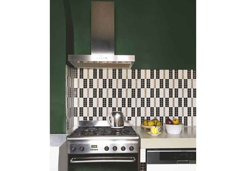
Black and White at Home: Interiors with Impact
Why black-and-white interiors feel so chic
Interior designers love alternance noir & blanc because it gives rooms structure. White walls
can make a space feel larger and brighter, while black accentswindow frames, lighting, cabinet
hardware, picture framescreate a crisp outline. The result is a space that feels both calm and
sharply defined.
A black-and-white scheme also adapts to almost any style. In a modern apartment, you might see
white walls, black metal furniture, and abstract art. In a traditional home, the same palette
shows up as checkerboard floors, black Windsor chairs, and white slipcovered sofas. It’s less
about a specific “look” and more about how you distribute light and dark.
Simple ways to bring alternance noir & blanc into your rooms
-
Start with a neutral base. White or off-white walls are an easy foundation.
Then add black through lamps, frames, side tables, or curtain rods. -
Use pattern underfoot. A black-and-white rugstripes, geometric, or Moroccan-inspired
creates instant contrast and anchors the room. -
Layer natural textures. To keep the space from feeling cold, mix in wood, rattan,
linen, and plants. The organic elements soften the sharp contrast. -
Choose one “hero” element. Maybe it’s a black range in a white kitchen or a white
sofa against a nearly black accent wall. Let that one move be the star.
If you’re worried that pure black and pure white will feel harsh, you’re not wrong. Designers often
shift slightly softerthink charcoal and soft ivoryespecially in rooms where you spend hours. You’ll
still get the drama of alternance noir & blanc, just with a more livable, cozy finish.
The Magic of Black-and-White Photography
When removing color adds more emotion
Stripping out color might sound like limiting your options, but in photography, it can actually
unlock creativity. Black-and-white images emphasize light, shadow, texture, and form. Wrinkles,
clouds, tree bark, city streetseverything suddenly has more graphic presence when you aren’t
distracted by color.
Portrait photographers often use black and white for emotional impact. Without color, a viewer is
more likely to focus on someone’s eyes, expression, and body language. Landscapes, architecture, and
street scenes gain a timeless, sometimes cinematic quality when rendered in monochrome.
How to think in black and white (even with your phone)
-
Look for strong light. Morning and late afternoon create dramatic shadows and
highlights that read beautifully in grayscale. -
Focus on shapes. Staircases, silhouettes, tree branches, and building lines are
perfect subjects because their outlines stay clear without color. -
Edit with contrast in mind. Increasing contrast and clarity can bring out texture
and drama, but don’t push so far that subtle details disappear. -
Use black and white as a fixer. Sometimes a color photo feels chaotic; converting
to black and white can pull the story back together.
You don’t need professional gear to experiment. Most phone cameras have a monochrome mode or filters.
Try shooting the same scene in color and black and white, then compare which one tells the story better.
That experiment alone will sharpen your eye.
Alternance Noir & Blanc in Branding and UI Design
Why so many logos start in black and white
When graphic designers create logos, they often begin in black and white on purpose. If a logo doesn’t
work without color, it usually doesn’t work at all. Alternance noir & blanc forces you to refine the
essentials: shape, spacing, negative space, and hierarchy.
Black-and-white logos are also practical. They reproduce well in print, digital, embossing, embroidery,
and on tiny screens. High contrast helps them stand out in busy feeds and crowded signage. Many high-end
brands stick to a mostly monochrome identity because it telegraphs confidence and clarity.
Using black and white wisely in digital experiences
In user interface design, black and white are toolsnot default settings. Pure black on pure white can
be fatiguing for the eyes over long periods, especially on screens. Designers often choose dark charcoal
text instead of pure black and opt for off-white or slightly tinted backgrounds to reduce glare while
keeping a crisp feel.
Alternance noir & blanc works beautifully for:
- Headlines and key actions that need to stand out against softer supporting elements.
- Wireframes and early prototypes where color would distract from structure and flow.
- Minimal landing pages where one accent color (like a bright call-to-action button)
pops against a black-and-white layout.
The trick is balance: use black and white for clarity and structure, then layer in softer tones and
carefully chosen accent colors to keep the experience comfortable and human.
How to Use Alternance Noir & Blanc in Everyday Life
You don’t need to rebrand your company or repaint your entire home to enjoy alternance noir & blanc.
Small, thoughtful changes can have a big impact.
Quick ideas you can try this week
-
Curate a mini monochrome gallery wall. Print a few favorite photos in black and white
and frame them in simple black or white frames. -
Build a “no-thinking” outfit formula. For busy days, keep one go-to black-and-white
outfit ready: black pants, white tee, black loafers, white tote. Done. -
Refresh your desk. Use black organizers, a white lamp, and a single green plant.
The contrast keeps the space feeling structured and calm. -
Experiment with black-and-white photos on social media. Try posting a monochrome series
for a week; notice how the mood of your feed changes.
Alternance noir & blanc is less about rigid rules and more about intentional contrast. Once you start
noticing it, you’ll see opportunities everywherefrom your coffee mug and notebook combo to the way you
style your living room shelves.
Real-World Experiences with Alternance Noir & Blanc
To really understand how powerful black and white can be, it helps to look at a few lived experiences.
These aren’t glossy magazine spreadsjust real-life moments where alternance noir & blanc quietly
transformed something ordinary into something special.
A tiny studio that suddenly felt “grown up”
A friend of mine lived in a 300-square-foot studio that felt more like a storage unit than a home. The
walls were off-white, the furniture was a random mix of hand-me-downs, and there was no clear style.
Instead of buying all-new furniture, she created a black-and-white rule: anything new had to be black,
white, or natural wood. She swapped colorful mismatched bedding for a white duvet with a black throw,
spray-painted a couple of old frames black, and added a simple black-and-white rug under the bed.
Within a weekend, the space looked intentional. The black pieces grounded the room, the white opened it up,
and the few wooden accents kept everything from feeling sterile. Friends started asking, “Wait, when did
you move into this nice place?” She hadn’t movedshe just harnessed alternance noir & blanc.
The wedding photos that felt timeless overnight
Another couple received their wedding photos and felt underwhelmed. The venue’s carpeting was a strange
color, the DJ lights were intense, and the floral arrangements didn’t look quite as magical on camera.
Their photographer suggested converting a selection of images to black and white. Overnight, the focus
shifted away from the loud colors and toward expressions: a tearful parent, a belly laugh during the
speeches, hands being held under the table.
The couple ended up printing mostly black-and-white images for their home. Years later, those photos still
feel current. If they’d stayed in the original color palette, the décor and lighting might feel dated by now.
Alternance noir & blanc gave their memories a kind of built-in nostalgia.
A brand that found its voice by losing color
A small bakery wanted to rebrand. Their original logo used pastel colors and whimsical fonts, but it felt
lost in a sea of similar brands online. When they worked with a designer, the first step was stripping
everything back to black and white. Suddenly, the focus was on the typography and the little illustrated
wheat stalk that had been there all along but never quite stood out.
The final identity used a mostly black-and-white palette with just a hint of warm beige for packaging.
On social media, their posts stood out precisely because they weren’t screaming with color. Photos of
golden bread and glossy pastries looked even richer against the restrained branding. Sales didn’t jump
just because of the color scheme, of coursebut the new identity helped the bakery feel “premium” and
memorable, which made every other marketing effort work harder.
The “no-color” wardrobe challenge
One minimalist-in-progress decided to do a 30-day wardrobe challenge: only black, white, gray, and denim.
At first, it sounded restrictive. But within a week, getting dressed took almost no mental energy. Every
top worked with every bottom. Packing for a weekend trip meant tossing a handful of pieces into a bag and
knowing they’d all coordinate.
The surprise benefit? She paid more attention to fit and fabric. Because the palette was simple, details
like drape, tailoring, and texture mattered more. At the end of the challenge, she reintroduced colorbut
much more intentionally. Alternance noir & blanc had become the foundation, and color was the accent
instead of the default.
What these experiences have in common
In every story, black and white didn’t work because of strict design tricks; it worked because it created
clarity. A small space felt edited and calm. Wedding photos emphasized emotion over décor. A brand finally
looked like itself. A wardrobe got simpler and smarter. That’s the heart of alternance noir & blanc:
it’s less about being trendy and more about making the important things easier to see.
Whether you’re styling an outfit, decorating a room, designing a logo, or just trying to make life feel a
bit more intentional, alternating black and white is a powerful, low-effort way to get there. Use it boldly,
soften it when needed, and let the contrast do the quiet, elegant work in the background.