Table of Contents >> Show >> Hide
- Why Aqua Feels Like a Mini Vacation
- Stripes: The Pattern That Behaves Like Architecture
- Putting Them Together: The Aqua + Stripe Formula
- Home Decor Playbook: Where Aqua and Stripes Shine
- DIY: Painted Stripes Without Losing Your Mind (or Your Tape)
- Fashion: Aqua and Stripes Outside the House
- Branding, Graphics, and “Why This Combo Pops Online”
- Common Mistakes (and How to Dodge Them Like a Pro)
- A Quick Checklist Before You Commit
- Conclusion: The Combo That Always Looks Intentional
- Real-World Experiences: Aqua and Stripes in Action (Extra )
Some design combos feel like a cheat code. Aqua and stripes is one of them.
Aqua brings that clean, watery “ahhh” (like your brain just put on flip-flops). Stripes bring structure
the visual equivalent of standing up straighter. Put them together and you get a look that’s fresh,
confident, and surprisingly flexible: coastal without being kitschy, playful without being childish,
bold without screaming for attention.
This guide breaks down why the pairing works, where it works best (home, fashion, even branding),
and how to use it without accidentally turning your living room into a beach towel that gained sentience.
Why Aqua Feels Like a Mini Vacation
Aqua isn’t one colorit’s a whole “water family”
“Aqua” usually lives somewhere between blue and green, with cousins like turquoise,
sea glass, robin’s egg, and soft teal.
In real life (and on real walls), these shades can shift depending on lighting and nearby colors.
That’s not a bugit’s a feature. Aqua tends to look crisp in daylight and cozy-soft at night,
especially when it has a whisper of gray or green in the undertone.
The vibe: calm, clean, and quietly energizing
Aqua gets its “refresh” reputation from the same place your brain gets the idea that water = reset.
It’s often used to create spa-like bathrooms, breezy bedrooms, and airy common spacesrooms where you
want clarity, not chaos. If your space feels heavy (dark furniture, busy schedules, too many “urgent”
emails), aqua is a simple way to lighten the mood without going full sterile-white.
Aqua loves neutrals (and it hates fighting with them)
The easiest way to make aqua look expensive is to pair it with neutrals that match its temperature.
Cool whites, soft grays, sandy beiges, and driftwood tones keep it grounded. Then you can add darker
accentsnavy, charcoal, even blackso the whole palette has a backbone.
Stripes: The Pattern That Behaves Like Architecture
Stripes add order (even when your life does not)
Stripes are basically visual structure. They read as intentional and clean, which is why they can
make a space feel “designed” even if the room still contains three laundry baskets and a mysterious
cable you’re afraid to throw away.
Direction changes the perception of space
- Vertical stripes can make walls feel taller and spaces feel more formal.
- Horizontal stripes can make a narrow area feel wider and more relaxed.
- Diagonal stripes are playful and modernbut they demand confidence (and planning).
Scale is everything: pinstripe vs. cabana stripe
A thin ticking stripe can feel classic and subtle, like a tailored shirt. A wide cabana stripe feels bold,
resort-y, and high-impact. The bigger the stripe, the more it becomes the “main character” of the room or outfit
so you’ll want the rest of your choices to support it, not compete for the spotlight.
Putting Them Together: The Aqua + Stripe Formula
Start with one hero and one sidekick
Decide what leads: aqua or stripes. If aqua is the hero, stripes should be smaller
(pillows, a rug, a shower curtain). If stripes are the hero (striped wall, striped wallpaper, striped sofa),
aqua becomes the accent (vases, art, throw, a single painted piece of furniture).
Use a simple balance rule so you don’t overdo it
A practical approach is the classic 60–30–10 idea:
60% dominant (neutral wall color or main clothing base), 30% secondary (aqua or stripes), and 10% accent (navy,
brass, black, coral, or natural textures). You don’t have to measure with a calculatorjust keep the proportions
feeling intentional.
Choose your stripe “flavor”
- Nautical: white + navy stripes with aqua accents = coastal classic.
- Modern: white + charcoal stripes with aqua pops = crisp and contemporary.
- Soft coastal: cream + muted aqua stripes with natural fibers = relaxed, not theme-park.
- Playful: multi-stripe (aqua + coral + white) in small doses = fun without noise.
Home Decor Playbook: Where Aqua and Stripes Shine
Bathrooms: spa energy with almost no effort
Bathrooms were basically born for aqua. Consider aqua as tile, paint, or accessories, then add stripes through
towels, a shower curtain, or a bath mat. A simple winning combo:
white walls + aqua vanity + thin navy/white striped textiles.
Want it to feel more high-end? Add one warm material: brass hardware, wood mirror frame, or woven basket storage.
Aqua keeps it clean; the warm material keeps it human.
Bedrooms: calm, but not sleepy
Try aqua on the bed (duvet, quilt, throw) and stripes on the supporting cast (pillows, a bench cushion,
curtains). Or flip it: striped bedding and aqua art. Bedrooms look best when the pattern count is low,
so stripes are idealgraphic enough to be interesting, simple enough to be restful.
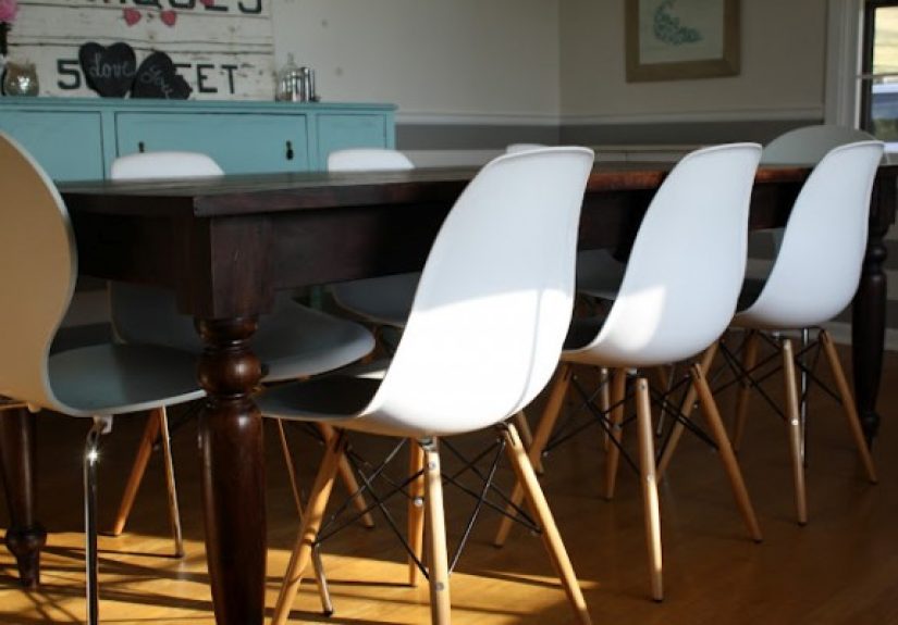
Living rooms: let stripes do the “tailoring”
In living spaces, stripes work like tailoring: they sharpen the look. Use a striped rug to define the seating
area, or add striped pillows to keep a neutral sofa from looking sleepy. Then add aqua through glass, ceramics,
art, or a single statement chair. If you’re nervous, start with one aqua objecta lamp base,
a vase, or framed printand see how your room reacts.
Kitchens + dining: clean and cheerful without being cute
If you love the idea of color but fear commitment (relatable), bring aqua in through bar stools, a runner,
dishware, or a backsplash. Stripes can appear in seat cushions, tea towels, or wallpaper in a breakfast nook.
Keep the stripes simple and the hardware classic, and it reads intentionalnot like a themed diner.
Outdoor spaces: instant resort mode
This pairing is basically the uniform of “I might read a book today.” Use aqua cushions with striped umbrellas,
or striped pillows on neutral outdoor furniture with aqua planters nearby. Outdoors can handle bolder stripes,
especially wide cabana styles.
DIY: Painted Stripes Without Losing Your Mind (or Your Tape)
Painted stripes are dramatic and surprisingly doableif you treat them like a mini engineering project.
Here’s the process that keeps lines crisp:
- Pick stripe width that matches the room size. Small room? Smaller stripes. Big wall? Wider stripes can breathe.
- Start with a fully cured base coat. Paint the whole wall your “background” color and let it dry thoroughly.
- Measure and mark lightly. Use a level (or laser level) for straight guidelines. Eyeballing is how stripes become “modern art.”
- Tape like you mean it. Apply painter’s tape carefully and press down edges (a putty knife helps).
- Seal the tape edge. Paint a thin layer of the base color along the tape edge to reduce bleed.
- Paint the stripe color. Use light coats; don’t flood the tape edge.
- Remove tape at the right moment. Pull it back slowly while the paint is still slightly tacky for cleaner edges.
Aqua stripes on a white wall can look beachy; aqua stripes on a warm cream wall can look sophisticated and vintage.
If you want “grown-up coastal,” try muted aqua with a touch of gray.
Fashion: Aqua and Stripes Outside the House
Why stripes became a style icon (and why they stay)
Stripes have long been tied to maritime styleespecially the classic Breton/marinière stripebecause the pattern
became associated with naval uniforms and later took on a life of its own in everyday fashion. Today, stripes are
a reliable wardrobe tool: they read classic, they layer well, and they don’t date as quickly as many prints.
Easy outfit formulas that work in real life
- Classic casual: navy/white striped tee + jeans + aqua sneakers or aqua tote.
- Office-friendly: striped button-down + neutral trousers + aqua tie/scarf or subtle aqua jewelry.
- Summer mode: striped sundress or striped swim + aqua cover-up (or flip it) for that “vacation even if you’re not” look.
- Minimalist: solid neutral outfit + one aqua-and-stripe piece (a knit top, a bag, or a scarf).
The trick is the same as in home decor: choose the hero. If your stripes are loud, keep aqua small. If your aqua
is bright, let stripes be thin and calm.
Branding, Graphics, and “Why This Combo Pops Online”
Aqua and stripes also play well in digital spaces. Aqua reads fresh, clean, and moderncommon in wellness,
beauty, and travel branding. Stripes provide immediate structure, help guide the eye across a page, and create
movement without requiring complicated graphics. That’s why you’ll often see stripe motifs in packaging and
seasonal campaigns: the pattern signals energy and order at the same time.
Common Mistakes (and How to Dodge Them Like a Pro)
1) Using the brightest aqua everywhere
Bright aqua is powerfulso treat it like hot sauce. A little makes everything better; too much and you’ll need
a glass of milk (design equivalent: repainting). If you want aqua on large surfaces, consider a softened, grayer
version.
2) Mixing stripe scales that are too similar
If you’re mixing stripes (say, striped rug + striped pillows), make them obviously different in scale:
one wide, one thin. Similar widths can look accidental, like you got dressed in the dark but with confidence.
3) Ignoring undertones
Aqua can lean green or blue. Whites can lean warm (creamy) or cool (crisp). If you mix a green-leaning aqua with
a very warm cream, it may look slightly “off.” Test samples together in the lighting you actually live in.
4) Forgetting texture
Stripes and aqua are both visually “clean,” so texture keeps them from feeling flat. Add wood, linen,
rattan, brushed metal, or matte ceramics to create depth.
A Quick Checklist Before You Commit
- Pick your lead: aqua or stripes.
- Choose one neutral anchor (white, cream, gray, sand, or wood tone).
- Decide stripe scale (thin = subtle; wide = bold).
- Add one “backbone” accent (navy, charcoal, or black).
- Layer texture so it feels lived-in, not staged.
Conclusion: The Combo That Always Looks Intentional
Aqua and stripes work because they balance each other: aqua is breezy and emotional; stripes are
structured and graphic. Together, they create spaces and outfits that feel fresh but not fussy, playful but not
chaotic. Start small if you’re cautious, go bold if you’re braveand remember: the goal is “effortless,” not
“I bought the entire coastal aisle in one trip.”
Real-World Experiences: Aqua and Stripes in Action (Extra )
If you’ve ever tried a new color or pattern and immediately wondered, “Did I just make a mistake that will haunt
me on sunny days?”welcome to the club. The good news is that aqua and stripes are one of those combos that tend
to recover well, even when the first attempt isn’t perfect. Here are a few experience-style scenarios that
show how people typically make this pairing work (and what they learn along the way).
1) The Bathroom Glow-Up That Started With One Towel.
Someone buys an aqua towel set because it looks “clean and happy” in the store. At home, it suddenly makes the
old white shower curtain look tired. The fix? A simple striped curtainthin navy stripes, nothing wild. The room
instantly looks coordinated, like it has a plan. The lesson: one small aqua choice can reveal what the room
actually needs (usually contrast and a pattern with boundaries).
2) The Living Room That Needed a Backbone.
A neutral sofa, neutral walls, neutral everything… and the space still feels unfinished. They add two striped
pillows and suddenly the sofa looks sharper. Then a single aqua ceramic lamp or vase shows up and the whole room
gets that “fresh air” feeling. The lesson: stripes create structure; aqua adds life. Together, they provide
the two things neutrals sometimes lackdefinition and energy.
3) The “I Want Coastal But Not Themed” Challenge.
People often say they want coastal style, but they don’t want anchors, rope knots, or signs that say “BEACH”
like the room is yelling at them. Aqua and stripes solve that: aqua nods to water, stripes nod to maritime,
and neither requires seashell décor. Add natural textures (woven baskets, linen, light wood) and it reads
coastal-adjacent in a modern, livable way. The lesson: vibe beats props.
4) The Outfit That Looked “Put Together” With Almost No Effort.
A classic striped tee is already dependable. Add an aqua layermaybe sneakers, a light jacket, or a bagand the
outfit goes from basic to intentional. People often notice they get compliments specifically because the aqua
feels unexpected but still clean. The lesson: stripes are the reliable base; aqua is the twist that makes it feel
current.
5) The DIY Stripe Project That Taught Patience.
Painted stripes look amazing… and they also reveal whether you respect measurement. The common experience:
the first stripe takes forever, the second stripe takes half as long, and by the end you’re a tape-removal expert
with opinions about humidity. But when the tape comes off cleanly? Pure joy. Add aqua stripes in a small nook or
behind shelving, and it becomes a favorite spot in the house. The lesson: if you’re going to be dramatic, be
precise.
Across these scenarios, the pattern repeats: start with one element, build in balance, and let texture do some of
the heavy lifting. Aqua and stripes aren’t just a lookthey’re a system for making things feel fresh, structured,
and a little bit happier to walk into every day.