Table of Contents >> Show >> Hide
- Why Color Matters So Much in Home Decor
- Start with Color Theory, Not Chaos
- Use the 60-30-10 Rule for Balance
- Match Color to the Function of the Room
- Light Changes Everything
- How to Add Bold Color Without Regret
- Create Color Flow Throughout the House
- Common Mistakes to Avoid
- Real-World Experiences with Decorating with Color
- Conclusion
Color is the fastest way to change a room without knocking down a wall, adopting a new personality, or pretending you suddenly understand Scandinavian joinery. It sets mood, changes scale, highlights architecture, and can make a basic room feel polished, cozy, dramatic, playful, or quietly expensive. In other words, decorating with color is not just about picking a pretty paint chip and hoping for the best. It is about choosing hues, values, undertones, and proportions that make your home feel intentional.
The good news is that you do not need an interior design degree or a secret handshake from a paint store employee to get it right. A few reliable principles go a long way. Once you understand how color works in a room, you can stop second-guessing every beige, blue, and suspiciously aggressive mustard yellow. Whether you love soft neutrals, saturated jewel tones, or bold rooms that look like they drink espresso and read art books, decorating with color becomes much easier when you approach it with a plan.
Why Color Matters So Much in Home Decor
Before furniture, before accessories, before the throw pillow collection that somehow multiplied on its own, color sets the emotional tone of a space. Warm colors like red, orange, and yellow tend to feel energetic, social, and welcoming. Cool colors like blue, green, and violet usually feel calmer, quieter, and more restorative. That does not mean every bedroom must be blue and every dining room must be red. It means color affects the atmosphere of a room, and smart decorating starts with deciding how you want the room to feel.
Color also changes how a space looks physically. Light colors can make a room feel more open and airy, while darker tones can add intimacy and depth. Saturated hues can make architectural details pop. Soft layered neutrals can calm visual clutter. Even small accents, like a rust-colored lamp or olive-green drapery, can shift a room from flat to memorable. If your room feels “off,” the problem is often not the sofa. The problem is the color story.
Start with Color Theory, Not Chaos
The color wheel is not just classroom nostalgia. It is one of the most practical tools for decorating with color because it helps you build combinations that feel intentional rather than accidental.
Monochromatic Schemes
A monochromatic palette uses different shades, tones, and tints of one color. Think dusty blue walls, navy pillows, slate upholstery, and pale blue ceramics. This approach feels cohesive and elegant because everything belongs to the same family. The trick is to add variation through texture, finish, and material. Linen, velvet, wood, metal, and woven fibers keep a one-color room from looking like it accidentally fell into a vat of paint.
Analogous Schemes
Analogous palettes use colors that sit next to each other on the color wheel, such as blue, blue-green, and green. These combinations feel harmonious and easy on the eyes, making them ideal for bedrooms, family rooms, and other spaces where you want a relaxed mood. A sage-green room with blue-gray textiles and natural oak accents is a classic example of an analogous scheme that feels serene without being sleepy.
Complementary and Triadic Schemes
Complementary colors sit opposite each other on the color wheel, like blue and orange or green and red. They create higher contrast and more energy. Used well, they make a room feel lively and balanced. Used badly, they can look like a sports mascot exploded in your living room. The secret is to let one color dominate and use the opposite hue as an accent. Triadic schemes, which use three evenly spaced colors, are also vibrant, but they need strong editing. If you go bold in three directions at once, your room may start shouting.
Use the 60-30-10 Rule for Balance
One of the easiest ways to decorate with color is to follow the 60-30-10 rule. It sounds technical, but it is basically a formula for visual balance.
Your dominant color covers about 60 percent of the room. This is usually the wall color or the overall background tone. Your secondary color takes up about 30 percent and often appears in upholstery, rugs, drapery, or bedding. Your accent color makes up the final 10 percent and shows up in pillows, art, lamps, ceramics, and other smaller details.
For example, a living room might use warm white as the dominant color, olive green as the secondary color, and terracotta as the accent. Or you might choose greige walls, camel upholstery, and a pop of black or deep plum. The beauty of the 60-30-10 approach is that it gives you freedom without letting the room become a free-for-all. It keeps bold ideas from going feral.
Match Color to the Function of the Room
Living Rooms
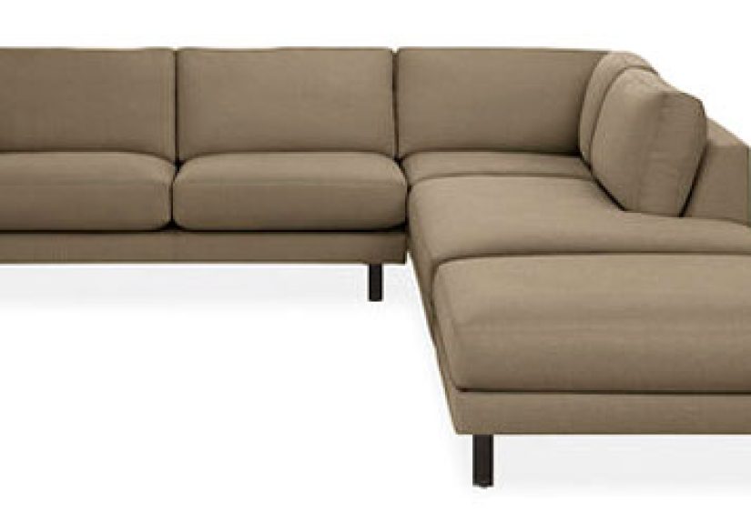
Living rooms tend to work best with colors that feel layered and welcoming. Soft greens, warm whites, mushroom tones, muted blues, and earthy browns create a comfortable backdrop for daily life. If you want more drama, deep navy, aubergine, charcoal, or rich terracotta can add sophistication. Because living rooms are often used both day and night, aim for colors that look good in shifting light.
Bedrooms
Bedrooms benefit from calming, grounded palettes. Blue, green, lavender-gray, soft taupe, and warm cream remain popular because they feel restful without being boring. The best bedroom colors are not always the palest ones. A moody deep green or smoky blue can make a bedroom feel cocooning and luxurious, especially when paired with layered textiles and softer lighting.
Kitchens and Dining Areas
Kitchens can handle more energy. Greens, blues, buttery neutrals, clay tones, and warm whites all work well depending on the style of the home. Dining areas are great places to experiment with color because they can be more theatrical. A dining room in deep rust, burgundy, or olive feels intimate and memorable. Even a painted ceiling can make the room feel more designed and less default.
Home Offices and Transitional Spaces
Home offices often benefit from colors that support focus without feeling sterile. Blue-greens, muted navy, soft clay, or complex neutrals can create a polished workspace. Hallways, entryways, and powder rooms are excellent places to take risks. Because they are smaller or transitional, they can handle stronger color without overwhelming the whole house. Think of them as the espresso shots of your home: short, strong, and surprisingly effective.
Light Changes Everything
If you remember only one thing about decorating with color, remember this: paint does not live on a swatch card. It lives on your wall, in your light, next to your floors, under your lamps, and across from your very opinionated sofa.
Natural light changes from morning to evening, and room orientation matters. North-facing rooms often feel cooler, so colors can read grayer or bluer. South-facing rooms usually get warmer light, which can make beige feel creamier and bold colors feel brighter. East-facing rooms shift from crisp morning light to softer afternoon light, while west-facing rooms can glow warmly later in the day. That is why paint samples should be tested on multiple walls and viewed at different times. It is not indecision. It is wisdom with a roller brush.
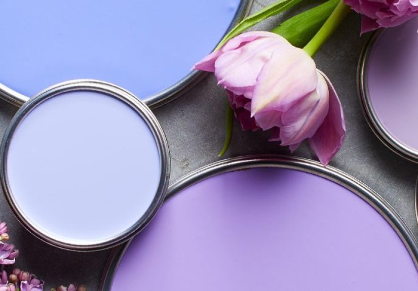
Undertones matter just as much. A “white” can lean yellow, pink, gray, or green. A greige can turn muddy if the undertones fight with your flooring. Before committing to a wall color, compare it against wood finishes, countertops, tile, upholstery, and trim. Color harmony is often less about the main hue and more about whether the undertones get along like civilized adults.
How to Add Bold Color Without Regret
Not everyone wants a cobalt-blue living room, and that is perfectly fine. Decorating with color does not require full commitment on day one. You can build color gradually and still create a strong result.
Start with Moveable Pieces
If you are color-shy, begin with rugs, pillows, artwork, throws, lampshades, and smaller furniture. These elements let you test bolder shades without repainting an entire room in a panic two weeks later. A neutral room can come alive with one rust velvet chair, green curtains, and art that repeats both tones.
Use Accent Walls Sparingly
Accent walls can work, but only when they feel intentional. Randomly painting one wall navy because you got nervous halfway through a project is not a design strategy. Accent walls are most effective when they highlight architecture, frame a bed, define a fireplace wall, or anchor a dining area.
Try Ceilings, Trim, and Millwork
Some of the most stylish ways to use color happen above eye level or around the edges. A painted ceiling can soften a tall room or make a cozy room feel more enveloping. Colored trim can add personality. Built-ins and cabinetry are perfect for deeper shades because they feel substantial and custom. A library painted in dark green or a mudroom in smoky blue can look instantly elevated.
Consider Color Drenching
Color drenching means painting walls, trim, and sometimes the ceiling in the same hue or closely related tones. It creates an immersive look that feels dramatic, cohesive, and often surprisingly sophisticated. In small rooms, it can even make the space feel larger by reducing visual breaks. A newer variation, double drenching, uses two related tones throughout a room for depth and contrast. This is a great move when you want bold color with a designer finish instead of a cartoon effect.
Create Color Flow Throughout the House
A beautiful room is nice. A home that feels connected is better. Decorating with color works best when each room has its own personality but still relates to the spaces around it. That does not mean every room should be painted the same warm white until morale improves. It means the colors should feel like cousins, not strangers at a bus stop.
One way to create flow is to repeat undertones. If your main living areas lean warm, keep that warmth moving into nearby spaces. Another trick is to use one anchor neutral throughout the home and then vary accent colors from room to room. You can also repeat a signature hue in small doses, such as a dusty green appearing in kitchen tile, entryway art, and bedroom textiles. This kind of repetition makes a house feel thoughtful and cohesive.
Designers also often think vertically: darker values at the floor, mid-tone values on the walls, and lighter values at the ceiling. This mirrors nature and tends to feel stable and comfortable. It is a subtle principle, but it helps rooms feel grounded rather than top-heavy.
Common Mistakes to Avoid
The first mistake is choosing paint before considering everything else in the room. Wall color should relate to flooring, fabrics, wood tones, fixed finishes, and natural light. The second mistake is ignoring undertones. The third is using too many equally strong colors at once. Contrast is important, but every element should not try to be the lead singer.
Another common mistake is relying only on trends. Trend colors can be fun, but your home should still reflect how you want to live. If a trendy dill green or espresso brown genuinely suits your style, go for it. If it does not, skip the trend and keep your peace. Your walls do not need to keep up with social media.
Finally, do not forget texture. A room with a restrained palette can still feel rich and layered when you mix matte walls, glossy ceramics, woven baskets, stone, metal, wood, velvet, and linen. Color gets all the attention, but texture is often the reason a room feels finished.
Real-World Experiences with Decorating with Color
One of the most common real-life experiences people have with color is realizing that the shade they loved in the store behaves very differently once it reaches home. A soft gray suddenly looks lavender. A warm white turns yellow at sunset. A gorgeous blue becomes much louder than expected once it covers four walls instead of a two-inch sample square. This is not failure. It is one of the most universal lessons in home decorating. Color is relational. It reacts to light, surrounding materials, and scale, which means living with a color teaches you more than staring at a swatch ever can.
Many homeowners also discover that they are braver than they thought. Someone who swore they would “never do dark walls” tries a deep green in a powder room and suddenly starts speaking confidently about moody paint like they host a design show. A renter who begins with colorful pillows ends up building an entire palette around ochre, olive, and ink blue. Decorating with color often starts cautiously and then grows into a stronger point of view. Once people see how color can make a room feel warmer, calmer, or more personal, they stop treating it as a risk and start treating it as a tool.
Another common experience is learning that color works best when it connects to real life, not just inspiration photos. A family with kids and pets may discover that fragile pale walls are less “serene retreat” and more “fingerprint museum.” Someone who works from home may realize that a too-bright office color becomes distracting after eight hours. A person who loves morning light may lean into crisp blues and soft greens, while someone whose home gets mostly evening light may prefer richer, warmer neutrals. The most successful homes are not the ones that copy a perfect photo. They are the ones that translate color into something livable.
People also tend to remember the emotional side of color more than the technical side. They remember how a bedroom finally felt restful after a harsh white was replaced with a muted blue-gray. They remember how a dark dining room made holiday dinners feel special. They remember how an entry painted in a cheerful earthy tone made the whole home feel more welcoming. In everyday life, color becomes part of memory. It shapes the atmosphere of routines, celebrations, quiet mornings, and late-night conversations.
Perhaps the biggest experience decorating with color teaches is confidence. At first, people want guarantees. They want the one perfect beige, the foolproof green, the magical neutral that never changes. Eventually, most realize that beautiful rooms are not built on perfection. They are built on thoughtful choices, testing, adjusting, and trusting what feels right in the space. Sometimes the best decision is bold. Sometimes it is subtle. Sometimes it is repainting because the first choice was wrong and moving on without drama. That is part of the process too. Decorating with color is not about never making mistakes. It is about learning how to use color to make home feel more like you.
Conclusion
Decorating with color is part strategy, part instinct, and part willingness to tape giant sample boards to your walls like a mildly obsessed detective. The most successful rooms usually balance all three. Start with the mood you want, use basic color theory to shape your palette, pay attention to light and undertones, and build in contrast with intention. Whether your style is airy and neutral or rich and dramatic, color can turn a generic room into one that feels deeply personal.
The smartest approach is not to ask which color is universally best. It is to ask which colors make your rooms function better, feel better, and tell a more interesting story. When that happens, color stops being decoration and becomes part of the architecture of daily life. And that is when a room really starts to sing.