Table of Contents >> Show >> Hide
- Start With the “Three Surfaces Rule”
- Undertones: The Plot Twist Nobody Warned You About
- 8 Kitchen Color Scheme Playbooks That Rarely Fail
- Cabinets, Walls, and Islands: Where Should the Color Go?
- Choosing a Scheme Based on Your Kitchen’s “Personality”
- Sheen and Finish: The Unsung Hero of Kitchen Paint Colors
- How to Test Colors Without Losing a Weekend (or Your Patience)
- Trends That Are Actually Livable (Not Just Popular on the Internet)
- Common Mistakes to Avoid
- Conclusion
- Real-World Experiences: What People Learn After Painting Their Kitchen
Picking a kitchen color scheme is a little like choosing a dinner party playlist: you want something that feels like “you,”
won’t irritate the neighbors, and still works when the lights are dim and someone’s burning garlic. Kitchens are busy roomssteam,
sun glare, stainless steel, sauce splatterso color has to be both pretty and practical.
This guide breaks down how to choose kitchen paint colors and palettes that look intentional (not accidental), feel good every day,
and play nicely with cabinets, countertops, and flooring. You’ll get specific, designer-approved combinations, plus a testing process
that prevents the classic “Why is my white… blue?” meltdown.
Start With the “Three Surfaces Rule”
Before you fall in love with a paint chip named something like “Whispered Cloud Latte,” zoom out. Most kitchen color schemes are really
a conversation between three big surfaces:
- Cabinet color (dominant visual mass)
- Countertops/backsplash (pattern + reflectivity)
- Walls (the “air” around everything)
If two of those are already fixedsay you’re keeping granite or existing wood floorsyour color scheme becomes easier. Let the fixed
materials lead, then choose paint that supports them. A kitchen doesn’t need 12 colors; it needs one clear story.
Undertones: The Plot Twist Nobody Warned You About
Color temperature (warm vs. cool) is the difference between “cozy” and “clinic.” Warm colors (think creamy whites, beiges, warm greens)
tend to feel inviting. Cool colors (crisp whites, blue-grays, many navies) read calmer and cleaner. Both can be gorgeousjust don’t mix
undertones like they’re random socks. You’ll feel it, even if you can’t name it.
How to spot undertones fast
- Compare, don’t guess: Hold your paint sample next to something truly white (printer paper works).
- Check against your countertop: If the stone has warm veining, a cool gray can look strangely “off.”
- Watch it at different times: Morning light is not the same person as evening light.
Bonus reality check: glossy surfaces (quartz, tile, stainless steel) bounce color around the room. Your “barely there” wall color may
show up as “surprise mint” once it’s reflecting off a backsplash.
8 Kitchen Color Scheme Playbooks That Rarely Fail
Below are proven kitchen color palettes that designers return to again and again. Treat them like recipes: you can swap ingredients,
but keep the ratios.
1) Warm White + Natural Wood + Matte Black
This is the “clean but not cold” classic. Warm white cabinets or walls keep things bright, wood adds soul, and matte black hardware
brings definition. It works in farmhouse, modern, Scandinavian, and “I don’t know my style but I have a dog” homes.
- Best for: open-plan kitchens, small kitchens that need light
- Countertop match: warm quartz, butcher block, or stone with beige/gold veining
- Pro move: use black in 2–3 places (hardware, faucet, light fixture) so it feels intentional
2) Greige + Cream + Brass
Greige (that perfect gray-beige handshake) is a powerful neutral kitchen color when you want softness without going full beige.
Pair it with creamy whites and warm metals like brass for a kitchen that feels calm, upscale, and quietly confident.
- Best for: transitional kitchens, homes with warm wood floors
- Countertop match: creamy quartz, limestone looks, subtle marble
- Pro move: choose one “hero” warm metal and stick to it
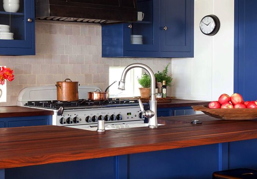
3) Navy + White + Walnut
Navy cabinets (or a navy island) create instant depth. White keeps it crisp. Walnut or medium wood tones add warmth so the navy doesn’t
feel too nautical-costume-y. This combo photographs beautifully and also survives real life.
- Best for: kitchens with good natural light
- Countertop match: white quartz, light marble-look surfaces, pale granite
- Pro move: if you’re nervous, do navy on the island only
4) Forest Green + Off-White + Stone
Deep greens have moved from “trend” to “new classic.” They pair naturally with marble, warm woods, and even brushed nickel.
If you want a kitchen that feels grounded and elegant, green is your friend.
- Best for: traditional, cottage, modern organic styles
- Countertop match: marble, soapstone looks, warm white quartz
- Pro move: keep walls off-white to avoid a dark cave effect
5) Black + Warm White + Gold
Black-and-white kitchens stay stylish because they’re basically a tuxedo: always appropriate, never try-hard. Warm the white slightly
(avoid icy whites unless the whole room is cool-toned) and use gold/brass to soften the contrast.
- Best for: modern kitchens, apartments, spaces with strong architectural lines
- Countertop match: white with subtle veining, black stone, or a dramatic waterfall island
- Pro move: add one warm natural texture (wood stools, woven shade, cutting boards on display)
6) Soft Blue + Crisp White + Terracotta Accent
Light blues feel fresh without screaming “beach theme.” Add crisp white for structure, then bring in terracotta (or rust) through
a runner, pottery, or bar stools for a little spice. Like adding paprika: small amount, big impact.
- Best for: coastal-inspired, cottage, casual kitchens
- Countertop match: bright white quartz, pale stone, classic subway tile
- Pro move: keep the terracotta accents repeatable and removable
7) Charcoal + Oak + Polished Nickel
Want moody without going full “goth pantry”? Charcoal is the sweet spot. It pairs beautifully with oak tones and polished nickel
for a clean, tailored look. This scheme is especially strong in contemporary kitchens with simple cabinet fronts.
- Best for: larger kitchens, kitchens with layered lighting
- Countertop match: pale quartz to brighten, or stone with subtle movement
- Pro move: include under-cabinet lighting so your counters don’t live in shadow
8) Butter Yellow + White + Vintage Metals
Yellow can be risky… in the same way karaoke can be risky: fabulous when done with confidence. Soft, buttery yellows add warmth and
cheer, especially in kitchens that feel cold or north-facing. Pair with white and vintage-inspired metals for a welcoming vibe.
- Best for: smaller kitchens, breakfast nooks, family homes
- Countertop match: warm neutrals, butcher block, creamy stone
- Pro move: use yellow on walls, not every cabinet (unless you’re truly committed)
Cabinets, Walls, and Islands: Where Should the Color Go?
If you’re trying to refresh a kitchen without a full renovation, placement matters more than picking the boldest shade on the rack.
In many updated kitchens, the island becomes the accent color while perimeter cabinets stay neutral. It’s the design equivalent of
wearing sneakers with a suit: a little contrast, a lot of style.
Easy placement strategies
- Color on the island: safest way to try navy, green, or charcoal without committing to a whole room.
- Two-tone cabinets: darker lowers + lighter uppers makes the space feel grounded and airy at once.
- Statement wall or pantry door: great for renters or anyone who likes options.
Choosing a Scheme Based on Your Kitchen’s “Personality”
Small kitchen color schemes
Small kitchens benefit from high light reflectance, but that doesn’t mean you must live in a white box. Try off-white walls, then
bring depth with a darker island or lower cabinets. Also: glossy tile and reflective hardware can help bounce light.
Open-concept kitchens
In open floor plans, your kitchen palette should connect to adjacent spaces. If your living room leans warm, a cool gray kitchen may
feel like it moved in from a different zip code. Repeat at least one color family across rooms (warm whites, similar woods, matching metals)
for continuity.
Low-light kitchens
North-facing or shaded kitchens are where undertones become dramatic actors. Many grays can look bluish; some whites can look dingy.
Warm neutrals, creamy whites, and soft greens often read more flattering in low light. Add layered lighting (ceiling + task + under-cabinet)
before blaming the paint.
Sheen and Finish: The Unsung Hero of Kitchen Paint Colors
Kitchens are high-touch, high-humidity zones. Paint sheen affects durability and how color reads:
- Walls: eggshell or satin (wipes better than flat, still looks smooth)
- Trim & cabinets: satin or semi-gloss (durable and easier to clean)
- Ceilings: flat (hides imperfections and doesn’t glare under lights)
One more thing: glossy finishes reflect more light, which can make color appear stronger. If you pick a bold cabinet color, a slightly
lower sheen can keep it rich without looking like a candy coating.
How to Test Colors Without Losing a Weekend (or Your Patience)
- Test big: paint a large poster board, not a tiny square on the wall.
- Move it around: check near windows, under cabinets, and beside appliances.
- Check it at night: warm bulbs can turn whites creamy; cool LEDs can make them look icy.
- Compare to “fixed” items: countertop, backsplash, flooringalways.
- Live with it: at least 48 hours. If you hate it on day two, day two is telling the truth.
Trends That Are Actually Livable (Not Just Popular on the Internet)
Kitchen trends come and go, but certain directions are proving sticky because they’re practical: richer greens, moody blue-greens,
warmer neutrals, and two-tone cabinet layouts. These palettes pair well with natural materials like wood and stone, and they still feel
good after the novelty wears off.
If you want a “trendy but safe” approach, use the trend color on a swappable element (island, stools, pantry door) and keep the big-ticket
items (perimeter cabinets, counters) in timeless neutrals.
Common Mistakes to Avoid
- Ignoring undertones: a warm countertop and cool gray cabinets often clash quietly (and then loudly).
- Going too dark without lighting: moody cabinets + weak lighting = “why does chopping onions feel like a noir film?”
- Using one white everywhere: cabinets, walls, trim all identical can look flat; use subtle variation for dimension.
- Forgetting the backsplash: it’s a huge visual surfacetreat it as part of the palette, not an afterthought.
- Chasing “the” perfect color online: your lighting and materials will change how it looks. Always test.
Conclusion
The best kitchen color scheme is the one that works with your home’s fixed finishes, flatters your lighting, and feels good on a random
Tuesday when you’re just making toast. Start with the big surfaces, respect undertones, and use color placement strategicallyespecially
if you’re experimenting with bolder cabinet colors.
If you’re stuck, pick one timeless anchor (warm white, greige, navy, green) and build around it with wood tone and metal finish. Your
kitchen will feel cohesive, intentional, andmost importantlylike a place you actually want to hang out.
Real-World Experiences: What People Learn After Painting Their Kitchen
Color advice is great, but real kitchens are where the lessons get spicy. Below are common “I lived with it” experiences homeowners
run intoshared here as a practical reality check so you can skip the expensive plot twists.
1) The “White Isn’t Just White” Awakening
Many people start by saying, “I’ll just do white cabinets.” Then they discover there are warm whites, cool whites, creamy whites, and
whites that look innocent in the store but turn faintly blue next to a countertop. The most successful white kitchens usually choose a
white that matches the room’s temperature: warm whites with warm stone and wood, crisper whites with cooler marble and modern finishes.
Once that alignment happens, the kitchen looks clean instead of clinical.
2) The Island Is the Gateway Drug to Bold Color
Homeowners who want color but fear commitment often test-drive it on the island. Navy, forest green, charcoal, even a dusty bluean island
is big enough to matter but isolated enough to change later. The common reaction after a few weeks: “Why didn’t I do this sooner?”
The island trick also makes the rest of the palette easier: neutral perimeter cabinets, then repeat the island color in two small places
(a runner, a piece of art, a few ceramics) so it feels planned rather than random.
3) Lighting Changes Everything (Yes, Even That “Perfect” Paint)
A frequent post-paint surprise is how the same wall color can look soft and airy at noon, then murky at night under warm bulbs. Kitchens
with under-cabinet lighting almost always feel more “finished,” especially with darker lower cabinets. People who add lighting after painting
often say the paint suddenly looks betterbecause it does. If you’re going moody, budget for lighting like it’s part of the color.
4) Two-Tone Cabinets Feel Custom Without Feeling Busy
Two-tone kitchens work in real life because they solve a common problem: you want depth, but you still want brightness. Dark lowers hide
scuffs and ground the room; light uppers keep the space open. Homeowners also like the flexibilityif tastes change, repainting just the
lowers is faster and cheaper than a full reset.
5) The “One More Color” Temptation Usually Backfires
A lot of kitchens go sideways because of an innocent thought: “Maybe we add one more accent color.” Then it becomes two more, and suddenly
the kitchen looks like it’s wearing mismatched socks. The best lived-in kitchens keep a tight palette: one dominant neutral, one supporting
tone (often wood), and one accent (hardware or island color). If you’re craving variety, bring it in with textiles, art, or countertop items
you can swap seasonally.
6) Real Life Loves Forgiving Finishes
Ultra-matte cabinets look amazing in photos, but busy households often prefer finishes that can handle fingerprints and quick wipe-downs.
People with kids, pets, or “I cook every day” habits tend to be happiest with durable cabinet paint and a finish that doesn’t require a
ceremonial cleaning ritual. Translation: pick beauty you can live with, not beauty that needs its own caretaker.
The recurring theme from real kitchens is simple: the most satisfying color schemes are the ones that consider light, undertones, and daily
messthen use accents for personality. Do that, and your kitchen will age gracefully instead of becoming a cautionary tale told over takeout.