Table of Contents >> Show >> Hide
- Before You Pick a Color: 6 Quick Rules That Save Regret
- The 11 Best Front Door Colors for Instant Curb Appeal
- How to Make Any Door Color Look More Expensive
- Quick Painting Checklist (So It Looks Good for Years)
- Conclusion: Pick the Color That Fits Your Houseand Your Personality
- Real-World Experiences: What Painting a Front Door Is Actually Like (The Extra )
Your front door is basically your home’s handshake. It’s the first thing guests see, the last thing you glare at when you realize you forgot your keys, and the one exterior detail you can upgrade without repainting the entire house (or selling a kidney to pay for scaffolding).
Changing your front door paint color is one of the fastest, most budget-friendly ways to boost curb appeal. It can make a basic exterior look polished, make a traditional home feel updated, and make a modern façade feel warmer and more inviting. And because it’s a smaller surface than siding, you can go bolder here than almost anywhere else outdoors.
Below are 11 front door colors that designers, paint brands, and home editors consistently recommend because they’re either timeless, flattering to many exterior styles, or bold in a way that still looks intentional (not like you lost a bet).
Before You Pick a Color: 6 Quick Rules That Save Regret
1) Match the “undertone,” not just the color family
Two whites can look identical… until one turns slightly yellow next to your stone and the other turns icy next to your warm brick. Look for undertones in your fixed materials: brick, stone, roof shingles, hardscaping, and trim.
2) Consider your trim and hardware at the same time
A great door color can look “off” if the trim is fighting it. And hardware matters: matte black reads modern, polished brass reads classic and elevated, oil-rubbed bronze reads warm and traditional, and chrome/nickel reads crisp and contemporary.
3) Test in real light (morning, noon, and evening)
Exterior light is dramatic. A color that looks perfectly deep at noon can look almost black at dusk. Tape up large paint samples (or paint a poster board) and check it at different times of day.
4) Think about the vibe you want
Want “quiet luxury”? Try black, charcoal, deep navy, or a muted green. Want “friendly and playful”? Try yellow, coral, teal, or terracotta. Want “classic and welcoming”? Red, navy, and rich green are the hall-of-famers.
5) Choose a durable finish
Front doors get sun, rain, fingerprints, and delivery-driver side-eye. A semi-gloss is a popular sweet spot for durability and easy cleaning, while high-gloss can look ultra-polished (and a little dramaticin a good way).
6) Prep is the difference between “wow” and “why is it peeling?”
Clean, sand lightly, patch, prime where needed, and use an exterior-rated paint. The color gets the compliments, but prep is what keeps those compliments coming next year.
The 11 Best Front Door Colors for Instant Curb Appeal
1) Classic Black
Best for: Nearly everythingmodern farmhouses, colonials, cottages, brick homes, and contemporary builds.
A black front door is the little black dress of curb appeal: dependable, flattering, and always appropriate. It creates crisp contrast on light exteriors and looks sophisticated on darker palettes when you pick a black with a tiny undertone (warm or cool) that matches your exterior.
Style tip: Add polished brass or matte black hardware to make it feel intentional. If your home has traditional detailing, consider a slightly softer “off-black” to keep it warm rather than harsh.
2) Deep Navy Blue
Best for: White houses, gray siding, light stone, coastal styles, and traditional homes that want a modern touch.
Deep navy is bold but still classic. It reads “tailored” rather than trendy, and it gives you that rich contrast like blackjust with a little more personality. If your exterior is busy (mixed materials, lots of trim), navy can anchor the look without screaming for attention.
Style tip: Pair navy with bright white trim for a clean, preppy look. Add planters with glossy greenery to make the blue feel even richer.
3) True Red (Classic, Not Neon)
Best for: Brick exteriors, traditional homes, and any façade that needs a confident focal point.
Red doors have been popular forever for a reason: they’re energetic, welcoming, and instantly noticeable (without needing a parade permit). The trick is picking a red with the right depth. A deep, slightly muted red can look timeless; a super-bright red can skew “toy firetruck” if the rest of your exterior is subdued.
Style tip: Red looks especially good with warm-toned brick and creamy trim. Keep porch décor simple so the door stays the star.
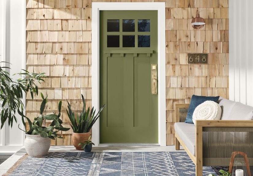
4) Forest Green
Best for: Stone homes, craftsman styles, neutral siding, and homes surrounded by trees or lush landscaping.
Forest green feels grounded and upscale. It’s bold, but it blends naturally with the outdoors, which helps it look “meant to be there.” It also works beautifully with natural textureswood porch ceilings, stone steps, and black iron railings.
Style tip: Try warm brass hardware to make the green feel classic, or matte black hardware to push it modern.
5) Sage Green
Best for: Farmhouse looks, cottages, light brick, beige or greige siding, and anyone who wants color without drama.
Sage is the calm, collected friend of green. It’s soft, welcoming, and easy to coordinate. It can brighten an entry without becoming the only thing people remember about your house (like that one neighbor’s neon flamingo yard phase).
Style tip: Sage looks great with warm whites, light natural stone, and porch décor in woven textures.
6) Teal or Blue-Green
Best for: Coastal styles, mid-century homes, light siding, and homes that need a “happy pop” that still looks grown-up.
Teal is a personality color that can still read sophisticatedespecially when it leans a bit muted rather than electric. It pairs beautifully with white trim, sandy stone, and natural wood accents. If you want something that feels fresh year-round, teal is a strong contender.
Style tip: Coordinate with a small porch detail (like a planter or a cushion) in a similar tone so it feels pulled together.
7) Charcoal Gray
Best for: Modern homes, industrial-inspired exteriors, white houses that want contrast without “jet black,” and homes with black windows.
Charcoal is sleek, modern, and forgiving. It hides dirt and scuffs better than many lighter colors, and it plays nicely with both cool and warm exteriors depending on the undertone you choose.
Style tip: If your exterior already has black accents (railings, lighting, window frames), charcoal makes the whole front elevation look cohesive.
8) Warm White or Cream
Best for: Dark exteriors, historic homes, Mediterranean-inspired styles, and anyone who loves timeless simplicity.
White is often cited as the most common front door color for a reason: it works with almost everything. But “white” is not one color. A warm creamy white can look inviting and classic, while a crisp bright white can look sharp and modern.
Style tip: This is where hardware can do heavy lifting. Upgrade the handle set and add statement lighting for an instantly elevated entry.
9) Sunshine Yellow (Buttery to Golden)
Best for: Dark siding that needs cheer, small porches that need energy, and homes where you want “friendly” as the first impression.
Yellow doors can feel joyful and welcominglike your house is offering cookies (even if you’re offering “please remove your shoes”). The key is choosing a yellow that suits your exterior. Pale buttery yellows look classic and soft; deeper golden yellows feel bold and sunny.
Style tip: Yellow loves contrast. Pair it with crisp white trim or deep charcoal accents for a look that feels intentional, not accidental.
10) Dusty Blush or Muted Mauve
Best for: White or light gray exteriors, modern cottages, and anyone who wants something different without going full neon.
Muted pinks and mauves have quietly become a designer favorite because they feel unexpected but still soft and livable. A dusty blush reads warm and welcoming, and it can make an entry feel curatedespecially with the right hardware and clean landscaping.
Style tip: Pair with matte black or aged bronze hardware to keep it sophisticated, not “bubblegum.”
11) Terracotta or Burnt Orange
Best for: Stucco homes, Southwestern styles, mid-century modern exteriors, and homes with warm stone or brick.
Terracotta and burnt orange tones feel earthy and design-forward. They’re warm, inviting, and look fantastic with natural materials. They also show up beautifully in photosgreat if you care about that listing shot or just want your front porch to look like it belongs in a magazine.
Style tip: Add a simple green wreath or potted olive/boxwood to balance the warmth with fresh contrast.
How to Make Any Door Color Look More Expensive
Upgrade the details that frame the color
- Lighting: Replace dated fixtures with something slightly larger and more modern.
- House numbers: Simple, modern numbers can make the whole façade feel updated.
- Planters: Two matching planters instantly add symmetry and polish.
- Doormat + layering: A larger outdoor rug under a doormat makes the entry feel styled, not accidental.
Do a mini “color echo”
Pick one small element that repeats the door color: a planter, a pillow on a porch chair, or even a seasonal wreath ribbon. You’re not matching everythingjust creating a subtle thread that makes the choice look purposeful.
Quick Painting Checklist (So It Looks Good for Years)
- Clean: Remove grime and chalky residue so paint sticks.
- Prep: Lightly sand glossy surfaces; patch dents; caulk gaps.
- Prime: Prime bare spots or stained areas, especially if changing from dark to light (or vice versa).
- Paint: Use exterior-rated paint; apply thin, even coats; let it cure fully.
- Protect: If your door gets harsh sun, consider a finish and product rated for exterior UV exposure.
Conclusion: Pick the Color That Fits Your Houseand Your Personality
The best front door color is the one that makes your home feel welcoming and cohesive. If you want timeless, go black, navy, charcoal, or warm white. If you want friendly energy, reach for yellow, teal, or terracotta. If you want classic charm, you can’t go wrong with red or a rich green.
And remember: a front door is the perfect place to take a small design risk. Worst-case scenario? You repaint. Best case? Your curb appeal levels up so hard your neighbors start sweeping their porches out of pure competition.
Real-World Experiences: What Painting a Front Door Is Actually Like (The Extra )
Let’s talk about the part nobody glamorizes on social media: painting a front door is a tiny project with big emotions. People go in thinking, “This will be a fun weekend upgrade,” and come out with strong opinions about sanding, wind, and why bugs are drawn to fresh paint like it’s a luxury resort.
One common experience homeowners share is the surprise of how much lighting changes everything. That navy you loved on a sample card may look perfectly rich in afternoon shade, then read almost-black under a porch light at night. Meanwhile, that “soft sage” can look calm and cozy on a cloudy day, but suddenly turn brighter in full sun. The lesson people repeat over and over: test the color outside and check it at different timesmorning, mid-day, and eveningbefore committing.
Another real-life moment: undertones reveal themselves at the worst possible time (usually after the second coat). A charcoal can look sleek until it sits next to warm brick and starts reading slightly blue. A creamy white can look elegant until it’s paired with cool gray siding and suddenly looks a bit yellow. Homeowners who end up happiest usually picked their door color by comparing it directly to their fixed materialsbrick, stone, roof, and triminstead of choosing it in isolation.
Then there’s the “I didn’t think hardware mattered” phase. People paint a gorgeous door and realize the old handle set looks like it survived three decades of sticky summer hands. The truth is, door hardware is the jewelry. Even a basic color like warm white or charcoal looks instantly more upscale with updated hardware and a clean, modern porch light. Plenty of DIYers say the best money they spent wasn’t on the paintit was on the hardware upgrade that made everything feel finished.
Homeowners also talk a lot about finish choice. A semi-gloss is popular because it’s easier to wipe down and looks crisp, but some people fall in love with high-gloss because it gives that “front door spotlight” shine. The flip side is that higher sheen can highlight dents and imperfectionsso folks who choose it often admit they spent more time patching and sanding than they expected. That’s not bad news, though. It’s just a reminder that the most “designer-looking” results usually come from prep work, not magic paint.
Finally, there’s the emotional win: people often say a newly painted front door makes them enjoy coming home more. It sounds small, but it’s real. A cheerful yellow can make a gray day feel lighter. A deep green can make a house feel grounded and established. A classic black can make the whole exterior look sharper and more intentional. And if you pick a color that fits your home’s style and your taste, you get the best result of all: curb appeal that feels like you.