Table of Contents >> Show >> Hide
If your home has been feeling a little… crunchy (in the emotional sense, not the granola sense), green color schemes are the quickest way to
make your rooms exhale. Green sits right in that sweet spot between “neutral enough to live with” and “interesting enough to brag about on a
house tour.” It can read soft and airy like new leaves, rich and grounded like a forest floor, or dramatic like a velvet sofa that makes your
friends suddenly speak in whispers.
Below you’ll find 51 green color schemespractical, mix-and-match palettes that work in real rooms with real lighting and real people who
occasionally spill coffee. Use them as whole-room paint plans, accent-wall inspiration, cabinet color pairings, or a cheat sheet for choosing
rugs, pillows, art, and hardware that don’t fight each other.
Why Green Feels So Good Indoors
Green is nature’s “we’re fine” signal. It suggests growth, balance, and that comforting outdoor backdrop your nervous system recognizes even
when you’re indoors answering emails. Designers often call sage and muted greens “new neutrals” because they’re calm, flexible, and forgiving:
they pair beautifully with wood, stone, woven textures, and most metals, and they can lean modern, traditional, coastal, rustic, or minimalist
depending on what you put next to them.
The trick is choosing the right green. Every green has undertonesyellow, blue, gray, or brownthat decide whether it feels sunny,
misty, earthy, or moody. Pick your undertone, then build the rest of the palette around it (instead of forcing that one trendy green to behave
in a room with stubborn lighting).
How to Choose a Green That Won’t Betray You at 7 PM
1) Start with the light, not the paint chip
North-facing rooms often make colors feel cooler and grayer; south-facing rooms warm everything up. East light can look crisp in the morning,
while west light goes golden later in the day. Translation: test a few greens on large samples and look at them in the exact lighting you’ll
live withday, night, and “why is the overhead light so rude?”
2) Decide what kind of calm you want
- Silvery sage = airy, spa-like, quietly elegant.
- Olive and moss = grounded, cozy, organic, earthy-neutral vibes.
- Forest and hunter = dramatic, enveloping, library energy.
- Emerald and jewel greens = bold, glamorous, high-contrast sophistication.
- Mint and sea glass = fresh, cheerful, light-bouncing brightness.
3) Use “supporting actors” wisely
Greens love warm whites, creamy off-whites, natural woods, and stone. Add matte black for contrast, brass for warmth, nickel for crispness,
and terracotta or blush for a surprise that still feels natural. And if you’re nervous, keep the big surfaces calm and bring bolder colors in
through textiles and artyour walls won’t be offended.
51 Green Color Schemes That Bring Nature’s Calm Indoors
Soft Sages & Silvery Greens (1–12)
- Cloudy Sage + Warm White: Sage green, creamy white, pale oak, linen beige, soft black perfect for open living rooms that need calm without going bland.
- Silver Sage + Greige: Silvery green, greige, crisp white trim, brushed nickel, light stone a clean, modern palette that still feels organic.
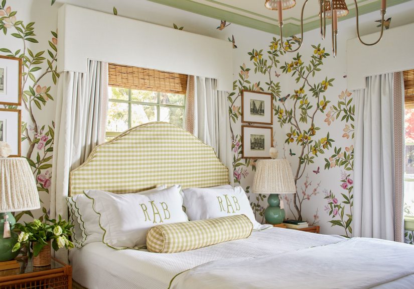
- Sage + Blush Accent: Sage, blush pink, warm white, natural cane, brass soft and welcoming for bedrooms and powder rooms.
- Eucalyptus + Sand: Eucalyptus green, sandy beige, off-white, driftwood, matte black coastal calm without screaming “beach theme.”
- Herbal Green + Cream: Herbal sage, cream, warm taupe, antique brass, walnut ideal for kitchens that want cozy sophistication.
- Foggy Green + Charcoal: Green-gray, charcoal, soft white, light oak, black accents great for offices where focus is required (and daydreaming is optional).
- Sage + Terracotta Touch: Sage, terracotta, warm white, jute, dark wood earthy and friendly, especially in dining rooms.
- Sage + Navy Grounding: Sage, deep navy, crisp white, medium wood, brass classic contrast that reads tailored, not trendy.
- Celadon + Pearl: Pale celadon, pearl white, light gray, chrome, glass airy for bathrooms and small rooms that want to feel bigger.
- Dusty Green + Oatmeal: Dusty green, oatmeal, creamy white, rattan, soft black relaxed, “Sunday morning” energy for family rooms.
- Muted Mint + Warm Wood: Muted mint, warm white, honey oak, tan leather, matte black mid-century friendly without time-traveling too hard.
- Soft Fern + Stone: Soft fern, light stone, off-white, pale wood, pewter calm and timeless for hallways and entryways.
Olive & Moss Neutrals (13–24)
- Classic Olive + Cream: Olive, cream, warm taupe, brass, walnut an instant “grown-up” palette for living rooms and libraries.
- Moss + Clay: Moss green, clay, warm white, terracotta tile, black earthy and grounded for kitchens and mudrooms.
- Olive + Marble White: Olive, marble white, gray veining, brushed brass, dark wood especially sharp on cabinets and islands.
- Avocado Modern + Putty: Avocado-leaning green, putty, warm white, oak, black retro-adjacent but clean and current.
- Khaki Green + Linen: Khaki green, linen, camel leather, aged brass, natural sisal cozy in dens and reading corners.
- Moss + Smoky Blue: Moss, smoky blue, warm white, stone gray, brass soothing, layered, and surprisingly versatile.
- Olive + Mustard Pop: Olive, mustard, cream, walnut, black cheerful contrast that still feels nature-based (like a stylish hiking jacket).
- Brown-Green + Warm Gray: Brown-green, warm gray, off-white, bronze, dark oak perfect for rooms with lots of wood trim.
- Olive + Soft Peach: Olive, soft peach, ivory, rattan, brass warm and flattering, especially in spaces where people gather.
- Moss + Stone + Black: Moss, stone, crisp white, matte black, light wood modern organic minimalism that doesn’t feel cold.
- Olive + Burgundy Hint: Olive, deep burgundy, cream, walnut, antique brass dramatic but still classic, great for dining rooms.
- Army Green + Natural Textures: Army green, canvas beige, aged leather, raw wood, iron rugged, handsome, and hard to mess up.
Deep Forest & Hunter Drama (25–34)
- Forest Green + Crisp White: Deep forest, crisp white, black accents, warm wood, brass the “tailored suit” of green palettes.
- Hunter + Camel Leather: Hunter green, camel, cream, walnut, brass cozy-luxe for dens, lounges, and rooms with serious snack potential.
- Pine + Stone Fireplace: Pine green, stone gray, warm white, oak, iron perfect for a hearth moment (even if your fireplace is decorative).
- Inky Green + Gold: Inky green, brushed gold, black, ivory, dark wood moody and glamorous for powder rooms and bars.
- Deep Green + Warm Beige: Deep green, warm beige, creamy white, bronze, natural fiber grounded and inviting in bedrooms.
- Evergreen + Soft Black: Evergreen, soft black, warm white, walnut, aged brass dramatic without feeling like a haunted manor.
- Forest + Rust: Forest green, rust, ivory, oak, black autumnal warmth that’s still elegant year-round.
- Dark Green + Pale Pink: Dark green, pale pink, off-white, brass, marble chic contrast that feels surprisingly calm.
- Green Drench + Creamy Trim: Same deep green on walls/trim, creamy ceiling, warm wood, brass immersive and high-end looking.
- Bottle Green + Slate: Bottle green, slate gray, crisp white, black metal, medium wood a clean, architectural palette for modern homes.
Jewel Greens & Statement Combos (35–41)
- Emerald + White + Brass: Emerald, bright white, brass, black, walnut timeless glam that works from kitchens to sitting rooms.
- Emerald + Sapphire: Emerald, sapphire blue, ivory, gold, dark wood bold but classic, especially with rich textiles.
- Jade + Warm Neutrals: Jade, warm beige, soft white, light wood, brushed nickel fresh and sophisticated for open-plan spaces.
- Teal-Green + Coral: Teal-green, coral, warm white, rattan, brass playful energy that still feels nature-adjacent.
- Viridian + Concrete Gray: Viridian, concrete gray, crisp white, black steel, pale oak modern, crisp, and gallery-like.
- Emerald + Chocolate: Emerald, chocolate brown, cream, brass, walnut rich and cozy, perfect for bedrooms and media rooms.
- Green + High-Gloss Black: Saturated green, high-gloss black accents, white, gold, dark wood dramatic, editorial, and surprisingly timeless.
Fresh Mint & Sea-Glass Greens (42–46)
- Sea Glass + White: Sea-glass green, bright white, pale wood, glass, chrome clean and breezy for bathrooms and sunrooms.
- Mint + Navy Stripe: Mint, navy, crisp white, light oak, brushed nickel preppy, fun, and great for kids’ rooms that grow up gracefully.
- Spearmint + Peach: Spearmint, peach, ivory, brass, rattan cheerful and warm for breakfast nooks.
- Mint + Charcoal: Mint, charcoal, white, black accents, pale wood modern contrast that keeps mint from feeling too sweet.
- Aqua-Green + Sandy Beige: Aqua-green, sandy beige, warm white, driftwood, rope textures coastal without the seashell sermon.
Bold, Unexpected Pairings (47–51)
- Olive + Lavender: Olive, muted lavender, cream, walnut, brass a soft “garden at dusk” vibe that feels fresh, not fussy.
- Sage + Cinnamon: Sage, cinnamon brown, warm white, brass, natural linen cozy, spicy, and excellent in dining rooms.
- Forest + Butter Yellow: Forest green, butter yellow, warm white, oak, black sunny contrast that still feels grounded.
- Deep Green + Crisp Red Accent: Deep green, crisp red (tiny doses), warm neutrals, brass, dark wood bold, classic, and very “designer knows what they’re doing.”
- Green + Mixed Metals: Balanced green, warm white, brass + black + nickel, wood the ultimate flexible palette for homes that evolve over time.
Make Any Green Scheme Look Intentional
Pick a “dominant,” “supporting,” and “spark” color
Use green as the dominant (walls or cabinets), keep one supporting neutral (warm white, cream, greige, or stone), and add one spark color
(terracotta, blush, mustard, navy, or black). This prevents the “I bought six cute pillows and now my room looks like a confused boutique”
problem.
Match your finish to your lifestyle
Matte walls hide imperfections and feel soft, but they can show scuffs in high-traffic areas. Eggshell or satin is easier to wipe. For cabinets
and trim, a more durable finish helpsbecause cabinet doors live a hard life of fingerprints and dramatic slams.
Use nature as the cheat code
When you’re stuck, copy the outdoors: moss + stone + bark (greens, grays, browns), or eucalyptus + sand + sky (green, beige, blue). Nature has
been color-matching longer than any of us, and she rarely misses.
Extra: of Real-World “Green Scheme” Experience (Lessons You Can Steal)
People tend to think choosing a green paint is the hard part. In practice, the hard part is choosing a green that behaves in your exact room
with your exact lighting and your exact “I swear I’ll keep the blinds open” lifestyle. A common experience: the green you loved at noon looks
mysteriously gray at night, and you start questioning your judgment, your eyesight, and possibly your entire personality. That’s why the
smartest move is sampling bigposter board size or peel-and-stick samplesand walking past it for a few days like you’re evaluating a
job candidate.
Another thing homeowners often notice: green makes wood look better. It’s like wood’s best friend who always tells it, “You look great today.”
Warm woods (oak, walnut) glow next to olive and moss greens, while lighter woods feel airy next to sage and sea-glass tones. If you’ve got
existing wood floors you can’t change, treat them like the “truth” of the room and pick a green that harmonizes with that truthbecause floors
do not care about your Pinterest board.
Kitchens are where green schemes become believers. A lot of people try green on an island first: it’s bold enough to feel like a makeover, but
not so permanent that you feel like you married the color. The classic experience is realizing green cabinets don’t need loud countertops.
Simple, warm whites or light stones let the green be the star, and your hardware choice decides the vibe: brass reads warmer and more classic,
black reads modern and graphic, nickel reads crisp and clean.
Bedrooms are where green proves it can be both calm and interesting. Many people start with sage because it’s “safe,” then discover they want
depthso they shift toward a slightly grayer, smokier green that still feels restful but more layered. The bedding does a lot of emotional work
here: crisp white sheets make green feel fresh; creamy linens make it feel cozy; and a single accent color (like terracotta, blush, or navy)
keeps the room from looking like it’s trying to impersonate a yoga studio.
One of the most useful lessons: when a green feels “off,” it’s usually the undertone, not the intensity. If a green looks sour, it may have
more yellow than your room wants; if it looks chilly, it may be pulling blue or gray in your light. Swapping to a neighboring greensame depth,
different undertoneoften solves the problem without changing the whole plan. And if you ever doubt whether green is worth the effort, add one
big plant, a warm lamp, and a natural-texture rug next to your chosen shade. Suddenly the scheme clicks, and your room looks like it started
drinking water and journaling.