Table of Contents >> Show >> Hide
- 1. The Postage-Stamp Rug
- 2. Matching Furniture Sets That Feel Like a Showroom Starter Pack
- 3. One Harsh Overhead Light Doing All the Emotional Labor
- 4. The TV Mounted Too High, Usually Above the Fireplace
- 5. Furniture That Is the Wrong Scale for the Room
- 6. Clutter Posing as Decor
- So, What Actually Makes a Living Room Feel Good?
- Real-Life Experiences With Living Room “Icks”
- Conclusion
A living room does not have to look like a showroom to feel polished. In fact, most designers would rather walk into a room with personality than one that looks like it was assembled in a panic at a big-box store on a three-day weekend. But there are a few features that make design pros wince almost on contact. Not because they are illegal, obviously. Not because a decorating referee blows a whistle and revokes your throw pillows. But because these choices quietly make a room feel awkward, cramped, generic, or harder to enjoy.
That is really what the modern design “ick” comes down to: a space that fights the way people actually live. A living room should help you relax, host, sprawl, read, snack, nap accidentally, and maybe pretend you are “just resting your eyes” during a movie. When the layout is off, the lighting is harsh, or the furniture looks like it was selected by a committee of exhausted algorithms, the room loses warmth fast.
The good news is that most of these living room mistakes are fixable. You do not need a six-figure renovation budget, a custom millworker, or a dramatic reveal with a fog machine. Sometimes the difference between “cozy and intentional” and “why does this feel like a furniture waiting room?” comes down to scale, placement, and editing.
Here are six living room features that give designers the ick, plus what to do instead if you want your space to feel elevated, comfortable, and far more expensive than it has any right to.
1. The Postage-Stamp Rug
Why it gets side-eyed
If your area rug looks like it is nervously floating in the middle of the room, designers notice immediately. A too-small rug breaks up the space instead of grounding it. Rather than making the room feel airy, it often makes everything look disconnected, as if the sofa and chairs are in a custody dispute with the floor.
This is one of the most common living room design mistakes because people naturally assume a smaller rug will make a room feel bigger. In practice, the opposite usually happens. A tiny rug chops up the layout, makes the seating area feel underfurnished, and can turn a lovely sofa into something that appears oddly oversized. It is the decorating version of pants that are technically wearable but spiritually incorrect.
What to do instead
Choose a rug large enough that at least the front legs of the main seating pieces sit on it. In many rooms, even better is a rug that fits all major furniture legs comfortably. This creates a visual anchor and helps the layout read as one intentional zone rather than several unrelated objects who happen to know each other.
If a large rug is out of budget, do not default to tiny. Try shopping vintage, looking for flatweaves, or layering a smaller patterned rug over a larger neutral natural-fiber rug. The point is not perfection. It is making the room feel grounded, not like the coffee table landed on a decorative napkin.
2. Matching Furniture Sets That Feel Like a Showroom Starter Pack
Why it gets side-eyed
Designers are not against coordination. They are against over-coordination. When the sofa, loveseat, chair, coffee table, side tables, and maybe even the lamp all look like they arrived in one shrink-wrapped package labeled “Living Room, Human Version,” the result can feel flat and impersonal.
Matching furniture sets are popular because they make decision-making easy. And honestly, sometimes easy is beautiful. But rooms with too much matching tend to lose tension, contrast, and personality. They can feel safe in the least flattering waylike everyone in the room was told to wear beige and keep conversation to a minimum.
The problem is not that the pieces work together. The problem is that they only work together. There is no visual rhythm, no surprise, no collected-over-time quality that makes a home feel lived in and personal.
What to do instead
Mix shapes, materials, and finishes while keeping a common thread. That thread might be color temperature, wood tone, silhouette, or overall mood. A tailored sofa can pair beautifully with a vintage wood coffee table. A sleek lamp can sit next to a cozy slipcovered chair. A modern room can absolutely handle one antique piece without calling a crisis meeting.
A better goal than “everything matches” is “everything belongs.” That is what makes a living room feel designed rather than merely purchased.
3. One Harsh Overhead Light Doing All the Emotional Labor
Why it gets side-eyed
Lighting can make a gorgeous room feel warm and layeredor make it feel like a tax office with nicer pillows. A single ceiling fixture, especially one paired with overly bright or mismatched bulbs, is one of the fastest ways to flatten a living room.
Harsh overhead lighting creates glare, emphasizes shadows in all the wrong places, and leaves the room feeling stark after sunset. It is functionally useful, sure, but so is a parking lot floodlight. That does not mean you want it setting the mood near your boucle accent chair.
Designers talk about layered lighting for a reason. A living room needs multiple light sources at different heights. Otherwise, the space tends to feel sterile, unfinished, or weirdly tense, even if everything else is beautifully styled.
What to do instead
Use a mix of floor lamps, table lamps, sconces, and soft overhead lighting. Add dimmers wherever possible. Keep bulb temperatures consistent so the room does not look like one half is golden hour and the other half is a hospital hallway.
A good rule of thumb is to light the room for the way you actually use it: reading, conversations, movies, and the occasional lying-on-the-couch-scroll-session that “just happened.” Warm, layered lighting makes a room feel instantly more expensive because it adds depth, softness, and intention.
4. The TV Mounted Too High, Usually Above the Fireplace
Why it gets side-eyed
There are few living room debates more persistent than the TV-over-fireplace question. Designers usually dislike it for a simple reason: comfort. When a television is mounted too high, the room stops supporting actual human necks. Seating gets pushed too close. Sightlines get awkward. And suddenly movie night feels less cozy and more like a chiropractic challenge.
This setup is often a compromise born from architecture. Fireplaces take the prime wall. Windows occupy the rest. The TV ends up above the mantel because, well, where else is it supposed to go? Fair question. But even practical decisions can create visual and physical tension if they are not handled carefully.
Beyond ergonomics, a too-high TV can also throw off the whole room. It competes with the fireplace, dominates the wall, and makes the seating area feel like it is worshipping electronics rather than inviting conversation.
What to do instead
If possible, place the TV at a more comfortable eye level on a separate wall or built-in unit. If it has to live above the fireplace, consider lowering the mantel profile, using a mount that adjusts downward for viewing, or balancing the wall with surrounding millwork so the screen does not feel like a giant black rectangle hovering over the room.
Also pay attention to sofa placement. A beautifully styled living room still fails the test if everyone has to sit three feet from a blazing fire and crane upward just to watch a sitcom.
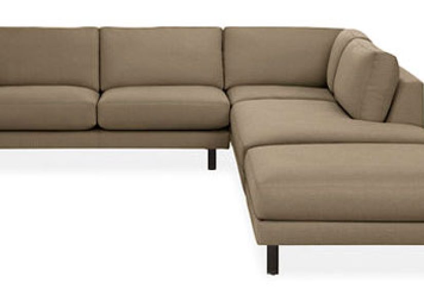
5. Furniture That Is the Wrong Scale for the Room
Why it gets side-eyed
Scale is one of those design concepts that sounds abstract until you walk into a room and immediately feel that something is off. Maybe the sofa is so bulky it eats the floor plan. Maybe the coffee table is tiny enough to qualify as a footnote. Maybe the accent chairs are adorable but look like they belong in a dollhouse lounge. Either way, designers notice scale problems instantly because they affect both aesthetics and movement.
An oversized sectional in a modest room can block pathways and make the space feel cramped. Undersized furniture can have the opposite problem, leaving the room looking timid and unfinished. In both cases, the space feels less relaxing because your brain is busy processing subtle imbalance.
This is also why random “space-saving” buys do not always help. Filling a room with several petite pieces can make it feel busier, not bigger. Likewise, one gigantic sofa does not automatically create luxury. Sometimes it just creates resentment from everyone trying to walk around it.
What to do instead
Think about proportion before you buy. Measure the room, map out walking clearance, and consider how each piece relates to the others. A good living room has a rhythm: substantial enough to feel inviting, open enough to move through comfortably, and balanced enough that no one item screams for attention like a toddler in a glitter cape.
When in doubt, prioritize fewer, better-scaled pieces over more furniture. Your living room is not graded on quantity.
6. Clutter Posing as Decor
Why it gets side-eyed
There is a fine line between layered and overloaded. Designers love personality, books, collected objects, and spaces that feel lived in. What they do not love is visual chaos disguised as styling. Too many throw pillows, overcrowded shelves, tangled cords, random baskets, stacks of things that have “nowhere else to go,” and decorative accessories that seem to multiply under cover of darkness can all make a living room feel messy fast.
Clutter does more than look untidy. It shrinks the room visually, interrupts clean sightlines, and makes cleaning harder. Visible cords in particular can make even a nice room feel unfinished. There is something about cable spaghetti under a media console that instantly kills the fantasy of a polished living room.
And no, not every surface needs a tray, a candle, a bead garland, a tiny sculpture, and three coffee table books arranged like they are waiting for a product photographer. Sometimes the chicest move is to put things away.
What to do instead
Edit ruthlessly. Keep what is useful, meaningful, or genuinely beautiful. Use concealed storage when possible. Corral remotes, hide chargers, manage cords, and leave breathing room on surfaces. Shelves look better when every single inch is not occupied. Sofas look better when they are not buried under a mountain of decorative pillows that guests must negotiate like emotional support boulders.
The secret is curation, not emptiness. A room can still feel warm, collected, and personal without looking like it recently lost a battle with impulse buying.
So, What Actually Makes a Living Room Feel Good?
The best living rooms are rarely the ones chasing every trend. They are the ones that understand balance. Good scale. Comfortable seating. Lighting that flatters humans instead of interrogating them. A rug that makes sense. A layout that supports conversation and TV watching without forcing one to destroy the other. Decor with actual personality. Storage that quietly keeps the chaos in check.
In other words, the opposite of the designer ick is not “expensive.” It is thoughtful. It is a room that understands what it is for and who uses it. That is why some of the most memorable living rooms are not the fanciest. They are the ones that feel easy to be in.
If your current setup includes one or two of these features, do not panic. You have not failed the living room exam. You are just very normal. Almost everyone has made at least one of these choices, usually with excellent intentions and a measuring tape that was either ignored or emotionally overwhelmed.
The nice thing about living room design is that the fixes are often more about editing and rearranging than starting from scratch. Move the rug. Swap the lamps. Remove two pillows. Rethink the wall with the TV. Break up the matching set. Hide the cords. The room may not transform overnight into a spread-worthy masterpiece, but it can absolutely stop giving off accidental waiting-room energy.
Real-Life Experiences With Living Room “Icks”
Anyone who has spent time in different homes starts to notice the same living room patterns over and over again. You walk into a friend’s new apartment and the first thing you see is a rug that could generously be described as “symbolic.” It is technically under the coffee table, but emotionally it is doing very little for the room. The sofa and chairs hover around it like distant relatives at a reunion. Nobody knows where to place their feet, and the whole room feels smaller than it actually is. Then someone swaps in a larger rug a few weeks later, and suddenly the exact same room feels calm, anchored, and much more grown-up.
The same thing happens with lighting. Plenty of living rooms look fine at noon and deeply confusing at night. One overhead light flips on and the atmosphere changes from “come sit and stay awhile” to “please state your business.” Add a floor lamp near a reading chair, a table lamp on a console, and warm bulbs across the room, and the space softens instantly. Nothing structural changed, but the experience of being in the room changed completely.
Another common real-world example is the matching furniture set that seemed like a smart shortcut at the time. It often starts with good intentions: everything coordinates, delivery is simple, and there is no need to agonize over finishes. But after a few months, the room can feel oddly generic, like a model home staged for a family whose names you never learn. The easiest fix is not replacing everything. It is usually introducing contrast: a vintage side table, a different accent chair, textured pillows, art with personality, or a coffee table that does not look like it signed a lifelong agreement with the sofa.
Then there is the TV-over-fireplace setup, which many people accept because the floor plan feels bossy. In real life, it often works well for approximately seven minutes, right until someone actually tries to watch something. Guests angle their heads upward. The sofa sits too close because there is nowhere else for it to go. The fireplace and TV compete for attention like siblings in a holiday photo. When homeowners finally move the TV to a side wall or add a pull-down mount, the room feels more comfortable immediately. Not trendier. Just easier on the body.
Clutter is perhaps the most relatable experience of all, because it rarely appears in one dramatic event. It accumulates quietly. A stack of mail here, charging cables there, extra throws, extra pillows, a basket that holds things no one can identify, coffee table books no one opens, and suddenly the room feels busy even after you clean it. That is why small edits matter so much in everyday spaces. When surfaces have breathing room and cords disappear, the room feels more restful without losing any character.
What these real-life experiences show is simple: the living room “ick” is usually not about taste policing. It is about friction. When a room looks wrong, it often also functions wrong. And when it functions better, it almost always looks better too. That is the sweet spot every good living room should aim for.
Conclusion
Designers are not hunting for reasons to hate your living room. They are reacting to the little choices that keep a space from feeling comfortable, cohesive, and personal. The most common offendersa rug that is too small, a room full of matching furniture, harsh lighting, a too-high TV, bad furniture scale, and clutter pretending to be charmare all fixable. Better still, fixing them usually does not require gutting the room. It requires noticing how the space feels, editing with intention, and making a few smarter choices about layout, lighting, and proportion.
If you want a living room that feels polished without feeling precious, focus less on perfection and more on function with personality. That is what keeps a space from giving designers the ickand what makes it a room people actually want to spend time in.