Table of Contents >> Show >> Hide
- Before You Start: The 20-Minute Setup That Saves Hours
- 1) Painter’s Tape Geometric Patterns (Modern, Clean, and Shockingly Forgiving)
- 2) Painted Stripes (Classic, Tailored, and Surprisingly Versatile)
- 3) Wall Stenciling (Wallpaper Energy Without the Wallpaper Commitment)
- 4) Color Blocking (Big Shapes, Big Style, Very Little Fuss)
- 5) Painted Arch (Soft, Trendy, and Easier Than It Looks)
- 6) Sponge, Rag Roll, or Soft Faux Finish (Texture That Feels Cozy, Not Chaotic)
- Troubleshooting: The “Why Did My Wall Do That?” Section
- Conclusion: Pick One Wall, One Method, and Let It Be Fun
- Experiences & Lessons Learned (So You Don’t Have to Learn Them the Hard Way)
Wallpaper is greatuntil you realize it costs “new dishwasher money,” and the pattern you loved last week now makes your eyes vibrate. Paint designs, though? They’re cheaper, customizable, and (best of all) you can undo them without hosting a dramatic farewell ceremony for a roll of paste. Whether you want a subtle upgrade or an “I have a personality and it lives on my walls” statement, these six techniques will get you there.
You’ll see a common theme: the prettiest wall designs aren’t just about colorthey’re about planning, crisp edges, and knowing when to stop fiddling. (Yes, I’m talking to you, “one more touch-up” person. Put the brush down.)
Before You Start: The 20-Minute Setup That Saves Hours
Most “paint disasters” aren’t caused by bad taste. They’re caused by skipping prep and then trying to fix a jagged edge while the paint is drying like it’s in a race. Do this instead:
Quick prep checklist
- Clear and protect: Move furniture, lay drop cloths, remove outlet/switch plates.
- Clean the wall: Dust plus cooking grease equals “paint won’t stick.” Wipe with mild soap and water, then rinse and let dry.
- Patch and sand: Fill dents/holes, sand smooth, and wipe dust off.
- Prime when needed: New drywall, patched spots, stains, or big color changes often need primer for even coverage.
- Use decent tools: A quality angled brush and a roller with the right nap makes everything easier (and less rage-inducing).
Safety note (especially for older homes)
If your home was built before 1978, assume lead-based paint may be present. Sanding or scraping can create hazardous dust. Consider testing and use lead-safe practicesespecially if kids or pregnant people are in the home.
1) Painter’s Tape Geometric Patterns (Modern, Clean, and Shockingly Forgiving)
If you want maximum impact with minimal art-school pressure, geometric tape designs are your best friend. Think: triangles, diagonal lines, chunky color blocks, “abstract mural but make it tidy.”
Where this looks amazing
- Behind a sofa or bed as an accent wall
- Home office Zoom backdrop (your walls can now do networking for you)
- Nursery wallsbold shapes read playful without feeling babyish
How to do it (clean lines edition)
- Sketch your layout lightly: Use a pencil and a level. Don’t trust the ceiling lineolder homes love optical illusions.
- Tape in short runs: Long tape stretches and drifts. Press edges firmly with a putty knife or a credit card.
- Seal the tape edge: For extra-crisp lines, paint a thin coat of the base color along the tape edge first. Let it dry, then paint your design color.
- Paint in thin coats: Heavy paint = seepage. Two lighter coats beat one gloopy coat every time.
- Peel tape the right way: Pull back slowly at about a 45-degree angle. If paint feels like it’s tearing, score the edge lightly with a utility knife.
Design example
Try a “mountain range” effect: tape three large triangles across the lower third of the wall in two complementary colors. Keep the top 2/3 a warm white. It’s bold but not loudlike a statement necklace for your living room.
2) Painted Stripes (Classic, Tailored, and Surprisingly Versatile)
Stripes can be crisp and preppy, soft and coastal, or bold and graphicdepending on width and contrast. The trick is straight layout and patient drying time.
Stripe styles to consider
- Vertical stripes: Make ceilings feel taller (great for smaller rooms).
- Horizontal stripes: Can make narrow spaces feel wider (great for hallways).
- Pinstripes: Subtle texture-like interest in a single color family.
- Wide bands: Bold, modern, and easiest to execute cleanly.
How to paint stripes that don’t wobble
- Paint the base coat first: Let it dry thoroughlyovernight is ideal so tape won’t pull it up.
- Measure and mark: Decide stripe width, mark along the wall, then connect marks using a level.
- Tape both sides of each stripe: Press edges firmly to seal.
- Stop bleed-through: Either seal with base color (easy) or use a very fine bead of clear caulk along tape edges (advanced, but extremely crisp).
- Roll carefully: Use a “W” pattern and don’t overload your roller near tape edges.
- Remove tape cleanly: Pull slowly at a 45-degree angle while paint is still slightly tacky or dry-to-touch (not fully cured). Score if needed.
Design example
For a guest room: soft sage base with warm-white stripes (4–6 inches wide). It reads “boutique hotel,” not “sports bar.”
3) Wall Stenciling (Wallpaper Energy Without the Wallpaper Commitment)
Stencils are the cheat code for pattern: you get repeating designs (tiles, botanicals, geometrics) without paste, bubbles, or the emotional damage of matching seams. Yes, it takes timebut it’s the kind of time that feels oddly satisfying.
Best rooms for stencils
- Powder rooms (small space, big payoff)
- Entryways (instant “wow” zone)
- Nurseries (custom patterns without custom price)
Stencil tips that separate “handmade” from “homemade”
- Level your first placement: If the first one is off, the whole wall will drift like a shopping cart with a busted wheel.
- Use repositionable spray adhesive: It helps the stencil hug the wall and reduces seepage under edges.
- Offload your paint: Load a foam roller or stencil brush lightly, then dab on a paper towel until it’s nearly dry.
- Use a stippling motion: Tap up-and-down rather than swipingswipes push paint under edges.
- Work top to bottom: Avoid leaning on your fresh pattern like a tired giraffe.
Design example
Want the “tile wall” vibe behind a bar cart? Pick a Moroccan-inspired stencil, use tone-on-tone colors (like soft white on warm white), and do a single accent panel. It reads upscale, not busy.
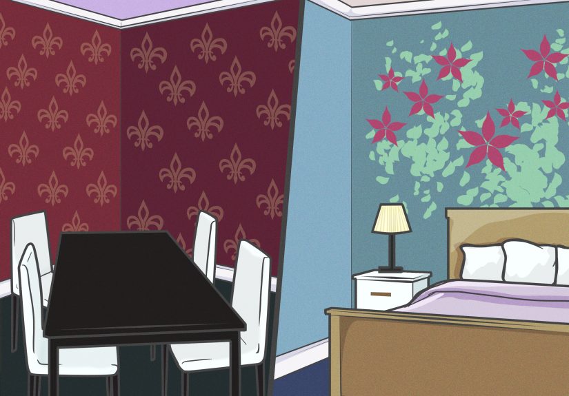
4) Color Blocking (Big Shapes, Big Style, Very Little Fuss)
Color blocking is exactly what it sounds like: bold, simple shapesrectangles, half walls, diagonal divides, or chunky framespainted in contrasting colors. It’s modern, graphic, and ideal for anyone who wants impact without painting a 600-petal mural.
Where color blocking shines
- Behind a headboard (paint a “giant headboard” shape)
- Dining rooms (create an architectural “panel” illusion)
- Kids’ rooms (playful without cartoon characters)
How to do it
- Choose your shape: A tall rectangle behind a bed, a half-wall line at chair-rail height, or a diagonal split.
- Mark lines with a level: Long level = straighter lines = less crying later.
- Tape carefully: Press edges firmly; consider delicate-surface tape if your base coat is fresh.
- Paint away from the tape edge: Roll from the tape toward the open area to reduce forcing paint underneath.
- Peel tape slowly: 45-degree angle, controlled pull, optional scoring if paint wants to tear.
Design example
Paint a “frame” around a gallery wall: a large rectangle in a deeper shade than the wall color. Hang your art inside the painted shape. The whole arrangement looks curatedeven if you just eyeballed the spacing and hoped for the best.
5) Painted Arch (Soft, Trendy, and Easier Than It Looks)
The painted arch is popular for a reason: it adds shape without clutter, creates a focal point, and works with modern, boho, or classic styles. It’s basically the wall equivalent of good lighting.
How to draw an arch without fancy tools
- String compass method: Anchor a thumbtack at the arch’s center point, tie a string to a pencil, and draw a smooth curve.
- Trace a large round object: For smaller arches, use a hula hoop, trash can lid, or even a large mixing bowl.
Painting steps
- Find center and mark height: Decide how tall and wide you want the arch.
- Outline lightly in pencil: Adjust until it looks balanced.
- Tape the straight sides: Many DIYers tape the vertical edges and freehand the curve with a smaller brush (less tape wrestling).
- Cut in the curve: Use an angled brush, slow strokes, and keep a damp rag nearby for tiny oops moments.
- Fill with a mini roller: Roll inside the arch for smooth coverage.
Design example
Create a reading nook: paint an arch behind a chair in a calm color (dusty blue, muted clay, olive). Add a sconce or floor lamp. Now your chair looks like it has a purpose besides being a laundry valet.
6) Sponge, Rag Roll, or Soft Faux Finish (Texture That Feels Cozy, Not Chaotic)
If flat paint feels a little “builder basic,” a soft faux finish can add depthespecially in bedrooms, dining rooms, or accent walls. The key is subtlety: you want “gentle texture,” not “2003 Tuscan restaurant.”
Option A: Sponge painting (easy, controlled, great for beginners)
- Base coat first: Let it dry fully.
- Mix top color with glaze: A glaze slows drying and helps you blend.
- Dampen a natural sea sponge: Never use it bone-dryit grabs paint unevenly.
- Dip, offload, dab: Lightly tap in a random pattern. Rotate the sponge to avoid repeating shapes.
Option B: Rag rolling (fast, organic, very forgiving)
- After base coat dries: Dip a rag into your accent paint (or glaze mix), wring out excess, wad it up.
- Roll the rag along the wall: Change direction for a natural, non-repeating pattern.
- Experiment with fabric: Cheesecloth, linen, burlapeach leaves a different texture.
Design example
In a dining room: do a warm greige base with a slightly deeper glaze dabbed in with a sponge. The result reads “soft plaster” in photos, and it hides minor wall imperfections like a champ.
Troubleshooting: The “Why Did My Wall Do That?” Section
My tape bled and the line looks fuzzy
- Press tape edges down firmly (credit card/putty knife).
- Use lighter coats and paint away from the tape edge.
- Seal tape with base color before your design color.
My tape pulled off the paint underneath
- Let the base coat cure longer (overnight is often safer than “a few hours”).
- Use delicate-surface painter’s tape on fresh paint.
- Remove tape slowly at a 45-degree angle; score if it resists.
My stencil looks blotchy
- Use less paint (seriouslyless than you think).
- Stipple instead of brushing side-to-side.
- Make sure the stencil is tight to the wall (repositionable adhesive helps).
Conclusion: Pick One Wall, One Method, and Let It Be Fun
Painted wall designs are one of the best “bang-for-your-buck” upgrades you can do in a weekend. If you’re nervous, start small: a painted arch behind a chair, a simple color block behind a desk, or stripes in a powder room. The goal isn’t perfectionit’s personality.
Experiences & Lessons Learned (So You Don’t Have to Learn Them the Hard Way)
Here’s the honest truth about painting designs on walls: the painting part is rarely the hard part. The hard part is everything around it deciding on the layout, keeping your lines crisp, and resisting the urge to “just tweak it” until your geometric pattern turns into modern art you didn’t order. After seeing a lot of DIY walls (and helping fix a few), a handful of real-world lessons show up again and again.
First: your wall is not as straight as you think it is. The ceiling line? Sometimes it’s slightly off. Corners? Often not perfectly square. Baseboards? They may dip and rise like they’re telling a story. That’s why a level becomes your best tool for stripes and color blocking. The first time you rely on “it looks straight,” you’ll step back and realize your stripe is slowly migrating toward the ceiling like it’s trying to escape. When in doubt, make your pattern straight and let the house be the weird one. You’ll be happier.
Second: tape is a tool, not a magic spell. People slap tape on like they’re sealing a snack bag and then wonder why paint sneaks underneath. The difference between crisp lines and fuzzy ones is usually boring: press the edge down firmly and use thin coats. If you want to feel like a painting wizard, seal the tape edge with the base color firstthen do your design color. That one extra step has rescued more stripes and triangles than we can count.
Third: dry time is not a suggestion. It’s tempting to rushespecially when you’re excited and the room already looks better. But if you tape over a base coat that’s only “kinda dry,” you risk pulling up paint, leaving gummy edges, or creating a texture line where the tape sat. The real flex is patience: paint base coat, wait overnight, then tape and design the next day. Your future self will be smugand smug is a wonderful emotion in home improvement.
Fourth: the best designs have breathing room. A common beginner mistake is trying to fill the whole wall with pattern. Stencils look incredible, but a full-room stencil can feel visually loud unless you keep it tone-on-tone or limit it to one accent wall. The same goes for geometrics: one strong feature wall often looks more expensive than four busy walls competing for attention. If you’re unsure, do the design behind a focal point (bed, sofa, desk) and keep the other walls calmer.
Fifth: touch-ups are easier if you keep your paint labeled and sealed. This sounds obvious until you’re holding a brush six months later thinking, “Was this ‘Warm White’ or ‘Soft White’?” Write the color name, sheen, and room on the can lid with a marker. Put a little paint in an airtight jar for quick fixes. Designsespecially stripes and taped shapessometimes need a tiny cleanup line after the tape comes off. Having the right paint on hand makes that a two-minute task instead of a “guess-and-regret” situation.
Finally: your first wall is practiceand that’s okay. If you’ve never done an ombré blend, your first pass might look a little harsh. If you’ve never stenciled, the first few repeats might feel awkward. That’s normal. Start with a smaller, lower-stakes wall (a hallway nook, a powder room, a guest room accent) and treat it like learning to cook a new recipe: the second time is always better, and the third time you’ll be giving advice like you’ve been doing it for years.
If you take anything from these experiences, take this: pick a design you genuinely like, prep like you mean it, go slow on the crisp edges, and stop when it looks goodeven if you’re tempted to keep “improving” it at midnight. Walls don’t need perfection. They need intention. And maybe a little bit of courage.