Table of Contents >> Show >> Hide
- Why Fall Colors Never Really Go Out of Style
- The Fall Color Palette Everyone Is Craving
- How to Use Fall Colors Without Making Everything Look Overdone
- Fall Colors Beyond the Living Room
- Why We Keep Coming Back to These Colors
- Experiences With Fall Colors: Why This Seasonal Obsession Feels So Personal
- Conclusion
Every year, fall arrives like it knows exactly what it’s doing. The air gets sharper, coffee orders become suspiciously cinnamon-forward, and suddenly everyone is acting like they personally discovered the color rust. But this year’s obsession with fall colors feels a little more interesting than the usual pumpkin-and-plaid routine. It is richer, moodier, more layered, and honestly, a lot more stylish.
Instead of treating autumn like a three-month orange commercial, designers, decorators, and color experts are leaning into a broader palette that feels grounded, elegant, and lived-in. Think chocolate brown instead of flat beige. Think aubergine instead of basic purple. Think mossy green, deep blue, scarlet, clay, amber, and creamy warm neutrals that make a room, an outfit, or even a dinner table look like it has its life together.
That is the real magic of fall colors: they are emotional. They make spaces feel softer, wardrobes feel smarter, and everyday routines feel a little less ordinary. Whether you are refreshing your home, rethinking your closet, or just wondering why you suddenly want everything in olive green, here is why fall colors are having a major moment right now.
Why Fall Colors Never Really Go Out of Style
Autumn shades have staying power because they do two things at once: they feel seasonal and timeless. Bright summer colors tend to shout. Spring pastels can flirt a little too hard with sweetness. But a strong fall color palette speaks in a lower, more confident voice. It is warm without being loud. Cozy without being lazy. Familiar without feeling stale.
Part of the appeal comes from nature. Fall colors echo changing leaves, bark, dried grasses, ripe fruit, moody skies, and golden afternoon light. That built-in connection to the natural world is why autumn colors feel so satisfying in interiors and fashion alike. They read as comforting because we have been wired to respond to them for a very long time.
There is also a practical reason people love them. Fall shades play well with texture. A brown wall looks better when paired with linen, wool, leather, wood, stone, or brass. Burgundy feels richer in velvet than it ever could in a flat synthetic fabric. Olive green loves woven baskets, aged metals, and ceramics with a little personality. These colors do not just sit there and behave. They mingle. They develop character. They make your stuff look more expensive than it was, which is one of the noblest services a color can provide.
The Fall Color Palette Everyone Is Craving
1. Chocolate Brown and Mocha Tones
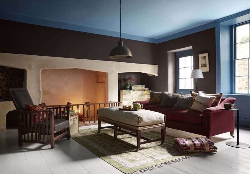
Brown has officially shaken off its old reputation as the color of forgotten offices and sad carpeting. Today’s version is deep, delicious, and confident. Chocolate brown, espresso, cocoa, and mocha are showing up everywhere because they make a space feel grounded. They also pair beautifully with cream, brass, black, dusty blue, and muted green.
In home decor, brown works especially well on accent walls, wood furniture, ceramics, throw blankets, and upholstered chairs. In fashion, it gives you the same versatility as black but with more warmth and personality. A brown knit sweater, suede boots, or structured coat instantly looks autumn-ready without trying too hard.
2. Aubergine, Plum, and Other Moody Purples
If orange is fall’s extrovert, plum is its mysterious friend with great taste in candles. Deep purple shades bring drama, but they also feel surprisingly refined. Used well, aubergine can make a room feel cocoon-like and luxurious. In a wardrobe, it can replace basic black for an outfit that feels richer and more interesting.
This shade works best when balanced. Pair it with warm woods, creamy neutrals, or muted gold accents so it feels elegant rather than overly theatrical. A plum velvet pillow, an eggplant-painted powder room, or a dark berry scarf can all deliver that moody seasonal energy without making your life feel like a haunted manor.
3. Olive, Moss, and Murky Greens
Green remains one of the smartest seasonal color trends for fall because it keeps the palette connected to nature while avoiding cliché. Olive, sage, moss, and muddier forest greens feel restorative and subtle. They can be rustic, modern, or classic depending on what you pair them with.
In interiors, these greens work beautifully in kitchens, entryways, and living rooms. They soften hard edges and play nicely with wood tones, stone, warm whites, and black accents. In clothing, they are incredibly wearable. Olive trousers, a moss jacket, or a muted green bag can act almost like a neutral while still adding color.
4. Deep Blue as the Unexpected Fall Hero
Blue may not be the first shade people associate with crunchy leaves and apple picking, but that is exactly why it feels fresh. Navy, lapis, ink, and blue-green jewel tones add depth to a fall palette without making everything lean brown or red. Blue also creates contrast. It gives the eye a cooler note among all the warmth, which keeps the whole look from feeling too predictable.
A deep blue sofa, table runner, lamp base, or front door can make traditional fall decor colors feel more elevated. In wardrobes, dark denim, navy wool, and sapphire accessories play especially well with camel, rust, ivory, and burgundy.
5. Wine Red, Rust, and Scarlet
Some colors simply smell like fall even when they do not have a scent. Red wine, scarlet, clay, terracotta, rust, and cinnamon-adjacent shades belong in that category. They bring warmth and movement to a room, and they are ideal for smaller accents if you want impact without repainting your entire existence.
Use them in table linens, artwork, dried floral arrangements, candles, pillows, or even a single statement chair. In fashion, a burgundy bag or rust-colored knit can do more for an outfit than ten motivational podcasts.
6. Warm Neutrals and Buttery Softness
Perhaps the quietest shift in this year’s fall color palette is the move away from cold grays toward warmer neutrals. Think oat, sand, camel, cream, mushroom, and soft greige with warmth rather than chill. These shades give fall colors room to breathe. They are the backdrop that makes the bolder tones shine.
If your style is minimal, this is where you live. A room built on warm neutrals with touches of brown, green, and plum can feel deeply autumnal without ever becoming theme-y. It whispers fall instead of yelling it from the front porch with eight identical pumpkins.
How to Use Fall Colors Without Making Everything Look Overdone
The best thing about the current obsession with fall colors is that it rewards restraint. You do not need to drench every surface in burnt orange to make a seasonal point. In fact, the most beautiful spaces and outfits usually use fall color in layers.
Start With One Anchor Shade
Choose one color that sets the tone. Maybe it is chocolate brown for your living room, olive green for your kitchen, or burgundy for your wardrobe. Once you have that anchor, build around it with supporting tones and texture. This keeps the look intentional rather than chaotic.
Let Texture Do Half the Work
Fall is not only about hue. It is about feel. Linen, bouclé, wool, corduroy, leather, wood grain, ceramic glaze, and brushed metal all make colors look better. A simple camel pillow becomes more interesting in chunky knit. A moss green wall feels richer beside matte black hardware and natural oak. If the color is the melody, the texture is the bass line.
Use Nature as Your Stylist
One of the easiest ways to bring in cozy color palette energy is to borrow from the outdoors. Branches with leaves, dried grasses, pears, figs, pomegranates, late-season flowers, seed pods, and weathered wood all carry natural fall color. They also make styling feel less artificial.
Think in Small Swaps
You do not need a renovation to enjoy fall colors. A table runner, new pillow covers, a throw blanket, candles, art prints, placemats, mugs, or a front-door wreath can shift the mood quickly. In your closet, a scarf, bag, loafers, cardigan, or lip color can accomplish the same thing. Seasonal style works best when it feels easy.
Fall Colors Beyond the Living Room
It is tempting to think of fall colors as strictly a home decor issue, but that is way too limiting for a palette this good. These shades show up beautifully across daily life.
In fashion, fall colors flatter almost everyone because they contain depth. Camel, olive, burgundy, chocolate, and navy can be styled in countless ways and mixed with classics you already own. They feel polished, but they are also forgiving. Coffee spill on a cream silk blouse? Tragic. Coffee spill on a mocha sweater? Suddenly it is a textural moment.
In entertaining, fall palettes shine on the table. Mix amber glassware with linen napkins in rust or olive, then add candles, fruit, and branches for a centerpiece that looks generous without being fussy. A good fall table should feel like someone thought about it but also still plans to eat at it.
In beauty, autumn shades invite a softer kind of drama. Berry lips, bronze eyes, warm blush, espresso nails, and muted terracotta tones all echo the season without looking costume-y. The overall effect is richer, not louder.
Even in digital spaces, fall colors work. Website banners, social graphics, newsletters, and branding elements feel more tactile and human when they borrow from a warm, earthy palette instead of generic bright templates. If a brand wants to feel thoughtful, seasonal, and slightly elevated, fall shades are basically free therapy.
Why We Keep Coming Back to These Colors
At a deeper level, the obsession with autumn colors is really an obsession with atmosphere. These shades help us create environments that feel calmer, warmer, and more intentional. They slow things down. They invite us to stay in the room, keep the sweater on, light the candle, set the table, and maybe text back a little more thoughtfully.
That emotional pull matters. In a world full of bright notifications and endless scroll, fall decor colors offer relief. They feel rooted. They suggest rituals. They remind us that not every good thing has to be shiny and new. Some of the best things are earthy, familiar, slightly imperfect, and better with age. Like cast iron skillets. Or your favorite boots. Or that one cardigan you claim is too old to wear in public but somehow keep reaching for anyway.
Experiences With Fall Colors: Why This Seasonal Obsession Feels So Personal
There is something about fall colors that goes beyond trend reports and paint chips. They do not just decorate a season. They narrate it. The first time you notice a tree turning from green to amber, it feels less like a weather update and more like a soft announcement that life is shifting again. Suddenly, everything around you seems to get a little deeper. The sky looks more dramatic. Sidewalks feel cinematic. Even a routine grocery run can feel strangely poetic when the produce section is full of squash, apples, and flowers in shades of rust and burgundy.
For many people, fall colors are tied to memory. Brown may remind you of an old leather chair in a grandparent’s home. Olive might bring back school jackets, camp trails, or favorite canvas bags. Burgundy could echo holiday dinners, lipstick from a first grown-up job, or the scarf you wore so often it practically became your personality. That emotional connection is part of why this palette lands so powerfully. These are not anonymous colors. They come with stories attached.
There is also the physical experience of living with them. Warm shades tend to make spaces feel intimate. A room with cream walls, dark wood, and touches of plum or moss feels quieter than one filled with stark white and chrome. You notice yourself lingering. You make tea instead of rushing out. You sit down with a blanket for “five minutes” and somehow emerge an hour later with a cold mug and a new attachment to your couch. Fall colors have that effect. They gently encourage nesting behavior without ever using the word nesting, which is good, because that word can get weird fast.
Even getting dressed feels different during this season. Summer style is often about surviving heat while pretending linen wrinkles are part of the plan. Fall style is more strategic, and a lot more fun. Layering a camel coat over a navy sweater, adding a burgundy bag, or swapping bright sneakers for deep brown boots can make ordinary clothes feel deliberate. The colors do so much of the work that the rest can stay simple.
What makes the experience especially satisfying is that fall colors do not demand perfection. They actually look better with a little softness and age. Scuffed wood, worn leather, vintage brass, dried leaves, handmade ceramics, and slightly faded textiles all belong here. That gives the season a lived-in charm. It invites real life into the aesthetic instead of insisting everything look untouched.
Maybe that is why people get a little obsessed. Fall colors make everyday life feel edited in the best way. They turn homes into retreats, outfits into statements, and ordinary routines into rituals. They remind us that beauty is not only found in big transformations. Sometimes it arrives as a plum pillow, a clay-colored mug, a branch in a vase, or the late-afternoon light hitting a brown wall just right. That is the genius of fall colors. They do not only change what we see. They change how a season feels.
Conclusion
The current obsession with fall colors is not about following a rigid formula. It is about choosing shades that feel warm, grounded, expressive, and easy to live with. From chocolate brown and aubergine to olive, deep blue, scarlet, and warm neutrals, today’s fall palette is broader and more sophisticated than the old orange-only stereotype. It works because it brings together comfort, texture, personality, and a strong connection to the natural world.
So whether you bring these colors into your home, your closet, your table, or your content strategy, the goal is the same: create something that feels layered, welcoming, and just a little bit irresistible. Fall, after all, is the season of beautiful overachieving. The colors are simply keeping up.