Table of Contents >> Show >> Hide
- What Color Is “Hay,” Really?
- How Hay Changes in Different Lighting
- The Finish Factor: Choosing the Right Farrow & Ball Finish for Hay
- Prep Like You Mean It: Primer, Undercoat, and the “Two-Coat Truth”
- Sampling Hay Without Losing Your Mind
- Where Hay Shines: Best Rooms and Use Cases
- Color Pairings: How to Style Hay Like You Know What You’re Doing
- Hay vs. Brighter Yellows: When to Choose It
- Common Mistakes (and How to Avoid Them)
- Three “Recipe” Looks Using Hay
- Final Thoughts: Is Hay Worth It?
- Real-World Experiences With Farrow & Ball’s Hay Paint (An Extra )
Some paint colors walk into a room and shout, “LOOK AT ME!” Hay walks in, pours you a cup of tea, and casually makes
your space feel calmer, warmer, and somehow more expensivewithout demanding applause. If you’ve been hunting for a
yellow that doesn’t read like a highlighter or a cartoon sun, Farrow & Ball’s Hay is the kind of
“quiet confidence” color that interior designers keep tucked up their sleeves.
In this deep-dive, we’ll break down what Hay actually looks like in real homes, why its undertones matter, which
finishes make it sing (or sulk), and how to pair it so it feels intentionalnot like you accidentally painted your
living room “butter mistake.” We’ll also add a practical, real-world experiences section at the end, because paint
is never just paintit’s lighting, prep, patience, and that one wall that refuses to behave.
What Color Is “Hay,” Really?
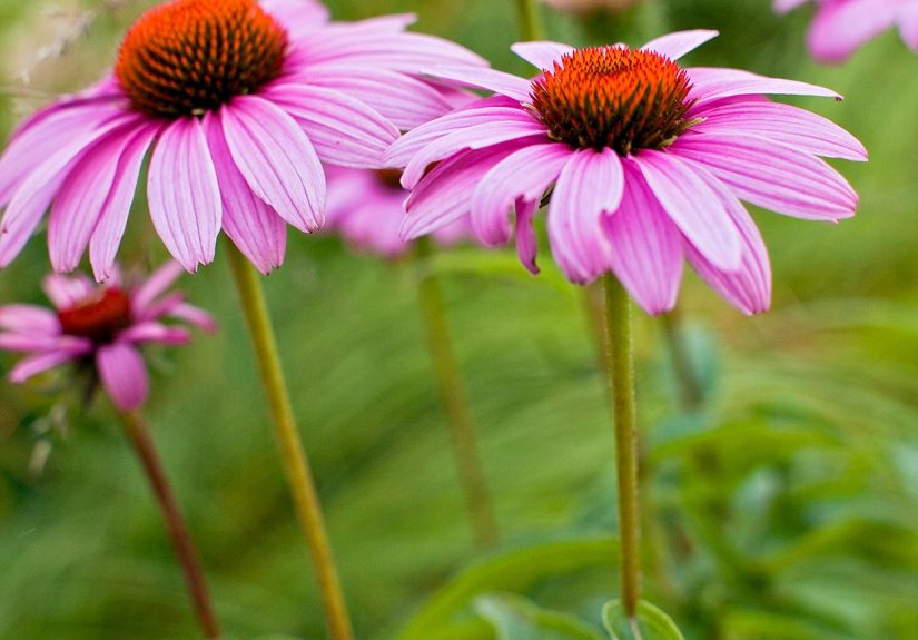
Hay (also known as Hay No. 37) is best described as a dusty, warm yellow with a
distinct green undertone. It’s intentionally less “sunny” than a cleaner, brighter yellow, which
is why it reads more grounded and lived-in. Think: dried grasses, vintage botanical prints, and late-afternoon light
hitting a linen tablecloth.
That green undertone is the secret sauce. It keeps the yellow from getting sugary or neon, and it’s a big reason Hay
can feel peaceful instead of peppy. In other words: it’s a yellow for people who don’t usually trust yellow.
Why the green undertone matters
Undertones are the “background notes” that show up depending on the room’s lighting and surrounding finishes.
A yellow with a green undertone will behave differently than a yellow with a red/orange undertoneespecially next to
wood, stone, and textiles. The result can range from softly earthy to slightly olive-leaning, which is great if you
want a cozy, established look (and not a room that feels like a lemon candy wrapper).
How Hay Changes in Different Lighting
Here’s the part nobody wants to hear, but everyone needs: paint is a shape-shifter. Hay is
especially sensitive to light because it sits in that nuanced zone between warm yellow and muted green. That means
the same can of paint can look “golden and gentle” in one room and “more earthy/green” in another.
Quick lighting read (the practical version)
-
North-facing rooms: Cooler, indirect light can pull the green undertone forward. Hay may look more
subdued and slightly more “herbal.” -
South-facing rooms: Warmer light tends to bring out Hay’s cozy yellow side, making it feel
sunnierbut still dusty, not electric. -
Evening + warm bulbs: Hay can glow warmly and feel more golden. If your bulbs are very warm, test
first to avoid going too “amber.” -
LEDs with cooler temperature: Cooler bulbs can emphasize the muted, greenish castsometimes in a
good, sophisticated way, sometimes in a “why does my yellow look like celery?” way.
The fix is simple and not glamorous: sample it, and sample it in multiple spots at multiple times of
day. Paint is a commitment, and unlike relationships, you can’t “change it later” without sanding your weekends away.
The Finish Factor: Choosing the Right Farrow & Ball Finish for Hay
Color gets the attention, but finish controls the vibe. The same shade can look softer, richer, or
more reflective depending on sheen and durability. Farrow & Ball offers finishes with different performance
profilesso picking the right one is how you keep Hay looking charming instead of looking like a scuffed-up regret.
Estate Emulsion: the classic “chalky-matte” look
If you want that signature velvety, heritage-style finish, Estate Emulsion is the go-to. It’s very matte and gives
walls that soft, almost powdery depth. It’s great for lower-traffic rooms where you want atmosphere: bedrooms,
formal living rooms, grown-up dining rooms (the kind where nobody eats spaghetti like an acrobat).
- Look: Very flat, chalky matte
- Best for: Low-to-moderate traffic walls
- Reality check: It’s wipeable, but not designed for heavy scrubbing
Modern Emulsion: the durable choice for busy homes
Modern Emulsion is where Hay turns practical. It’s still matte-ish, but with a bit more sheen (so light bounces a
touch more), and it’s built to handle scuffs, stains, and real life. If you’re painting a kitchen, hallway, mudroom,
or kids’ space, this finish is your “future self” decision.
- Look: Matte with a subtle sheen
- Best for: Kitchens, hallways, family rooms, bathrooms
- Bonus: Washable and wipeable, with added resistance to everyday mess
Dead Flat: the “stealth matte” upgrade
Dead Flat is for people who want a very matte look and a more hardwearing surface. It’s designed to be
washable and scuff resistant, while keeping an ultra-matte appearance from different viewing angles. It’s also
multi-surface, which opens the door to using Hay on trim, cabinetry, or even furniture for a more immersive look.
- Look: Ultra matte
- Best for: Walls + select woodwork/metal projects where you want low sheen
- Why it matters: Helps you keep the soft, chalky vibe without babying the walls
Prep Like You Mean It: Primer, Undercoat, and the “Two-Coat Truth”
Hay is a nuanced color. Nuanced colors love to expose rushed prep. If you want that rich, even finishespecially
with a dusty yellow that can be sensitive to patchinessprep is non-negotiable.
Use the recommended primer tone
Farrow & Ball recommends a Mid Tones primer/undercoat for Hay. That matters because the primer
influences color depth and coverage. Using the right base helps Hay read as intended (warm and dusty) rather than
thin, streaky, or unexpectedly dull.
The simple system that works
- One coat of the recommended primer/undercoat (tone-matched for the color family).
- Two coats of Hay as the topcoat for an even, saturated finish.
Also: don’t skip surface cleaning. Dust, grease (hello, kitchens), and mystery fingerprints will sabotage adhesion.
If you’ve ever watched paint “fish-eye” on a wall, you already know the pain.
Sampling Hay Without Losing Your Mind
Sampling isn’t optional for a green-undertone yellow. The most helpful approach is to test Hay on multiple walls
(or use pre-painted swatches) and live with it for a few days. Look at it in the morning, afternoon, and evening.
Then look again after you’ve turned on lamps, because lamp-light has opinions.
Pro sampling tips (that save money and emotional stability)
- Move the sample around: Don’t commit based on one corner. Hay can shift depending on exposure.
-
Compare it to a white: Put a white sample next to it. This helps you see if Hay is reading more
yellow or more green in your space. -
Check it near fixed elements: Cabinets, countertops, flooringthese “permanent roommates” will
affect what you see. -
Give it time: Your eyes adapt quickly. What looks bold on day one can look perfectly normal by day
three.
Where Hay Shines: Best Rooms and Use Cases
Hay is versatile because it’s muted. It’s warm without being loud, and earthy without going full “forest floor.”
Here are a few places it consistently works well:
Kitchens that feel warm (not theme-park yellow)
Hay can make kitchens feel sunlit even on gray days. Pair it with warm woods, aged brass, or creamy whites for a
classic look. If you’re worried about durability, choose a more hardwearing finish for easy wipe-downs.
Hallways and stairwells that need a friendly glow
Transitional spaces often have awkward light. Hay’s dusty quality can soften those spaces and make them feel
intentionallike you chose a “mood,” not just “a color that was on sale.”
Home offices that avoid sterile vibes
If pure white makes you feel like you’re working inside a blank Word document, Hay is a gentle alternative. It adds
warmth and focus without turning the room into a circus.
Bedrooms that feel calm and collected
Hay isn’t a sugary pastel. It reads more like a natural textile tone, which can make bedrooms feel relaxed and
groundedespecially with linen, soft greens, and natural wood.
Color Pairings: How to Style Hay Like You Know What You’re Doing
Hay plays nicely with a wide range of neutrals and muted colors. The key is to lean into its earthy undertone so the
room feels cohesive.
Whites and off-whites
Creamy or softly warm whites tend to complement Hay beautifully. Farrow & Ball often recommends pairing it with
softer whites for woodwork and trim to keep the look calm and established rather than stark.
Natural materials
- Wood: Oak, walnut, and pine all workjust watch very orange-toned stains, which can push Hay warmer.
- Stone: Warm limestone, travertine, and creamy quartz pair well with Hay’s dusty profile.
- Metals: Aged brass and antique bronze feel especially at home; matte black gives a sharper, modern contrast.
Accent colors that make sense
- Muted greens: Emphasize the undertone and create a relaxed, botanical vibe.
- Terracotta and clay tones: Add warmth and a “collected” feel, especially in older homes.
- Inky blues: Create contrast that feels classic, not trendy-for-five-minutes.
Hay vs. Brighter Yellows: When to Choose It
If you love the idea of yellow but hate the reality of yellow, Hay is your middle path. It’s specifically suited for:
- People who want warmth without “cheerleader energy.”
- Homes with lots of wood tones where a clean lemon yellow might clash.
- Spaces that need softness rather than high contrast.
- Rooms with mixed light where a strong yellow might look harsh.
If you want a punchier, cleaner yellow, you may prefer a brighter yellow family instead. But if you want “gentle,
lived-in warmth,” Hay earns its keep.
Common Mistakes (and How to Avoid Them)
1) Skipping the sample step
With a green-undertone yellow, sampling is the difference between “perfectly warm” and “unexpectedly swampy.”
Test it. Then test it again when your lamps are on.
2) Choosing the wrong finish for the room
A gorgeous matte wall finish in a high-traffic hallway can turn into a collection of scuffs and fingerprints.
Match the finish to your lifestyleespecially in kitchens and kid zones.
3) Ignoring the fixed elements
Hay will react to nearby colors: floors, countertops, tile, rugs. If your floor is very cool gray, Hay can look more
green by comparison. If your floor is orange-toned wood, Hay can look warmer and deeper. Always compare.
4) Rushing prep
Dusty yellows can show unevenness more than you’d expect. Clean, patch, sand, primethen paint. It’s boring, but so
is repainting.
Three “Recipe” Looks Using Hay
The relaxed, sun-warmed kitchen
- Walls: Hay
- Trim: Soft warm white
- Hardware: Aged brass
- Style notes: Add natural wood stools, creamy ceramics, and a green plant or two (or ten).
The quiet cottage office
- Walls: Hay
- Accents: Muted greens and warm neutrals
- Style notes: Linen curtains + a darker desk for contrast. Instant “I read books on purpose” energy.
The modern, earthy hallway
- Walls: Hay
- Trim/doors: A crisp but not icy white
- Style notes: Add black metal accents and a textured runner to keep it contemporary.
Final Thoughts: Is Hay Worth It?
If you’re after a yellow that feels grown-upwarm, dusty, calm, and a little bit nostalgicHay is a strong
contender. The trick is to respect its undertone, sample it in your lighting, and choose a finish that matches how
your home actually functions (not how it behaves in your imagination after you reorganize your pantry and become a
new person).
Done right, Farrow & Ball’s Hay can look like it’s always belonged in your spacelike the room finally exhaled.
Real-World Experiences With Farrow & Ball’s Hay Paint (An Extra )
People’s experiences with Hay tend to follow a familiar storyline: curiosity, cautious sampling, a brief moment of
panic, and then a surprisingly satisfying “oh… this actually works” ending. That’s because Hay is not a loud yellow.
When you first brush it onto a white wall, it can look a bit deeper and greener than expectedespecially if your
sample is surrounded by bright white paint that makes everything else look more saturated. This is the phase where
many folks stand back, squint, and wonder if they’ve accidentally painted their wall “antique mustard soup.”
Then the light changes. Morning arrives, and Hay can suddenly read warm and soft. Afternoon light may make it feel
quietly sunny. Evening lamps can push it into a cozy golden glow that looks especially good with warm wood and
textured fabrics. In homes with cooler daylight (north-facing rooms or lots of shade), Hay’s green undertone becomes
more obviousbut often in a way that feels natural rather than weird. Instead of “yellow,” it becomes “earthy,” like
a color you’d find in a vintage tapestry or a botanical illustration. Many people find that this is exactly what they
wanted: warmth without the cartoon effect.
Another common experience is realizing that finish matters more than expected. In a calmer roomsay,
a bedroom or sitting roompeople tend to love a super matte look because it makes Hay feel softer and more
old-world. But in real family spaces, the first week can be a crash course in durability. Hallways collect scuffs.
Kitchens collect splatters (even if you swear you’re a careful cook). If you choose a delicate-looking matte finish
in a high-traffic zone, you might find yourself wiping marks with the tenderness of a museum curator, whispering,
“Please don’t come off, please don’t come off.” The more durable finishes tend to relieve that stress, letting Hay
keep its beauty without requiring you to live like a paint-protecting monk.
Sampling experiences also tend to be educational. Many homeowners try Hay because they want “a warm neutral with some
personality,” and then discover that personality depends on what’s nearby. Next to cool gray tile, Hay can look more
green (the gray makes the warmth stand out). Next to honey oak floors, Hay can look more golden (the wood pushes the
warmth forward). Next to bright white trim, Hay can look deeper and more saturated; next to a softer white, it looks
calmer and more blended. The typical takeaway: Hay isn’t difficult, but it is honestit will react to your home’s
existing palette.
Finally, one of the most consistent “real-life” reactions is that Hay photographs better than people expect. Many
yellows blow out in photos or read too intense, but Hay’s dusty quality keeps it grounded. It tends to look
intentional on camerawarm, soft, and a little elevatedespecially when styled with natural textures (linen,
cane/rattan, wood, pottery) and a restrained accent palette. In other words, Hay often delivers that rare combo:
it’s pleasing in person, forgiving across lighting shifts, and still looks great in a quick phone photono filters,
no drama, no existential paint crisis required.