Table of Contents >> Show >> Hide
- Why the Mercator Map Became the Default (and Why It Won’t Die)
- The Problem Africa Is Calling Out: “Correct The Map” and the African Union
- The Proposed Replacement: Meet the Equal Earth Projection
- But WaitDon’t We Already Have Other “Better” World Maps?
- Why This Is Bigger Than Geography Class
- The Pushback: Why Some Defend Mercator (and Why They’re Not Totally Wrong)
- What Would Actually Change If the World Switched Maps?
- How to Talk About Map Projections Without Starting a Thanksgiving Argument
- Conclusion: A New Default Is About Accuracyand Agency
- Extra: of “Been There” Map Experiences (That You’ll Probably Recognize)
If you’ve ever stared at a classroom wall map and thought, “Wow, Greenland is basically the final boss of continents,”
congratulationsyou’ve met the Mercator projection. It’s the world’s most famous flat map, and it’s been quietly
messing with our sense of scale since the 1500s. Now, a growing movement backed by the African Union is saying:
enough with the cartographic cosplay. Africa wants the world to retire Mercator for everyday use and adopt a map
projection that shows the continent closer to its true size.
This isn’t a petty fight over paper. Maps shape how we learn geography, how we imagine power, and how we mentally
“rank” places. When the world’s second-largest continent looks “smaller” than it really is, that distortion can
spill into culture, education, media, and even policy conversations. The campaign’s message is simple:
represent the planet fairlystarting with the visuals we treat as fact.
Why the Mercator Map Became the Default (and Why It Won’t Die)
The Mercator projection became famous for one big reason: it’s a navigation superhero. Designed for sailors,
it preserves angles and directions. Draw a straight line on a Mercator map, follow that compass bearing, and
you can travel a consistent direction (a “rhumb line”). For the age of seafaring empiresand later, for a lot of
modern mapping systemsthis was extremely useful.
That practical advantage turned Mercator into a cultural icon. It’s familiar, rectangular, and easy to print.
And because people like “easy,” it migrated from nautical charts into textbooks, news graphics, office posters,
and early web maps. In other words: Mercator didn’t just become a map. It became the map.
Mercator’s Trade-Off: What It Preserves, What It Distorts
Every world map is a compromise because Earth is a sphere-ish object and paper is aggressively flat. Mercator’s
compromise is area. It dramatically enlarges places closer to the poles and shrinks regions nearer the equator.
That’s why Greenland can appear comparable to Africa on many Mercator mapseven though Africa is vastly larger
in reality.
Think of it like taking a selfie with a wide-angle lens… and then insisting it’s a passport photo.
The lens isn’t “lying”; it’s just doing a job it was designed to do. The problem is when we use it as a universal
truth-teller.
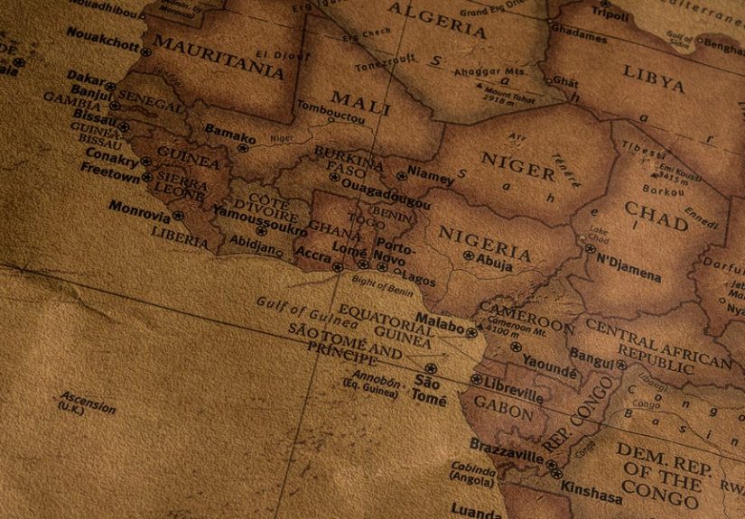
The Problem Africa Is Calling Out: “Correct The Map” and the African Union
In 2025, the African Union publicly backed a push to replace the Mercator projection for general-purpose world maps.
The campaignoften described under the banner “Correct The Map”argues that the Mercator map’s distortions have
helped normalize a misleading visual hierarchy: large-looking northern regions, diminished-looking equatorial ones,
with Africa consistently shortchanged.
The argument isn’t “Mercator is evil.” It’s “Mercator is overused.” If your goal is teaching students the relative
size of continents, or presenting a global overview in media, a projection that inflates polar areas and deflates
equatorial ones is like using a funhouse mirror to teach anatomy.
What Does “True Size of Africa” Really Mean?
Africa is enormousabout 30.3 million square kilometers. One of the most shareable reality checks is that Africa is
roughly 14 times larger than Greenland. It’s also about three times larger than Canada or the United States. These
comparisons aren’t trivia; they highlight how a common map can overwrite our mental model of the planet.
And mental models matter. If a continent is visually minimized, it can feel psychologically “farther away,” less central,
less consequentialeven when the facts (population, resources, markets, geopolitics, culture) say otherwise.
The Proposed Replacement: Meet the Equal Earth Projection
So what does Africa (and its supporters) want instead? A leading candidate is the Equal Earth projection,
a newer world map design introduced in 2018. Equal Earth is an equal-area projection, meaning it keeps
landmasses proportional in sizeso Africa looks like Africa, not a continent on a diet.
Equal Earth was created to balance fairness and aesthetics. The older equal-area celebrity, the Gall-Peters projection,
fixes area distortion but can make continents look stretched in ways that people find jarring. Equal Earth aims to keep
areas accurate while maintaining a visually pleasing, familiar “world map” vibe (curved edges, a globe-like silhouette,
and shapes that don’t feel like they went through a taffy puller).
Why Equal Earth Gets Attention (Beyond the Name)
- Equal area: continents and countries appear at their correct relative sizes.
- Readable design: it avoids the extreme stretching that turns some equal-area maps into geometry memes.
- Practical adoption: it’s been used by major scientific and institutional mapmakers for certain kinds of global visuals.
Importantly, “Equal Earth” isn’t trying to win the impossible prize of “perfect map.” It’s trying to be the best
all-around choice for the job many people mistakenly assign to Mercator: communicating global proportions.
But WaitDon’t We Already Have Other “Better” World Maps?
Yes. And that’s kind of the point: we have options. For example, the National Geographic Society famously adopted
the Winkel Tripel projection for many general-purpose world maps because it balances different distortions in a way
that looks “about right” to the eye. Other compromise projections (like Robinson) have long been used for education
and reference maps because they aim to reduce overall distortion rather than optimize one property.
The “replace Mercator” conversation isn’t saying there’s a single perfect successor. It’s saying the default should be
chosen based on the most common use case. For most people, most of the time, the use case is not plotting a nautical
course across the Atlantic like it’s 1569. It’s understanding the world.
Why This Is Bigger Than Geography Class
Campaigners emphasize that maps don’t just show the world; they tell a story about it. If the story consistently makes
some regions look huge and others look small, it can subtly reinforce old narratives about importance and centrality.
That’s why the effort is often described as part of a broader “decolonizing” push in education and representation.
This doesn’t mean a different map projection magically fixes inequality. But visuals are powerful. If your first impression
of the planet is built on a distortion, you start life with a bias you didn’t choose. Correcting that doesn’t solve everything,
but it’s an honest start.
Specific Examples of Where Mercator Distortion Shows Up
- Textbooks and classroom wall maps: where students form their earliest mental model of global size and distance.
- News graphics: where a “world map background” is used for everything from elections to economics.
- Digital basemaps: where some web mapping systems rely on Mercator-like projections for technical reasons, even when area accuracy matters.
- Corporate and NGO dashboards: where global data is mapped and viewers infer “weight” from visual scale.
The Pushback: Why Some Defend Mercator (and Why They’re Not Totally Wrong)
Defenders of Mercator aren’t cartoon villains twirling mustaches over a globe. Many are cartographers, engineers,
and GIS professionals who point out something true: Mercator is extremely useful for certain tasks. It preserves angles,
it’s mathematically convenient, and it plays nicely with some mapping workflows.
Also true: every projection distorts something. If you fix area, you distort shape. If you protect shape, you distort area.
If you minimize overall distortion, you accept that nothing is “perfect” anywhere. That’s cartography’s permanent reality.
The Reality Check: “Replace” Doesn’t Mean “Erase”
The healthiest version of this movement is not “ban Mercator.” It’s “stop using Mercator when it’s the wrong tool.”
Keep Mercator where it excels (navigation, certain web mapping contexts). But for general world reference maps and
educational materials about relative size, switch the default to something that doesn’t shrink the equator and inflate the poles.
In other words, it’s like saying: stop using a butter knife as a screwdriver. The butter knife isn’t “bad.” It’s just tired.
What Would Actually Change If the World Switched Maps?
A projection change won’t move mountains or rewrite borders. But it can change perception, and perception shapes behavior.
Here are realistic, concrete shifts you might expect if Equal Earth (or another equal-area/low-distortion alternative) became the standard:
1) Education gets a quieter, cleaner foundation
Students would grow up seeing Africa, South America, and Southeast Asia at more accurate relative scales. That doesn’t “teach politics.”
It teaches geometry honestly.
2) Media visuals become less biased by default
When a newsroom uses a world map backdrop, it’s sending a signalintentionally or notabout prominence. A fairer default reduces accidental
messaging baked into the background image.
3) Data storytelling improves
If you’re mapping land-based phenomena (deforestation, rainfall, population distribution, crop yields), an equal-area projection can prevent
viewers from overestimating high-latitude regions simply because they look huge.
4) People stop being surprised by basic geography
The internet is full of “Wait, Africa is THAT big?!” moments. Switching defaults won’t end those, but it will make them less commonand
less embarrassing for adults who swear they passed geography.
How to Talk About Map Projections Without Starting a Thanksgiving Argument
Here’s a simple way to explain this without turning it into a cultural cage match:
maps are tools. A hammer is great for nails. Terrible for soup. Mercator is great for navigation.
Terrible for teaching relative area. Equal Earth is great for showing proportional landmass. Less ideal for certain direction-based tasks.
No single map does everything.
A Better Classroom and Newsroom Rule
- If the goal is direction: consider Mercator (or other conformal projections).
- If the goal is size comparison: use an equal-area projection (like Equal Earth).
- If the goal is general reference: use a balanced, low-distortion compromise (Winkel Tripel, Robinson, or similar).
- If the goal is “the truth”: use a globeor multiple maps with labels that explain the trade-offs.
Conclusion: A New Default Is About Accuracyand Agency
Africa’s push to replace the world’s most famous map is a reminder that what feels “normal” is often just what we inherited.
The Mercator projection helped sailors cross oceans, but it also quietly trained generations to underestimate equatorial regionsespecially Africa.
Backed by the African Union, the “Correct The Map” movement is asking institutions to adopt more accurate projections, with Equal Earth often
highlighted as a strong candidate.
You don’t have to throw Mercator into the sea. But you can stop hanging it in every classroom like it’s the one true face of Earth.
Sometimes progress looks like a new technology. Sometimes it looks like a better picture of what’s been in front of us the whole time.
Extra: of “Been There” Map Experiences (That You’ll Probably Recognize)
If you want to understand why this debate has legs, you don’t need a PhD in cartographyyou just need to remember your first world map.
For a lot of people, that moment happened in a classroom where the map was basically a rectangle with a giant Greenland hovering near the top
like an ice-powered continent boss. No teacher stood up and said, “By the way, this map is lying to you for navigation reasons.” The map just
sat there, innocent as a poster, quietly installing its worldview into your brain.
Then comes the classic adult shock: you see a “true size” overlay online and suddenly realize Africa can swallow multiple large countries like
it’s playing geographical Pac-Man. People react the same way every time: disbelief, followed by a suspicious squint, followed by anger at their
ninth-grade social studies teacher (who, to be fair, was already overwhelmed and probably just wanted everyone to stop throwing erasers).
Another familiar experience happens in the workplace. Someone builds a dashboard with a world map background and pins data points across regions.
The high-latitude areas look massive, so viewers subconsciously assign them extra weighteven if the numbers don’t support it. You can almost
hear the meeting narration: “Look at how huge that region is,” as if land area itself is a KPI. Switch the projection and suddenly the visual
story feels different. Same data. Different emotional impact. That’s the power of the basemap.
Travel planning gives you a third “aha.” On a Mercator-style map, Europe looks comfortably sized and close together, while parts of Africa can
feel visually “smaller” and strangely faruntil you start checking flight times and realize the continent is not a side quest. The geography is
real, but your mental model was built on a distorted image. It’s like thinking you can walk across a city because it looks tiny on your phone,
then discovering your legs have filed a formal complaint.
And if you’ve ever watched kids learn geography, you’ll recognize how quickly maps become identity. Students don’t just memorize places; they
internalize what looks central, what looks peripheral, what looks “big,” and what looks “small.” When a child opens a textbook and sees Africa
represented closer to its true scale, it doesn’t magically rewrite historybut it can quietly adjust what “normal” looks like. It makes it harder
for a distorted picture to masquerade as a fact of nature.
That’s why “replace the famous map” resonates. It’s not only a technical debate about projections; it’s a shared human experience of realizing that
the image you trusted most was a compromise you were never told you were making. And once you see that, it’s hard to unsee it.