Table of Contents >> Show >> Hide
- Why Yellow Is One of the Best Colors for Your Home
- The Best Yellow Shades for Different Rooms
- How Light Changes Yellow Paint
- Best Colors to Pair With Yellow
- Where Yellow Works Best in Home Design
- Common Mistakes When Decorating With Yellow
- How to Choose the Right Yellow Paint Color
- Best Design Styles for Yellow
- Experience-Based Tips for Using Yellow at Home
- Conclusion
Yellow is the color equivalent of opening the curtains on a sunny morning. It is cheerful, warm, optimistic, and just a little bit boldlike a houseguest who brings fresh muffins and compliments your backsplash. But yellow is also one of the trickiest colors to use well at home. Choose the right shade, and your room feels fresh, welcoming, and full of personality. Choose the wrong one, and suddenly your hallway looks like a school bus got ambitious.
The good news? Yellow is incredibly versatile when handled with care. From soft buttercream walls to golden kitchen cabinets, mustard accents, pale straw bedrooms, and sunny front doors, yellow can work in almost every area of the home. The secret is knowing how light, undertones, room function, furniture, flooring, and trim colors affect the final look.
This guide explores the best ways to decorate with yellow, where it works beautifully, where to use it carefully, and how to choose a shade that feels stylish instead of shocking. Whether you want a happy kitchen, a cozy reading nook, a bright laundry room, or a front door that says “nice people live here,” yellow may be exactly the color your home has been waiting for.
Why Yellow Is One of the Best Colors for Your Home
Yellow has a unique ability to change the mood of a room. It reflects light, adds warmth, and creates a sense of energy without always needing to be loud. A soft yellow can feel calm and nostalgic, while a saturated marigold can make a space feel artistic and confident. In home design, yellow often works best when it is treated less like a novelty and more like a serious design tool.
Many homeowners avoid yellow because they remember overly bright walls from decades past. But modern yellow paint colors are much more nuanced. Today’s best yellows include creamy butter tones, muted ochre, warm straw, deep mustard, honey gold, and earthy turmeric. These shades bring character without shouting across the room like a decorative megaphone.
Yellow Makes Rooms Feel Brighter
One of yellow’s biggest strengths is its light-reflecting quality. Pale yellow walls can help brighten rooms that lack natural light, such as laundry rooms, basements, narrow hallways, and interior bathrooms. Unlike stark white, which can look flat in low light, a gentle yellow adds warmth and softness.
This does not mean every dark room needs lemon-yellow walls. In fact, too much brightness can backfire. For windowless spaces, look for soft, creamy yellows with warm undertones. They create a glow without making the room feel artificial.
Yellow Feels Welcoming
Yellow naturally suggests hospitality. It is associated with sunshine, fresh flowers, ripe fruit, and cozy kitchens. That makes it an excellent choice for entryways, breakfast nooks, dining areas, and family rooms. A yellow accent can make guests feel like they have stepped into a home that knows how to laugh at spilled coffee.
Yellow Adds Personality Without a Full Renovation
If your home feels safe but sleepy, yellow can wake it up. You do not need to paint every wall. Yellow works beautifully on a front door, powder room vanity, kitchen island, built-in bookcase, ceiling, or even a single accent wall. It is one of the easiest ways to make a neutral home feel more personal.
The Best Yellow Shades for Different Rooms
Not all yellows behave the same way. Some are creamy and quiet. Some are earthy and sophisticated. Some are so bright they practically ask for sunglasses. The best yellow paint color depends on the room, the natural light, and the feeling you want to create.
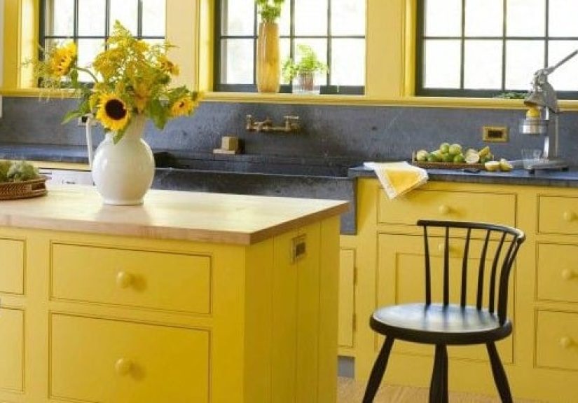
Soft Butter Yellow for Kitchens
Butter yellow is one of the most popular yellow shades for kitchens because it feels warm, clean, and timeless. It pairs beautifully with white cabinets, butcher block counters, brass hardware, marble, cream tile, and natural wood floors.
A butter yellow kitchen feels cheerful in the morning and cozy in the evening. It can lean cottage, traditional, farmhouse, vintage, or even modern depending on the surrounding finishes. For a subtle look, use butter yellow on walls. For a more memorable design, try it on lower cabinets or a kitchen island.
Mustard Yellow for Living Rooms
Mustard yellow is deeper, moodier, and more grown-up than bright lemon. It works especially well in living rooms with dark wood, leather furniture, navy accents, olive green, charcoal, or warm white trim. If pale yellow is sunshine, mustard is candlelight with better taste.
Use mustard yellow when you want a room to feel collected and layered. It looks excellent in velvet pillows, area rugs, accent chairs, drapes, or a painted bookcase. On walls, mustard can be dramatic and beautiful, especially in rooms with good natural light.
Pale Straw Yellow for Hallways
Hallways often get ignored, which is unfair because they do a lot of emotional labor. They connect your rooms, hold your family photos, and quietly witness everyone searching for keys. Pale straw yellow gives hallways a soft glow without overwhelming the eye.
This shade is especially helpful in narrow spaces. Pair it with crisp white trim, warm wood floors, black picture frames, or antique brass lighting. The result feels classic, bright, and friendly.
Golden Yellow for Dining Rooms
Golden yellow can make a dining room feel rich and inviting. It works well with traditional furniture, patterned rugs, dark wood tables, green plants, and warm metals. A golden dining room can feel elegant without becoming stiff.
If painting all four walls feels too intense, use golden yellow above wainscoting or on a ceiling. It also works beautifully in wallpaper with botanical, geometric, or vintage-inspired patterns.
Muted Ochre for Bedrooms
Bedrooms require more caution. Bright yellow can feel too energetic for a sleep space, especially if the room gets strong morning light. But muted ochre, soft wheat, or creamy yellow-beige can create warmth without disrupting rest.
For bedrooms, avoid highlighter yellow, neon yellow, and strong citrus tones. Instead, look for dusty, muted yellows with beige, brown, or gold undertones. Pair them with linen bedding, warm whites, sage green, faded blue, or natural wood.
Sunny Yellow for Laundry Rooms and Mudrooms
Laundry rooms are excellent places to have a little fun with yellow. Let’s be honest: folding towels is not exactly a luxury spa experience. A happy yellow wall, cabinet, or door can make the chore feel less like a punishment from the sock gods.
Because laundry rooms are often small, yellow can add energy without taking over the whole house. Try sunny yellow cabinets with white walls, a yellow patterned floor tile, or yellow storage baskets against a neutral background.
How Light Changes Yellow Paint
Yellow is highly sensitive to lighting. A shade that looks soft on a paint chip can become surprisingly bright on a large wall. This is why testing is essential. Never choose yellow from a tiny sample card and immediately paint the whole room unless you enjoy suspense, regret, and emergency trips to the hardware store.
South-Facing Rooms
South-facing rooms usually receive warm, steady light throughout the day. Yellow may look brighter and warmer in these spaces. A pale butter yellow can become more golden, while a bold yellow can become intense. If your room gets a lot of sun, choose a softer or slightly muted yellow.
North-Facing Rooms
North-facing rooms often have cooler light. Some yellows can look dull, greenish, or washed out in these spaces. A warmer yellow with a hint of gold or cream usually works better than a cool lemon tone.
East-Facing Rooms
East-facing rooms glow in the morning and cool down later in the day. Yellow can look beautiful at breakfast and more subdued by afternoon. This makes it a strong choice for kitchens, breakfast nooks, and home offices used earlier in the day.
West-Facing Rooms
West-facing rooms receive stronger afternoon light, which can intensify warm colors. A yellow that feels gentle at noon may become bold by sunset. Test your paint during the afternoon before committing.
Best Colors to Pair With Yellow
Yellow is friendly, but it needs good company. The colors you pair with it determine whether the room feels elegant, playful, rustic, modern, or chaotic. Think of yellow as the energetic friend at dinner: wonderful when seated next to the right people.
Yellow and White
Yellow and white is a classic combination. White trim, cabinets, ceilings, and furniture help yellow feel fresh and clean. For a timeless look, pair butter yellow walls with warm white trim. Avoid overly blue-white trim with creamy yellow, as the contrast can make the walls look dingy.
Yellow and Gray
Yellow and gray became popular because gray balances yellow’s warmth. The key is choosing the right gray. Cool gray can make yellow feel modern, while warm greige creates a softer, more relaxed look. Add black accents for definition.
Yellow and Blue
Yellow and blue is bold, crisp, and energetic. Navy makes yellow feel refined. Sky blue makes it feel breezy. Teal adds a vintage or artistic edge. This combination works beautifully in kitchens, kids’ rooms, coastal homes, and breakfast spaces.
Yellow and Green
Yellow and green feels organic and fresh. Sage green softens yellow, olive green adds depth, and apple green creates a playful retro mood. This pairing works especially well with plants, botanical prints, natural fiber rugs, and warm wood furniture.
Yellow and Brown
Yellow and brown can feel cozy, earthy, and grounded. Think honey walls with walnut furniture or mustard accents with leather seating. This combination is ideal for living rooms, libraries, dens, and traditional interiors.
Yellow and Pink
Yellow and pink can be charming when used thoughtfully. A pale yellow room with blush accents feels soft and romantic. A bright yellow and hot pink combination feels playful and modern. Use stronger versions in small doses unless you want your room to resemble a very stylish candy wrapper.
Where Yellow Works Best in Home Design
Yellow can be used in large or small amounts. The best approach depends on your comfort level and the style of your home.
Yellow Walls
Yellow walls are best when the shade is carefully selected and tested. Soft yellows work well in kitchens, hallways, breakfast rooms, laundry rooms, and sunrooms. Deeper yellows can work in dining rooms, powder rooms, and studies where you want drama and warmth.
Yellow Cabinets
Yellow cabinets are a fantastic way to create a memorable kitchen or bathroom. Butter yellow cabinets feel cheerful and nostalgic. Mustard cabinets feel modern and bold. Pair yellow cabinetry with simple counters and restrained backsplash materials so the room does not become visually crowded.
Yellow Front Doors
A yellow front door is welcoming, confident, and easy to love. It works with white, gray, navy, brick, charcoal, and many natural siding colors. Choose a golden or mustard yellow for a sophisticated exterior, or a brighter yellow for a playful cottage look.
Yellow Furniture and Decor
If you are nervous about yellow, start small. Try a yellow chair, lamp, throw blanket, vase, artwork, or patterned rug. Yellow decor can warm up neutral rooms without requiring a paint roller or a serious conversation with your spouse.
Common Mistakes When Decorating With Yellow
Yellow can be magical, but it does not forgive laziness. A few common mistakes can turn a promising room into a cautionary tale.
Choosing a Yellow That Is Too Bright
Paint looks more intense on walls than it does on a small card. Bright yellow can quickly become overwhelming, especially in sunny rooms. When in doubt, choose a shade that looks slightly softer or more muted than your first instinct.
Ignoring Undertones
Some yellows lean orange, some lean green, and some lean beige. Greenish yellows can look fresh in the right setting but sickly in the wrong light. Orange-based yellows feel warm and cozy but may clash with certain floors. Always compare samples next to your trim, flooring, countertops, and furniture.
Skipping Paint Samples
Testing is nonnegotiable. Paint large sample boards and move them around the room at different times of day. Look at them in morning light, afternoon light, evening lamplight, and cloudy conditions. Yellow is dramatic; make it audition before giving it the role.
Using Too Many Strong Colors at Once
Yellow already brings energy. If you pair it with several other bold colors, the room may feel busy. Use the 60-30-10 rule as a helpful guide: one dominant color, one secondary color, and one accent color. Yellow can be any of the three depending on your design goal.
How to Choose the Right Yellow Paint Color
Choosing yellow becomes easier when you follow a practical process instead of falling in love with a paint name. Paint names are persuasive little poets. “Morning Sunbeam” may sound delightful, but your wall cares more about undertone and lighting.
Step 1: Decide the Mood
Ask what you want the room to feel like. Cheerful? Cozy? Elegant? Playful? Vintage? Calm? For cheerful spaces, consider soft sunny yellow. For cozy rooms, try mustard or ochre. For elegant interiors, choose muted gold or creamy yellow-beige.
Step 2: Study Existing Finishes
Your floors, countertops, tile, cabinets, and large furniture pieces matter. Yellow reflects and reacts to nearby surfaces. Warm oak floors can make yellow look more golden. Gray tile can cool it down. Red brick can make it feel earthier.
Step 3: Pick Three Samples
Choose one light yellow, one mid-tone yellow, and one muted yellow. This gives you range. Paint large samples or use peel-and-stick swatches. View them vertically on the wall, not flat on a table.
Step 4: Check Day and Night
Look at the samples several times. A yellow that feels perfect at noon may look strange under warm bulbs at night. Consider your lightbulb temperature, too. Warm bulbs enhance yellow; cool bulbs can make it look sharper.
Step 5: Choose the Finish Carefully
Eggshell or satin finishes are often practical for walls in kitchens, hallways, and family spaces because they are easier to clean than flat paint. Matte finishes can look elegant in bedrooms or low-traffic rooms. Semi-gloss works well for trim, doors, and cabinets.
Best Design Styles for Yellow
Yellow is not limited to one decorating style. It adapts surprisingly well when paired with the right materials.
Cottage Style
Use butter yellow with white trim, floral fabrics, vintage furniture, painted cabinets, and woven baskets. This look feels sunny, relaxed, and charming without trying too hard.
Modern Style
Use yellow as a sharp accent against white, black, charcoal, or concrete. A yellow chair, abstract artwork, or lacquered cabinet can bring life to a minimalist space.
Traditional Style
Golden yellow works beautifully with dark wood, antique rugs, brass lamps, framed art, and classic molding. It creates warmth and depth while maintaining elegance.
Farmhouse Style
Choose muted straw, soft cream-yellow, or warm ochre. Pair with wood beams, white shiplap, black hardware, linen textiles, and vintage-inspired lighting.
Bohemian Style
Use mustard, turmeric, or marigold with layered textiles, rattan, plants, patterned rugs, and handmade ceramics. Yellow adds energy and warmth to a collected, global-inspired room.
Experience-Based Tips for Using Yellow at Home
After working with many home color ideas, one thing becomes obvious: yellow is rarely boring. It either solves a room’s problem beautifully or announces every design mistake with impressive confidence. That is why experience matters when using it.
One of the best ways to use yellow is in rooms where people gather briefly and happily. A breakfast nook, entryway, powder room, or laundry room can handle more personality than a primary bedroom. These are spaces where yellow’s energy feels useful rather than exhausting. A small powder room painted in deep mustard, for example, can feel like a jewel box. The same color in a large bedroom might feel like sleeping inside a jar of Dijon.
Another practical lesson is that yellow often looks better when the rest of the room has texture. A plain yellow wall with basic furniture can feel unfinished. But add woven shades, wood furniture, framed art, linen curtains, ceramic lamps, or a patterned rug, and the color suddenly feels intentional. Yellow loves materials that have depth. It plays well with wood grain, brass, rattan, marble, terracotta, and natural fabrics.
For homeowners who are nervous, the easiest starting point is decor rather than paint. Add yellow pillows to a navy sofa. Place a golden lamp on a walnut table. Hang art with warm yellow tones above a neutral console. Try a yellow front-door wreath or a mustard throw blanket. These small choices help you learn which yellows you actually enjoy living with.
If you do want yellow walls, remember that the sample stage is your best friend. Put the sample beside your trim, near the floor, and behind your main furniture. Many people test paint on a random empty wall and forget that the color will eventually sit next to cabinets, rugs, sofas, and curtains. Yellow changes depending on its neighbors. A buttery shade beside cream trim may look soft and elegant; beside bright white trim, it may look stronger and more saturated.
Yellow also works well when repeated in small touches. If you paint a yellow door, echo the color in a pillow, art print, planter, or dish towel. Repetition makes the design feel connected. Without it, yellow can look accidental, like the room got dressed in the dark and grabbed one very enthusiastic sock.
Finally, the most important experience-based advice is this: choose yellow because it suits your home, not because it is trending. Trends come and go, but the right yellow can feel timeless. A soft yellow kitchen, a golden hallway, or a mustard reading chair can bring daily joy for years. When used thoughtfully, yellow does not just decorate a room. It changes how the room greets you.
Conclusion
Yellow is one of the best colors for your home when you want warmth, brightness, and personality. It can make a dark hallway feel friendlier, a kitchen feel happier, a dining room feel richer, and a neutral living room feel alive. The key is choosing the right shade for the right space.
Soft butter yellow is ideal for kitchens and cozy rooms. Pale straw yellow brightens hallways and laundry areas. Mustard and ochre bring sophistication to living rooms, studies, and accent pieces. Bright yellow can be wonderful in small doses, while muted yellow is often easier to live with long term.
Before painting, always test samples in your actual room. Look at them in different lighting, compare them with your floors and trim, and choose a shade that supports the mood you want. Yellow may be sunny, but it still deserves a thoughtful design plan.
Used well, yellow can make a home feel more welcoming, expressive, and full of life. It is not just a color; it is a little daily dose of optimism on the wall. And honestly, most homes could use a bit more of that.