Table of Contents >> Show >> Hide
People love to ask what my abstract paintings are “of,” which is adorable. It is also a little like asking a thunderstorm what neighborhood it lives in. My work does not begin with a bowl of fruit, a nice vase, or a politely posed dog. It begins with pressure, rhythm, memory, motion, and that weird electric feeling you get when a color combination suddenly behaves like a full sentence.
I create abstract paintings because realism has never been the point for me. I am more interested in what happens when color starts arguing with shape, when texture makes a flat surface feel alive, and when a canvas stops acting like decoration and starts acting like weather. Some days that weather is elegant. Some days it is one bad decision away from chaos. Honestly, that is part of the fun.
These seven recent works are a snapshot of where my studio practice has been heading lately: richer surfaces, bolder contrasts, more confident negative space, and a stronger relationship between gestural marks and structured composition. In plain English, I have been making paintings that feel like they are both thinking and moving at the same time. Below, I am sharing the pieces, the ideas behind them, and the small obsessions that pushed them into existence.
Why I Keep Coming Back to Abstract Painting
Abstract painting gives me room to be honest without being literal. I do not have to paint a window to talk about distance. I do not have to paint a person to talk about tension. I do not have to paint a landscape to talk about atmosphere, gravity, or silence. With abstract art, line, color, shape, and texture can do the heavy lifting. A hard edge can feel stubborn. A blurred field can feel generous. A ragged brushstroke can feel like a confession that forgot to wear a tie.
That freedom matters in contemporary painting, especially when so much visual culture is polished, filtered, and desperate to explain itself. My recent abstract works are built to resist that neatness. I want viewers to feel first and decode second. I want the surface of the canvas to carry evidence of revision, hesitation, and instinct. I want a painting to reward a second look, then a third, then the kind of squint you do when you are trying to decide whether a color is whispering or yelling.
7 Recent Abstract Paintings From My Studio
1. Static Weather
Acrylic, charcoal, and cold wax on canvas
Static Weather started with a gray field that looked so calm it irritated me. That is usually a sign I need to ruin it in a productive way. I dragged charcoal through wet paint, scraped back the surface, then pushed in pale blue, bruised lavender, and quick black marks that feel like radio interference. The painting now sits in that sweet spot between atmosphere and agitation, like the sky five minutes before your phone sends an unnecessarily dramatic weather alert.
What I love most about this piece is the tension between softness and disruption. From far away, it reads like a cool, moody abstract painting. Up close, the surface becomes more argumentative. There are rough edges, wiped passages, and areas where the texture catches light differently across the canvas. It taught me that not every composition needs a central “hero” moment. Sometimes an allover rhythm creates more emotional pressure than a single focal point ever could.
2. Red Rooms for Loud Thoughts
Oil and pigment stick on linen
This painting is my ongoing proof that red is both a color and a personality disorder. Red Rooms for Loud Thoughts is built from stacked blocks of crimson, rust, maroon, and a sharp orange-red that kept trying to steal the whole show. Instead of blending those areas into a polite color field, I let the edges stay visible and tense. Thin graphite lines divide the forms just enough to suggest structure without turning the whole thing into geometry homework.
The result feels architectural, but not rigid. It is a painting about emotional interiors: how memory occupies space, how certain moods feel boxed in, and how heat can be psychological as much as visual. This is one of my more minimal recent works, yet it carries enormous weight because the color relationships do so much of the storytelling. It reminded me that abstract paintings do not need a hundred moves to feel complete. Sometimes three powerful colors and one brave decision are enough.
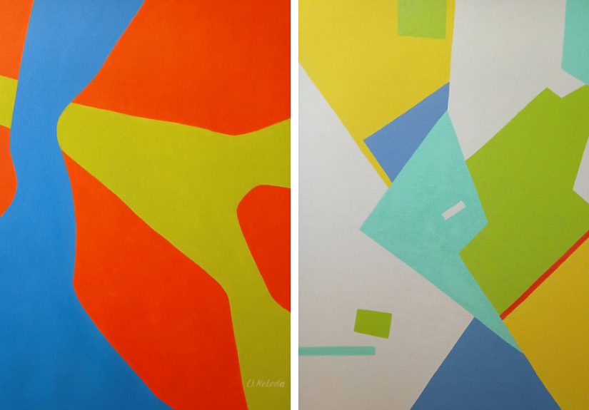
3. Tidal Geometry
Acrylic and pastel on canvas
Tidal Geometry came out of my habit of seeing grids in places where grids have no business existing: shoreline patterns, tangled reflections, sidewalks after rain. I began this work with a loose geometric scaffold, then interrupted it with curved bands of teal, sand, off-white, and deep ultramarine. The painting behaves like a negotiation between order and movement. The lines want discipline. The color wants to drift. I, meanwhile, stood in the studio pretending that was all part of a grand master plan.
This piece also helped me lean harder into contrast between geometric and biomorphic forms. Some shapes are crisp and deliberate; others feel like they grew there by accident. That push and pull gives the composition its pulse. It is one of my favorite examples of how contemporary abstract art can borrow energy from nature without illustrating nature directly. Nobody needs a literal ocean when color, spacing, and movement can make your eyes do the swimming.
4. Midnight With Citrus
Mixed media on panel
There is always one painting in a series that arrives like a plot twist. For me, that was Midnight With Citrus. I built the background with layered indigo, smoky black, and deep green, then interrupted that moody atmosphere with jolts of acidic yellow and orange. It sounds reckless because it was reckless. Fortunately, reckless is sometimes just another word for visually awake.
The dark ground gives the brighter forms a strange glow, almost as if the color is being lit from underneath. Some passages are smooth and flat; others are thick with dragged pigment and knife marks. That contrast matters because it keeps the viewer moving across the surface. The painting does not sit still, and I did not want it to. It is about surprise, interruption, and the pleasure of letting one absurdly bright note change the mood of an entire composition.
5. Soft Collapse, Hard Edge
Acrylic on canvas
If Static Weather is all atmosphere and Red Rooms for Loud Thoughts is all pressure, then Soft Collapse, Hard Edge is the one that combines both and then politely shoves them down the stairs. This painting is built around soft, washed passages in blush, fog gray, and cream that are suddenly interrupted by angular black forms. The softer areas feel unstable, as if they are dissolving. The dark shapes arrive like blunt facts.
I created this piece while thinking about how abstract composition can hold contradiction without resolving it. The soft areas are not weak. The hard edges are not cruel. They just need each other. The painting works because the visual language keeps switching between tenderness and certainty. In terms of studio process, this was one of the most revised works in the group. I painted over it repeatedly until it finally stopped looking like three different paintings fighting over rent.
6. Noise Map No. 3
Oil, acrylic, and collage on wood panel
Noise Map No. 3 is probably the busiest painting in this set, but I mean that as a compliment. It layers fragmented marks, collaged paper, short directional strokes, and clipped rectangles of color into a surface that feels almost cartographic. It is not a map of a real city, exactly. It is more like a map of overstimulation: traffic, alerts, memory fragments, overheard conversations, and the peculiar exhaustion of being online too long.
Despite all that activity, I was careful about balance. A dense abstract painting still needs breathing room, even when it is trying to mimic sensory overload. Small pale sections and repeated shapes create rhythm, while warmer reds and oranges keep the eye bouncing around the composition. This is one of those recent abstract works where viewers usually discover different favorite corners. I enjoy that. It means the painting is generous enough to offer multiple entry points instead of one loud instruction.
7. Blue Things I Couldn’t Explain
Oil on linen
This is the quietest painting in the group, which may be why it feels the most personal. Blue Things I Couldn’t Explain uses layered blue, gray-blue, green-blue, and barely-there white to create a surface that shifts slowly as you look. There are no dramatic collisions here, no flashy contrast, no theatrical gestures demanding applause. The painting is built on restraint, which for me is basically cardio.
What carries the piece is the subtle variation across the painted field: transparent passages, matte passages, softer edges, and a few linear marks that almost disappear. It asks for slower looking, which I consider a public service at this point. This work reminded me that abstract art does not have to shout to be memorable. Sometimes the strongest painting in the room is the one that refuses to perform and still somehow keeps everyone standing there.
What These 7 Works Have In Common
Even though these paintings look different from one another, they are connected by a few recurring ideas. First, I am clearly in a long-term relationship with texture. I like surfaces that reveal process: scraped paint, layered washes, dragged pigment, ghost lines, revisions left visible on purpose. A perfectly smooth painting can be beautiful, but I usually want the canvas to show evidence that something happened there.
Second, color is doing more than decorating the surface. In every one of these recent abstract paintings, color creates structure, mood, and momentum. I use it to push forms forward, bury them, separate them, and force them into awkward little conversations. Third, I am increasingly interested in compositions that feel open rather than narrated. I do not want to tell viewers exactly what to see. I want to give them enough visual logic to stay engaged and enough ambiguity to keep interpreting.
That is the sweet spot in abstract painting for me: a work can be nonrepresentational and still feel emotionally specific. It can be formally rigorous and still feel alive. It can be weird, elegant, rough, funny, and serious all at once. Frankly, I think more things in life should aim for that mix.
Conclusion
Looking at these seven recent works together, I can see my abstract painting practice getting sharper, stranger, and more honest. I trust interruption more than I used to. I trust negative space more. I trust the painting to carry feeling through color, rhythm, and texture without needing to explain itself like a nervous intern during a presentation.
That, for me, is the thrill of creating abstract art. Every canvas starts as a flat, silent rectangle and ends up becoming a record of attention, risk, revision, and instinct. Some paintings arrive like arguments. Some arrive like weather. Some arrive like a song you cannot remember but somehow know by heart. These seven pieces all taught me something different, and together they feel like the clearest evidence yet that I am exactly where I need to be in the studio: curious, messy, occasionally overconfident, and still very willing to let paint surprise me.
Studio Diary: What Painting These Works Taught Me
Making these paintings changed the way I think about time in the studio. I used to imagine progress as something obvious and dramatic: a breakthrough color choice, a brilliant compositional move, a day when everything suddenly clicked and I walked out feeling like a genius in paint-splattered shoes. That still happens once in a while, but these recent works reminded me that most real progress is quieter. It shows up in patience. It shows up in knowing when to stop adding and start editing. It shows up in recognizing that a painting can look unresolved for days and still be moving in the right direction.
I also learned that I work best when I let different kinds of energy coexist. Some mornings I need gesture, speed, and loud color. Other days I need restraint, repetition, and surfaces that build slowly. Earlier in my practice, I thought I had to pick one lane and become that kind of painter forever, as if the art police were waiting outside with a citation for mixed moods. These seven works cured me of that nonsense. They proved that my visual language is wider than I thought. I can make a painting that feels architectural and then make one that feels almost atmospheric vapor, and both can still belong to me.
Another big lesson was about revision. I have stopped treating repainting as failure. In fact, some of the strongest passages in these abstract paintings came from covering something up and letting traces remain. A buried line can be more interesting than a perfect one. A half-hidden color can create more depth than a fully visible shape. That sense of history on the surface matters to me now. I want viewers to feel that the painting has been through something, even if they cannot name exactly what.
There was also a personal shift happening while I made this group of work. I became less interested in whether a piece looked impressive and more interested in whether it felt true. That sounds lofty, but in practice it meant asking better questions. Was the composition actually working, or was I just distracted by a pretty section? Was the color relationship alive, or merely expensive-looking? Was the texture helping the piece breathe, or was I just adding more because texture is fun and I have the self-control of a raccoon near shiny objects?
The answer, occasionally, was humbling. But useful. These paintings taught me to trust slower looking, harder editing, and braver simplification. They also reminded me that abstract art is not random, no matter how often people say, “Oh wow, I could do that.” To which I always think: maybe, but would you know when to stop, where to cut, what to bury, what to leave exposed, and how to make blue argue convincingly with ochre for three square feet? Exactly.
Most of all, this body of work made me excited about what comes next. I can feel certain themes deepening: the dialogue between soft and hard edges, the tension between biomorphic movement and geometric control, the emotional power of restrained color, and the endless usefulness of texture in contemporary painting. These are not finished answers. They are ongoing questions, and I like my studio best when it feels full of good questions. That is where the next paintings will come from too: not certainty, but curiosity with a brush in its hand.