Table of Contents >> Show >> Hide
- Why Warm Color Palettes Work (and Why They’re Everywhere Again)
- How to Pick a Warm Palette That Won’t Turn “Cozy” Into “Cave”
- 31 Warm Color Palettes, Room by Room
- Entryway and Foyer (First Impressions Matter)
- Living Room (Cozy Without Looking Like a Cabin Gift Shop)
- Dining Room (Warmth That Makes Food Taste BetterScientifically Unproven, Emotionally True)
- Kitchen (Warm, Clean, and Not “Why Does This Look Orange?”)
- Bedroom (Soft Warmth, Better Sleep Energy)
- Bathroom (Warm Spa, Not “Orange Locker Room”)
- Home Office (Warm Focus Without Feeling Sleepy)
- Kids’ Rooms and Playrooms (Warm, Happy, Not Overstimulating)
- Hallways, Stairs, and “In-Between” Spaces
- Laundry, Mudroom, and Utility Spaces (Yes, They Deserve Style Too)
- Quick Styling Moves That Make Warm Palettes Look Designer
- Common Warm-Palette Mistakes (and How to Avoid Them)
- Extra: of Real-World Experience With Warm Color Palettes
If your home has ever felt a little “waiting room” (polite, beige, and emotionally unavailable), a warm color palette is the design equivalent of putting on a comfy sweater and actually meaning it. Warm colorsthink reds, oranges, yellows, and their cozy cousins like terracotta, camel, creamy whites, and golden brownscan make a space feel inviting, grounded, and lived-in (in the good way, not the “where did that sock come from?” way).
This guide gives you 31 warm color palettes you can use throughout the houseentryways, kitchens, bedrooms, bathrooms, offices, and even those “hallways of mystery” where the lighting is always weird. Each palette includes hex codes so you can save them, share them, and pretend you always knew what “undertone” meant.
Why Warm Color Palettes Work (and Why They’re Everywhere Again)
Warm colors visually “advance,” meaning they can make a room feel more intimate and welcoming. That’s why warm schemes often read as cozy, energetic, and comfortingespecially when layered with natural textures like wood, leather, linen, brass, and woven materials. Warm palettes also play nicely with popular “earthy” trends: rust, clay, ochre, caramel, and warm greens that behave like neutrals but with more personality than plain gray.
The key is balance. Warm doesn’t have to mean bright orange walls everywhere (unless you’re trying to recreate a permanent sunset inside your house). The best warm palettes usually include:
- A warm base neutral (creamy white, oat, sand, warm greige)
- A saturated warm anchor (terracotta, brick, cinnamon, paprika)
- A grounding deep tone (espresso, charcoal, oxblood, warm navy)
- A supporting accent (olive, blush, honey, brass, muted teal)
How to Pick a Warm Palette That Won’t Turn “Cozy” Into “Cave”
1) Start with the “fixed stuff” you can’t (or won’t) change
Flooring, countertops, cabinets, stone, brick, and big furniture pieces already have undertones. If your floors are honey oak, a cool gray wall can look… accidentally bluish and kind of sad. Warm palettes often feel more natural when they echo what’s already in the room.
2) Use a simple proportion rule (so the room doesn’t look like a paint store exploded)
A classic approach is the 60-30-10 idea: one dominant color, one supporting color, one accent. In real life, that can look like warm neutral walls (60), richer textiles or a rug (30), and smaller accents like art, hardware, or pillows (10).
3) Watch lighting like it’s a reality show and you’re rooting for chaos
Morning light, afternoon glare, warm bulbs, cool LEDslighting changes everything. Warm whites can go buttery, beige can go peachy, and terracotta can look either sophisticated or like you’ve moved into a giant clay pot. Always test samples in multiple spots and at different times of day.
4) Mix temperatures on purpose
Warm palettes look even better when they get a tiny “cool sip of water”a muted blue, a slate, a deep teal, or a soft gray-green. One cool-ish note prevents a space from feeling flat or overly orange.
31 Warm Color Palettes, Room by Room
Each palette below includes 5 colors with hex codes, plus a quick “how to use it” note. Treat these as plug-and-play recipes: swap one shade, keep the vibe, and you’ll still land on something that works.
Entryway and Foyer (First Impressions Matter)
-
1) Oat Milk Welcome #F5EFE6, #D7C2A3, #B07A4B, #4A3A2D, #C9A227
Use the creamy oat as walls, warm tan for runners, and a walnut-brown for a console. Brass (#C9A227) is your “hello, I have my life together” finishing touch.
-
2) Brick + Linen Greeting #F3E7D8, #C65B46, #8B4A3A, #2F2A26, #A8B08A
A brick-toned accent (or art) makes an entry feel instantly grounded. Add a quiet olive to keep it from going too “restaurant vestibule.”
-
3) Golden Hour Hall #FFF2D8, #E6B566, #C97B3A, #6B4E3D, #3E5F6B
Perfect for narrow foyers: pale warm cream brightens, amber warms, and a muted blue-gray adds a crisp contrast in frames or a small bench.
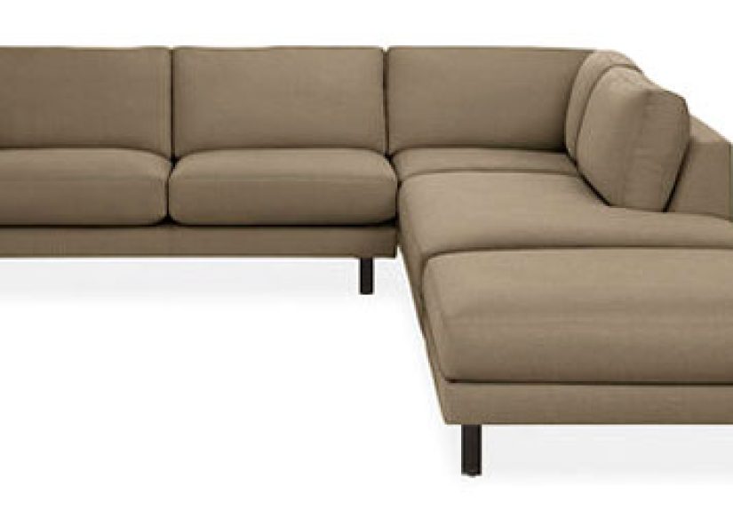
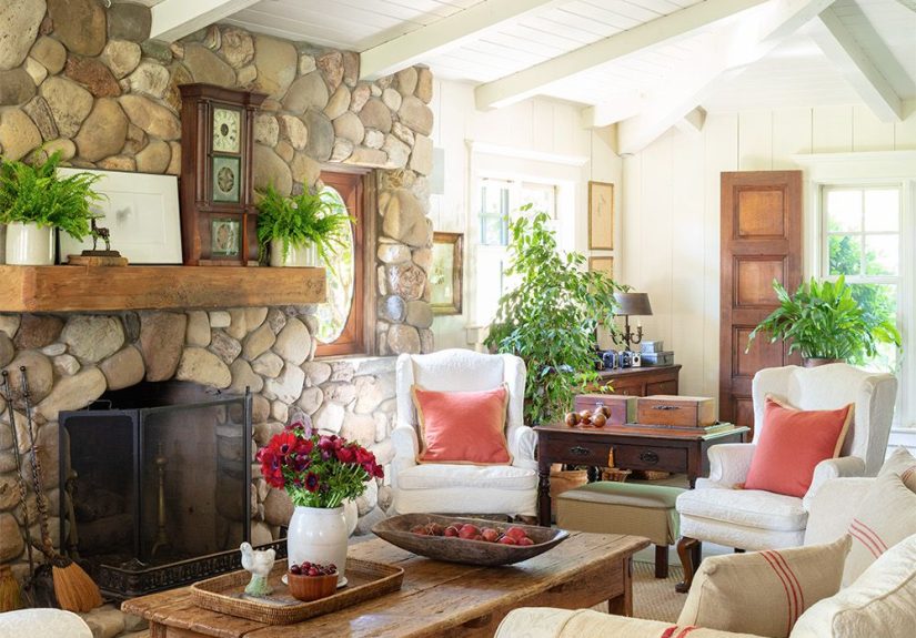
Living Room (Cozy Without Looking Like a Cabin Gift Shop)
-
4) Modern Camel + Charcoal #F6F1E8, #C8A27A, #A66A3F, #2C2B2A, #D8B6A4
Warm neutral walls with camel upholstery is timeless. Charcoal anchors big shapes (media console, fireplace surround), while blush keeps it soft.
-
5) Terracotta + Cream Classic #FAF3E8, #D88B66, #B85A3E, #6B5A4A, #8AA08A
Terracotta works best when it’s not alone. Pair it with creamy white and one “quiet green” to stop the room from feeling too spicy.
-
6) Rust Leather Lounge #F2E9DF, #B24A3B, #7A3B2E, #3B2F2A, #C7A57A
Designed for leather, wood, and moody evenings. Use the light neutral on walls, then bring rust in with a rug or statement chair.
-
7) Saffron + Warm Navy Pop #F8F0E4, #E0A12B, #C46A2C, #1F2E3A, #B7A99A
If you want warm but not “all brown everything,” this is it. Navy adds grown-up contrast while saffron keeps the room lively.
-
8) Cinnamon + Sage Calm #F5EEE4, #C47C5A, #8C5A3C, #6E7C64, #2E2B28
A cozy, earthy palette that looks great with plants and natural textiles. Sage reads neutral but still feels intentional.
Dining Room (Warmth That Makes Food Taste BetterScientifically Unproven, Emotionally True)
-
9) Oxblood Dinner Party #F6EFE6, #6C1F1B, #B55A45, #3A2D2A, #C9A26D
Use oxblood as an accent wall or built-ins, not necessarily all four walls (unless you love drama). Brass lighting makes it glow.
-
10) Toasted Apricot Table #FFF1E6, #F2B08A, #D87A4C, #6B4B3B, #4C6B6A
Apricot is warm, friendly, and forgiving. Add the muted teal in glassware, art, or seat cushions for a fresh twist.
-
11) Walnut + Butterscotch #F7F0E6, #D9A441, #B07A2E, #4B352A, #9D8B7A
This palette loves wood grain. Keep walls light and let butterscotch show up in textiles, ceramics, and warm lighting.
Kitchen (Warm, Clean, and Not “Why Does This Look Orange?”)
-
12) Cream Cabinets + Clay Accent #FBF4EA, #E3D2BF, #C97B5A, #6C5A4B, #C1A15E
Perfect for warm-white cabinets and clay-toned tile. Use the deeper brown for stools or open shelves.
-
13) Paprika + Warm Stone #F4EEE6, #D35F3E, #B44A2F, #8C7C6D, #2D2A28
If you want spice without chaos, keep paprika to a backsplash, island, or accessories. Warm stone tones do the heavy lifting.
-
14) Honey + Olive Kitchen #F7F2E8, #D9A85B, #A6752D, #6A6F4C, #3B332C
Honey wood cabinets? This palette feels like it was made for them. Olive reads earthy, not “green screen.”
-
15) Peachy Clean Minimal #FFF5EE, #F3D2C6, #E6A58A, #B36B52, #5A4B45
Great for kitchens that need warmth but still want that bright, clean vibe. Peach plays nicely with white quartz and brass.
-
16) Terracotta Tile + Sea-Glass Relief #F6EEE3, #D8825D, #B55A3C, #5D7C7A, #2D2B2A
Terracotta + a muted blue-green is a classic “warm/cool handshake.” Use sea-glass in bar stools, art, or dishware.
Bedroom (Soft Warmth, Better Sleep Energy)
-
17) Blush Linen Retreat #FBF1EA, #E6C7BC, #C48D7A, #7A5A4D, #4B3F3A
Blush in a bedroom reads calming when it’s muted and grounded with warm browns. Add texture: linen, boucle, wool.
-
18) Cinnamon Cocoa Cozy #F3EDE3, #C27A5B, #8E513A, #3A2B26, #C7A68C
Ideal for moody bedrooms: keep walls light, then go rich in bedding and curtains. It feels luxe without shouting.
-
19) Warm Greige + Rosewood #F4F0E9, #CFC2B6, #A5796A, #5A3C35, #2E2A28
If you want warm but subtle, this is a “quiet luxury” palette. Rosewood shows up best in nightstands, frames, or a headboard.
-
20) Desert Dawn #FFF0DD, #E9B07B, #CC7A46, #8A6A57, #6B7D74
Sun-baked and calm. Add the dusty green as a single accent (throw blanket, bench cushion) to keep it airy.
-
21) Soft Saffron + Cocoa Trim #FFF6E3, #F0C44C, #C8902A, #5A3E32, #AFA08F
Great if your bedroom gets low light. Saffron lifts the mood; cocoa adds depth so it doesn’t feel like a nursery.
Bathroom (Warm Spa, Not “Orange Locker Room”)
-
22) Warm Spa Stone #F6F1E8, #D8C7B2, #B98A6A, #6A5B52, #7E8C82
Pair with matte stone tile, warm white paint, and brushed nickel or brass. The gray-green keeps it fresh.
-
23) Clay + Cream + Black Linework #FBF3E8, #D49A7A, #B56C4E, #1F1E1E, #AFA39A
Warm neutrals plus crisp black looks modern and clean. Think black-framed mirrors and simple sconces.
-
24) Peach Quartz Glow #FFF4EC, #F1C6B3, #D89278, #8A5A4A, #C8A46A
Especially flattering with warm lighting. Use peach in towels or paint, then keep surfaces simple for an upscale feel.
Home Office (Warm Focus Without Feeling Sleepy)
-
25) Caramel + Ink Contrast #F7F0E6, #C99A6B, #9A6A3F, #1E2A36, #6B5A4A
Warm neutrals reduce glare and feel comfortable for long work sessions. Inky blue keeps it sharp and professional.
-
26) Terracotta + Paper White #FDF6EC, #E08B64, #B95B3D, #5B4A41, #9A8E82
A terracotta accent wall behind your desk adds energy without becoming distracting. Keep the rest light and simple.
-
27) Warm Eucalyptus + Putty #F3EFE6, #B9B6A6, #7F8A78, #C79A6A, #2F2D2B
A warm green can act as a calming “new neutral.” Pair with putty and caramel wood for a grounded, modern look.
Kids’ Rooms and Playrooms (Warm, Happy, Not Overstimulating)
-
28) Gentle Sunset Playroom #FFF1E8, #F4B7A6, #F0C96B, #C97A4A, #6A7C7A
Keeps the energy upbeat without neon chaos. Use the warm yellow as accents (bins, art) instead of full walls.
-
29) Storybook Warm Neutrals #FAF4EA, #E2D2C1, #C7A68C, #9A6B56, #3A3431
Warm neutrals are practical for kids: they hide scuffs better than bright whites and still feel soft and calm.
Hallways, Stairs, and “In-Between” Spaces
-
30) Buttered Beige Connector #FBF5EA, #E7D2B8, #C9A27E, #7A5C4A, #2C2B2A
Hallways need continuity. This palette flows beautifully from room to room and looks great with warm wood trim.
Laundry, Mudroom, and Utility Spaces (Yes, They Deserve Style Too)
-
31) Warm Yellow Utility Boost #FFF3D6, #F2C85B, #CFA24A, #6B5A4B, #4E6A5A
Warm yellow makes “chores” feel slightly less like chores. Pair it with practical darker accents that can handle real life.
Quick Styling Moves That Make Warm Palettes Look Designer
- Repeat your warm accent color 2–3 times across the room (pillows, art, a vase). Repetition makes it look intentional.
- Use warm metals (brass, aged bronze) to enhance cozy tones without adding more “color.”
- Layer texture: a warm palette on flat surfaces can look one-note. Add linen, boucle, wood grain, leather, or woven baskets.
- Choose one deep anchor (espresso, charcoal, warm navy) so everything doesn’t float away into “beige cloud.”
- Keep whites creamy if your palette is warmbright icy white can look harsh next to camel, terracotta, and honey tones.
Common Warm-Palette Mistakes (and How to Avoid Them)
-
Mistake: Choosing warm paint without checking undertones.
Fix: Compare swatches next to your flooring/cabinets. Warm doesn’t always mean “yellow”it can be red, peach, or golden. -
Mistake: Using too many mid-tone warms, so the room feels flat.
Fix: Add a deep anchor (espresso/charcoal) and one light creamy neutral for contrast. -
Mistake: Forgetting that lighting changes everything.
Fix: Test samples in morning/day/night and under your actual bulbs, not the store’s superhero lighting. -
Mistake: Going “all warm” with no relief.
Fix: Add a cool-leaning accent (muted teal, warm navy, gray-green) in small doses.
Extra: of Real-World Experience With Warm Color Palettes
Warm palettes are one of those design choices that feel “obvious” once you live with themkind of like realizing your phone should not be your alarm clock (yet here we are). In real homes, people tend to notice warm color schemes changing personality throughout the day. In the morning, warm whites and oat tones can look fresh and airy, especially in rooms with east-facing light. By late afternoon, those same shades can turn rich and buttery, which is lovelyunless you picked a warm white that’s secretly a banana in disguise. That’s why many designers recommend testing more than one “warm neutral” and comparing them directly against fixed finishes like floors, cabinets, and tile.
Another common experience: warm colors feel more forgiving. A slightly scuffed hallway in a creamy beige often looks like “patina,” while the same scuff on a cool bright white looks like evidence for a crime scene investigation. Warm mid-tones also tend to hide everyday dust and fingerprints better than icy cool tonesespecially in busy areas like entryways, kitchens, and mudrooms.
People also discover that warm doesn’t have to mean dark. A palette can be warm and still feel bright if the dominant color is a light warm neutral (like oat milk, ivory, or soft sand) and the deeper shades are used in smaller doses. In living rooms, for example, a warm cream on walls with cinnamon accents in pillows and art often feels lighter than a full-room tan. The “secret sauce” is contrast: warm palettes look best when there’s a clear difference between light, medium, and deep elements. Without that range, everything can blend into one continuous toast situation.
One more real-life lesson: warm palettes are easier to decorate over time. A terracotta-and-cream base can swing modern, rustic, Mediterranean, or even midcentury depending on the shapes and materials you add. Swap brass for black hardware, or add a muted teal instead of olive, and the entire mood shiftswithout repainting the whole house. That flexibility is why warm palettes are a go-to for “whole-home” color planning: they connect rooms smoothly, especially when you repeat a consistent warm white and rotate accents by space.
Finally, warm palettes tend to feel more “human” in the evening, when most homes are lit by warm bulbs. Under nighttime lighting, cool grays can go flat or slightly blue, while warm neutrals keep their softness. If your goal is a house that feels welcoming after a long day, warm color palettes do a lot of emotional heavy liftingwith none of the drama of a full red dining room (unless you want that drama, in which case: commit, and buy a great dimmer switch).